The network for creativity
Join 1.25M professional creatives like you
Connect with clients, get discovered, and run your business 100% commission-free
Creatives on Contra have earned over $150M and we are just getting started
Back to feedPost

What's something you've started doing because of social media?


The network for creativity
Join 1.25M professional creatives like you
Connect with clients, get discovered, and run your business 100% commission-free
Creatives on Contra have earned over $150M and we are just getting started





Related posts

A little milestone worth celebrating 🥹
I was offline for the last 2 days because I fell ill, so I wasn't really keeping up with anything.
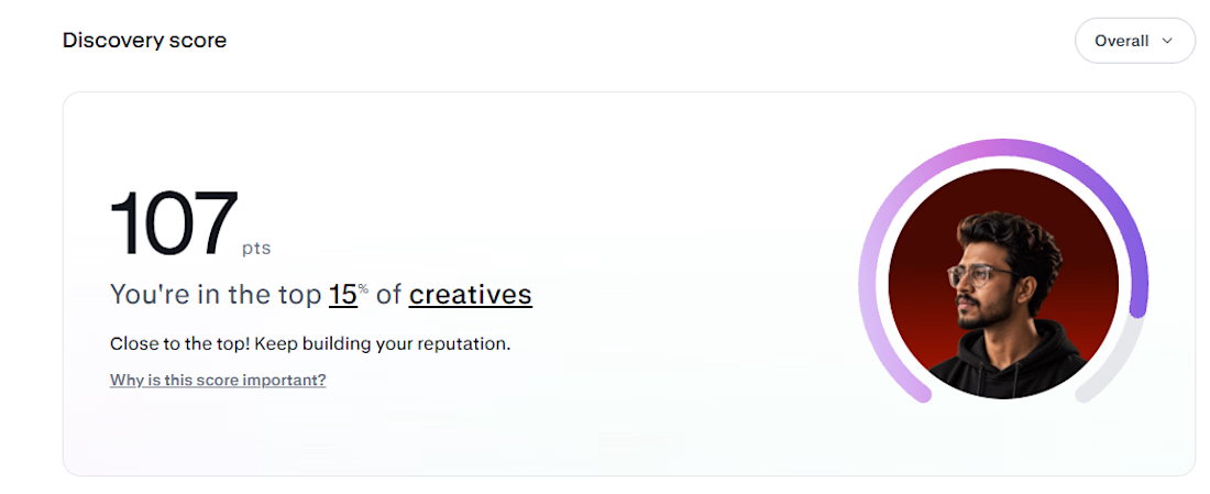
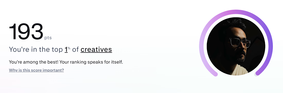
Came back today and saw my Discovery Score had gone from 99 → 107.
I was literally celebrating being one point away from 100, so seeing this was a really nice surprise.
Small milestone, but it means a lot. ❤️
Slowly building, one step at a time.


Congrats man

Same prompt. Same concept. Two AI tools. 👀
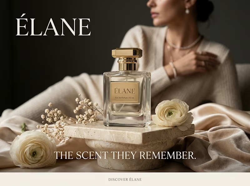
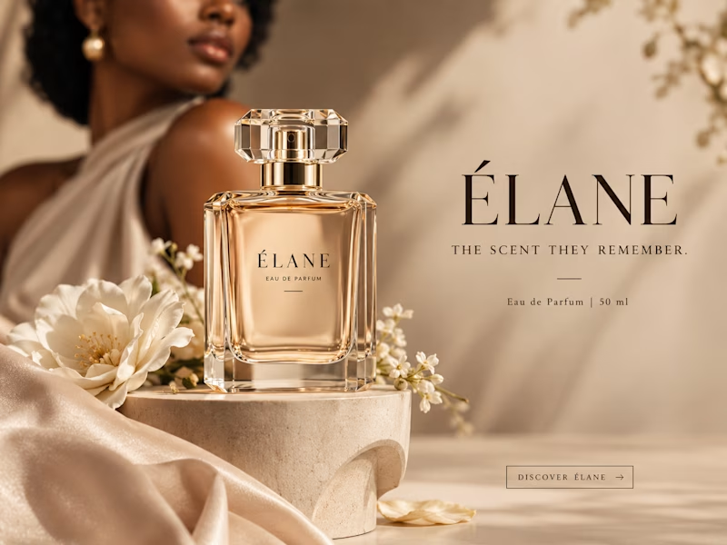
I gave ChatGPT and Gemini the exact same prompt to create a luxury perfume ad creative.
No changes. No extra instructions.
Now I want to know what YOU think:
Which creative did it better?
🔵 A— Gemini
🟣 B— ChatGPT
Look at the overall concept, visual quality, composition, typography, and how “ad-ready” it feels.
Who wins this round? 👀
Vote below and tell me what made you choose your answer.
#AIContent #AIAdvertising #AdCreative #CreativeStrategy #ChatGPT #Gemini #SocialMediaManager #SocialMediaStrategy #SocialMediaMarketing #MarketingStrategy #DigitalMarketing #ContentCreation

11 voted
39%
17 voted
61%
28 votes
Closed

I will go with Chatgpt on this.
It looks more luxurious and eye catching 🔥


When I started freelancing, I never imagined reaching milestones like this. There have been challenges, long nights, and plenty of lessons along the way.
Seeing that consistent effort pay off feels rewarding.
A big thank you to all my clients who trusted me with their ideas and everyone who has supported me along the way.
Still a long way to go, but today, I'm taking a moment to appreciate how far I've come. ❤️
What's a recent milestone that made you feel proud?


congrats on the milestone, consistency really does pay off 🔥