The network for creativity
Join 1.25M professional creatives like you
Connect with clients, get discovered, and run your business 100% commission-free
Creatives on Contra have earned over $150M and we are just getting started
Back to feedPost

When you put your heart into a project, clients notice.
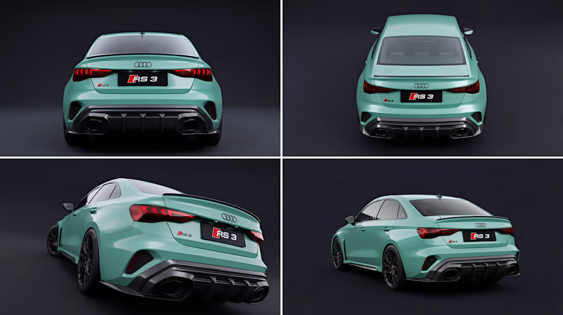
Created these body kit renders for a client, and they loved them so much that they came back for more work. Quality and passion build lasting relationships.
These body kit 3d renders turned into repeat business, and that's the real win.

The network for creativity
Join 1.25M professional creatives like you
Connect with clients, get discovered, and run your business 100% commission-free
Creatives on Contra have earned over $150M and we are just getting started





Related posts



Amazing!

Exploring clean geometry and satisfying motion.
Inspired by minimalist sculptures, I put together this seamless looping animation. The focus here was entirely on rhythm, clean form, and soft shadows as the sphere navigates the twisting spiral of geometric planes.
Sometimes keeping things strictly black and white is the best way to dial into pure motion.

The soft shadows on the black and white spiral make the loop feel really smooth.

Day 8 of 60-days-collecting-awesome-motion-design-references
I am gathering cool references for my own work as a Motion Designer, and thought it would be nice to share with the Community as I do so.
This one has been circulating on my socials for a few weeks now, and from the first moment I saw it, I saved it. Created by the team at Wix Motion Studio.
It has a nice mix of subtle motion and great design, combined with aesthetically pleasing AI-generated footage. I love the use of match cuts to keep the flow in the transitions, without overthinking them too much.
Would you keep this one in your collection?