The network for creativity
Join 1.25M professional creatives like you
Connect with clients, get discovered, and run your business 100% commission-free
Creatives on Contra have earned over $150M and we are just getting started
Back to feedPost


Show a status the same way everywhere it appears. //Micro-case study
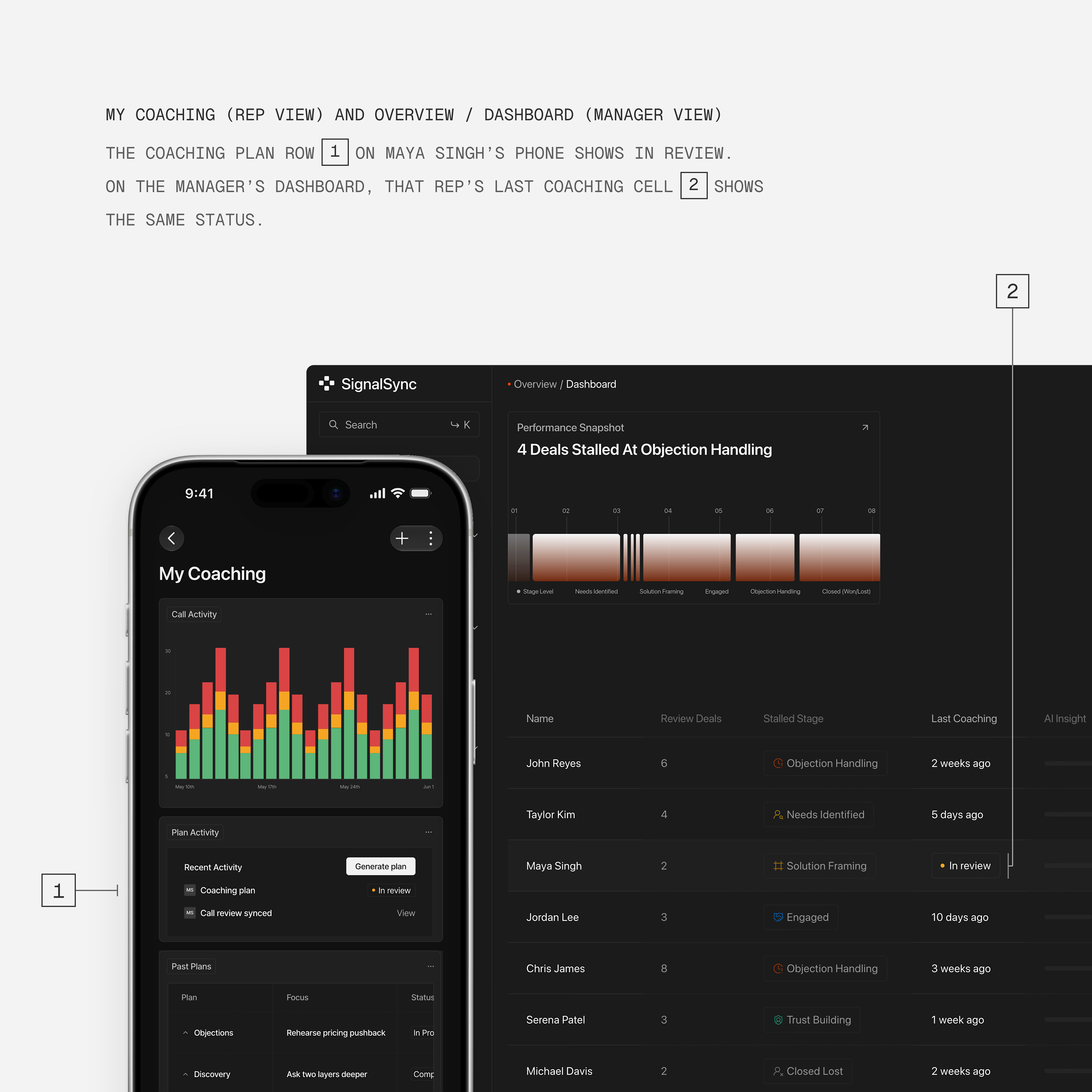
In B2B products, one record moves between people and screens. A rep sees it on their phone. A manager sees it on a desktop dashboard. If each screen shows the status differently, each person learns a different product.
In a sales coaching app, a plan in review looks the same on both screens:
→ The same word, "In review"
→ The same orange dot
→ The same pill
I find consistency like this helps users:
Learn the product's words once
Understand what the other role sees
Move faster, because nobody stops to ask
Get to the value sooner

Fantastic UI!
The network for creativity
Join 1.25M professional creatives like you
Connect with clients, get discovered, and run your business 100% commission-free
Creatives on Contra have earned over $150M and we are just getting started



Related posts

Can two different typographic directions change how you perceive the same skincare brand? 👀
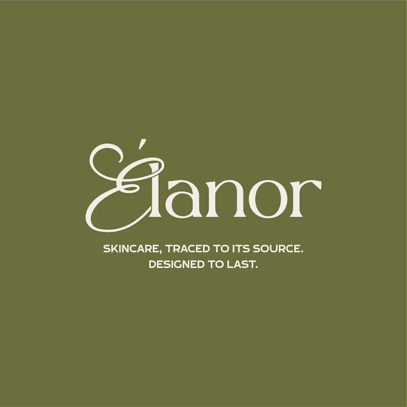
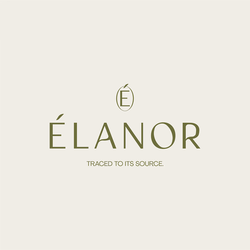
For Elanor, a skincare brand I’ve worked on, I’m putting two wordmark directions head to head.
A. Script Combo brings more personality and a distinctive, expressive touch.
B. Contemporary feels cleaner, more restrained, and modern.
Now I want your honest opinion: A or B? Which direction feels right for Elanor, and why?
26 voted
58%
19 voted
42%
45 votes
Closed

Absolutely! Typography changes everything. For Élanor, I love the contemporary direction - it feels elegant, clean and very premium for a skincare brand like this. The É icon on top is a beautiful touch! Script has personality but contemporary feels more timeless for skincare. Great exploration!

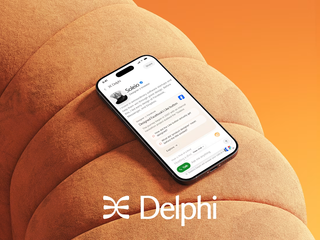
Yay! Experiences are now live for all Delphi users! Check them out live on https://delphi.ai/ Much more new features to come!


Congrats on shipping this Dario! Experiences sounds like a great addition to Delphi, curious to try it out

🎨 What makes an e-commerce website stand out: the design, the products, or the shopping experience?
Here’s a look at my e-commerce website design concept for a retro-inspired fashion store.
From product collections and featured items to community-inspired sections, the goal was to create a storefront that brings the brand’s personality to life while making product discovery feel effortless.
But I want to hear your honest thoughts 👇
💬 If you were improving this website, what would you focus on first?
🎨 The visual design and branding
🛍️ The product browsing experience
📱 The user experience and navigation
💰 The layout and conversion potential
Feel free to share your suggestions, even if you would do something differently. I’m always interested in hearing how other designers, founders, and e-commerce professionals think.
#EcommerceDesign #WebDesign #UIDesign #Shopify #UXDesign


The layout is perfect