The network for creativity
Join 1.25M professional creatives like you
Connect with clients, get discovered, and run your business 100% commission-free
Creatives on Contra have earned over $150M and we are just getting started
Back to feedPost

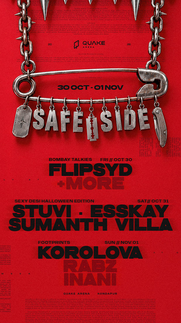
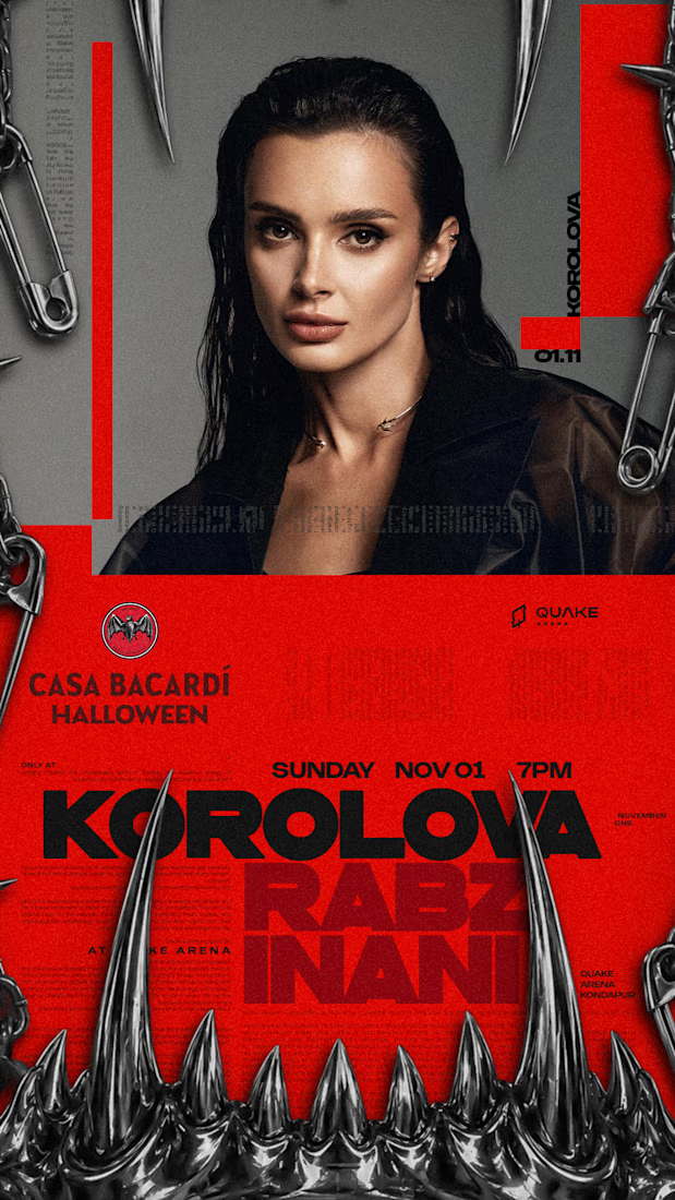
SAFE SIDE — A Rather Unsafe Visual Identity.
What started as an exploration of safety pins, industrial chains, razor blades and metallic fangs evolved into a Halloween identity built around a simple contradiction: not everything associated with safety looks particularly safe.
That irony became the foundation of SAFE SIDE, a Halloween IP developed for QUAKE Arena's Halloween weekend, featuring Korolova's Hyderabad debut.
From visual research and concept development to a cohesive design language of chrome elements, sharp silhouettes and bold typography, the idea took shape across the weekend's campaign.
A little danger, a little humour, and absolutely no commitment to looking safe.


The network for creativity
Join 1.25M professional creatives like you
Connect with clients, get discovered, and run your business 100% commission-free
Creatives on Contra have earned over $150M and we are just getting started



Related posts


The movement flow so naturally, it feels effortless to watch.


The little green dot moving through the grid is so satisfying

skin in the game.
pick a card.
live with it.
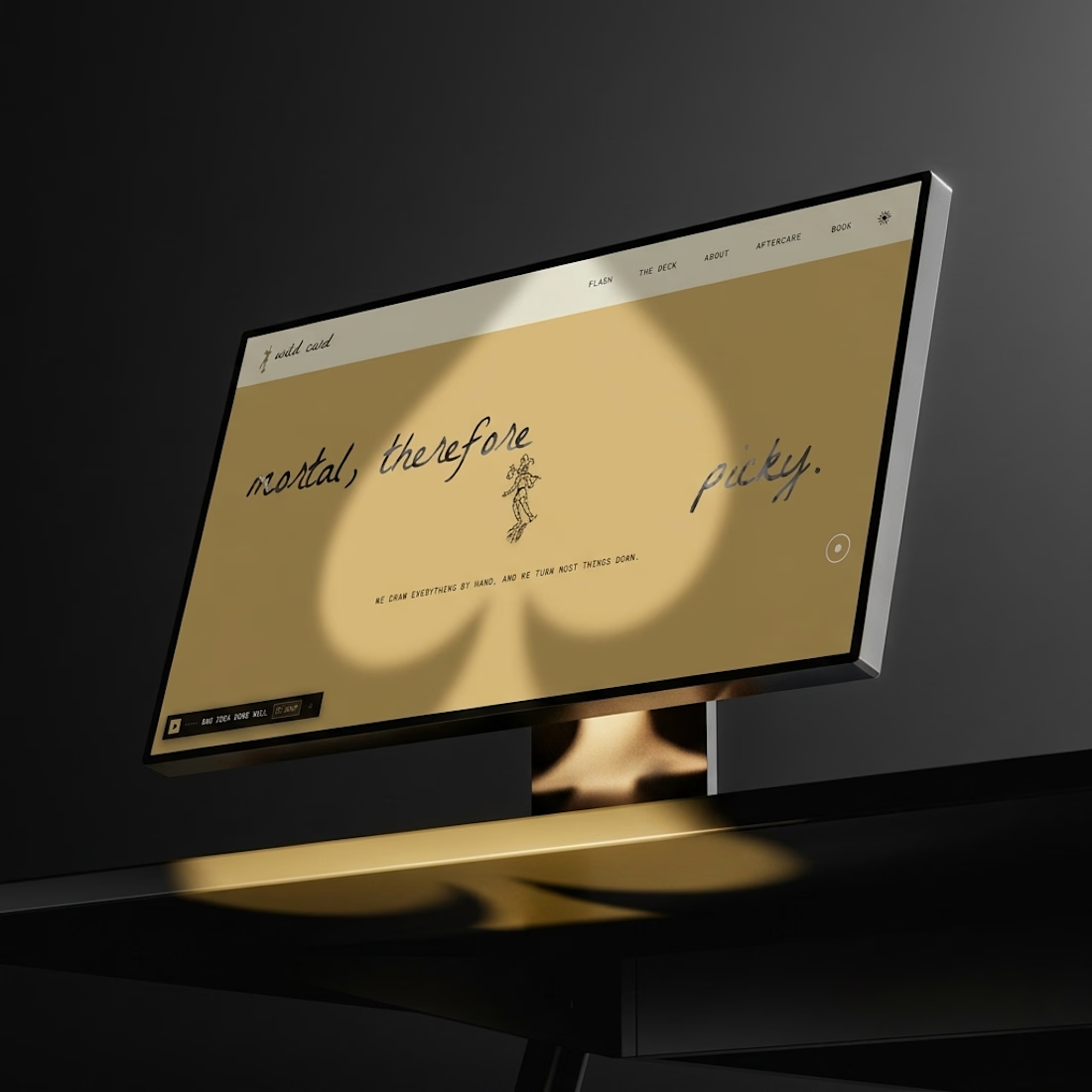
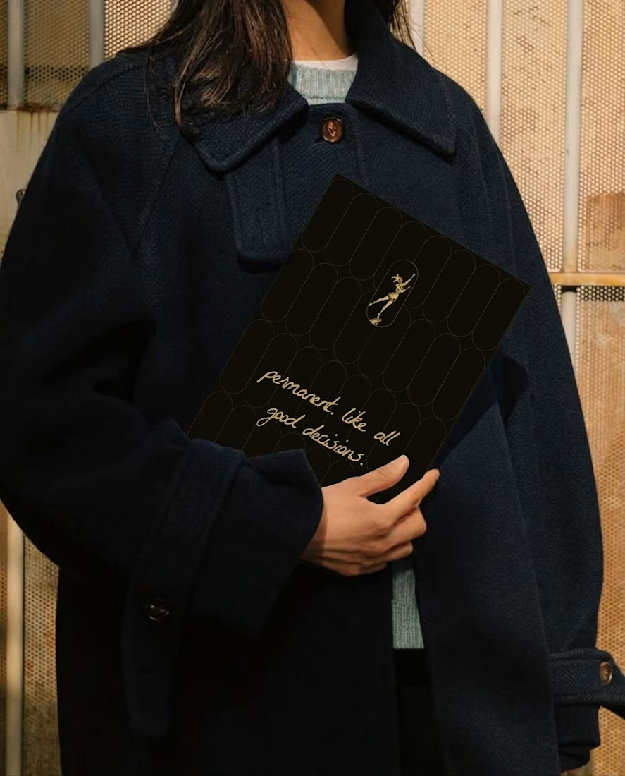
the wild card tattoo club case study is coming soon: the brand, the voice, a looping soundtrack and a website where you draw a card.
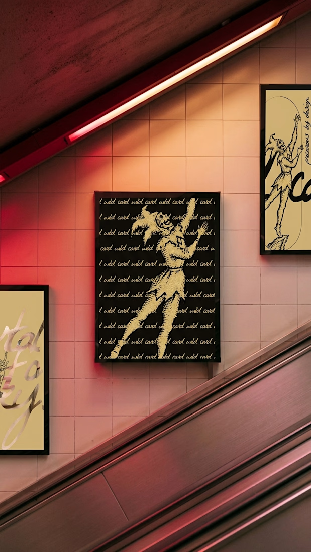
The gold illustrations on those black cards are gorgeous, Révolté