The network for creativity
Join 1.25M professional creatives like you
Connect with clients, get discovered, and run your business 100% commission-free
Creatives on Contra have earned over $150M and we are just getting started
Back to feedPost
Taste Test

Which logo would you prefer?
1 voted
50%

1 voted
50%

2 votes
Closed
The network for creativity
Join 1.25M professional creatives like you
Connect with clients, get discovered, and run your business 100% commission-free
Creatives on Contra have earned over $150M and we are just getting started



Related posts


Video-led hero for me. The big script Presence over the field sells a feeling in one glance, which is what wellness needs. The expanding gallery would work well as the second section.


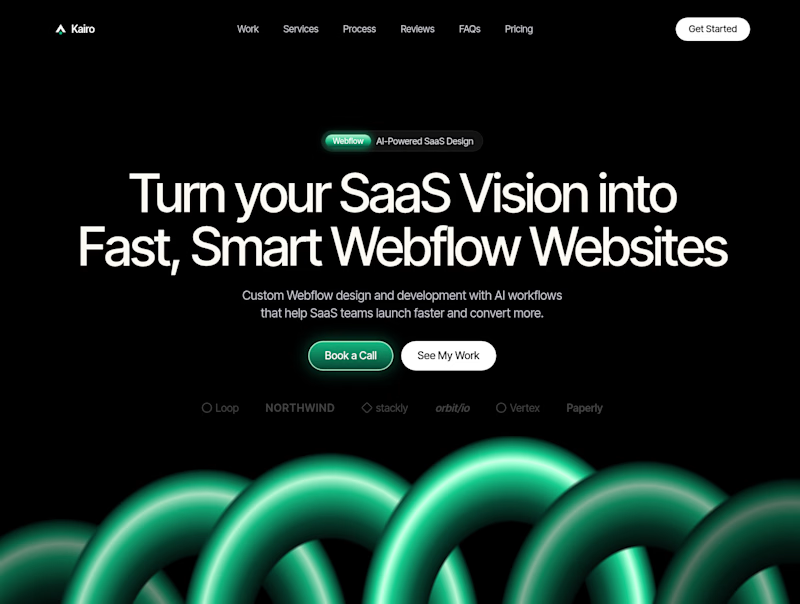
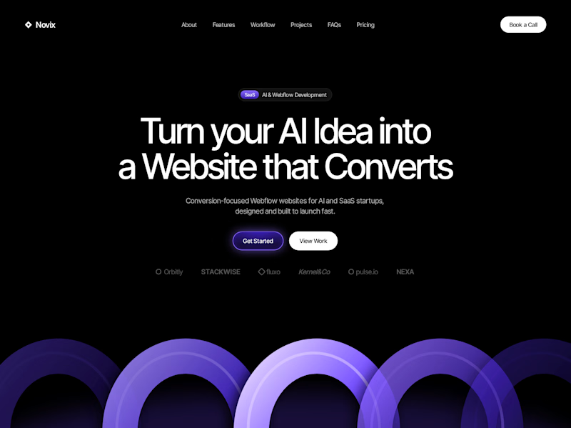

Both look great, but Violet & Black gets my vote! The purple accents give it a more modern, premium feel while keeping the design clean and focused on conversions. Amazing how a color change can create such a different brand personality. Have you tested which version performs better with visitors?

Codix - Which Visual Direction Works Better? 👀
Exploring two different visual styles for Codix, an experimental tech brand identity.
Option 1
Bold, geometric, and pixel-inspired. A playful mix of digital patterns, modular shapes, and vibrant colors.
Option 2
Abstract, expressive, and futuristic. A dynamic blend of flowing forms, gradients, and digital textures.
Same Brand. Two different creative directions.
Which one would you choose - 01 or 02?
5 voted
24%

16 voted
76%

21 votes
Closed

Option 2 was stunning🔥🔥