The network for creativity
Join 1.25M professional creatives like you
Connect with clients, get discovered, and run your business 100% commission-free
Creatives on Contra have earned over $150M and we are just getting started
Back to feedPost

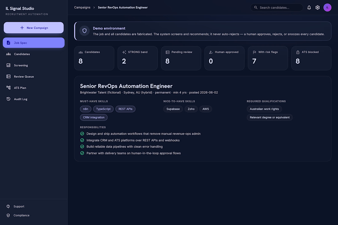
I built a working AI recruitment screening demo that shows how a hiring team can use AI without handing over the final decision.
The flow is simple:
A job spec goes in.
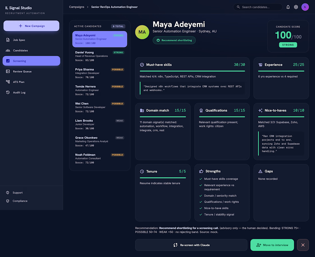
Candidate profiles are screened against a weighted guideline.
Each candidate gets a score, band, evidence quotes, and risk flags.
Then everything stops at a human review queue.
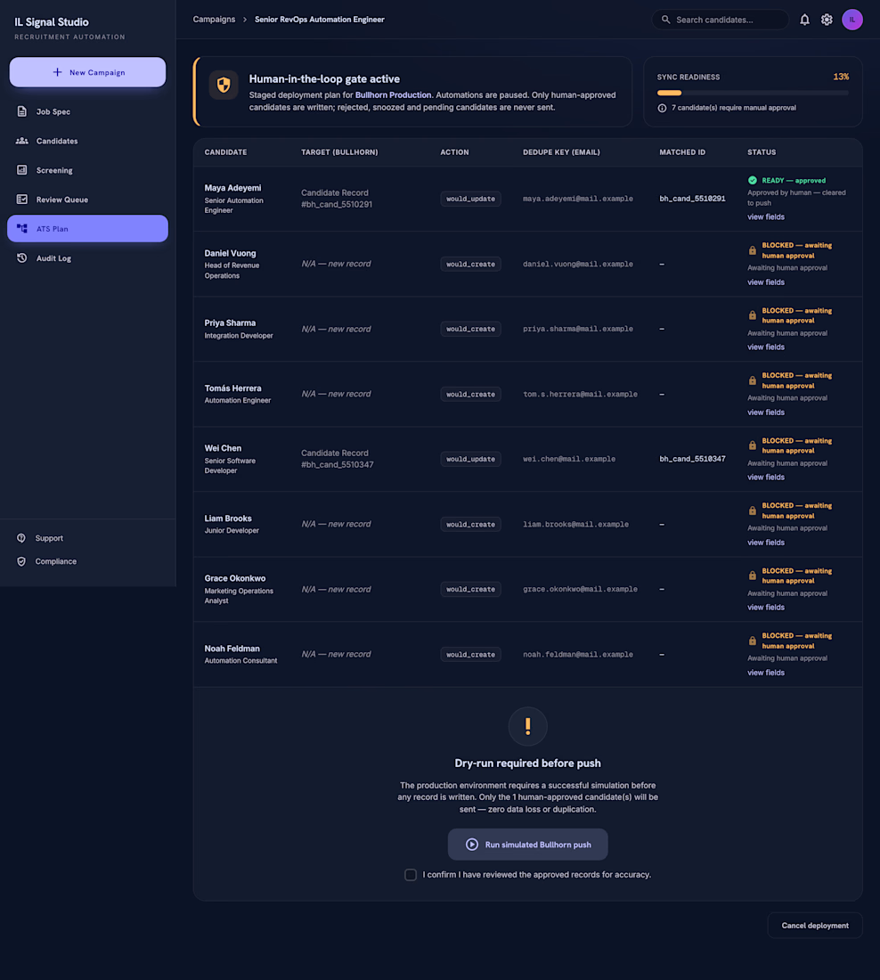
No auto-rejects. No silent ATS updates. No “AI decided this person is out”.
The system includes:
Candidate pipeline table
Evidence-based screening view
Human review queue
Approve / reject / snooze decisions
ATS deployment plan
Audit log for compliance
n8n workflow export with a human-in-the-loop Wait node
Optional live Claude screening path

The network for creativity
Join 1.25M professional creatives like you
Connect with clients, get discovered, and run your business 100% commission-free
Creatives on Contra have earned over $150M and we are just getting started





Related posts

Then: 1 month, 1 template.
Now: 1 week, 15 templates.
Same designer, different workflow.
I wrote up how I built no-code.supply: fifteen website templates, each with its own brand, in HTML and React, and some in Framer too. Claude Code did most of the typing. I did the directing.
no-code.supply
How I built 15 website templates with an AI coding agent in a week
How I built 15 AI-ready website templates with Claude Code in a week: the workflow, the quality bar, and why a template is only the starting point.

Going from one template a month to fifteen a week is wild. How much of the design direction did you still do by hand?

👋 I'm new to Contra and I did my first post without realizing I hadn't even introduced myself!
Hey I'm Katya, I'm an AI Systems Architect, marketer and yoga teacher.
I build AI systems that bring in business and handle the work behind it. A voice agent that calls new leads back within seconds and books the appointment. A pipeline that traced 16,900+ leads to the ads that brought them. Listing videos made from the photos a real estate agent already has.
The marketing side came first. I built the multi-channel campaign for Jay Shetty's launch (22 million followers). After that I discovered the tech world and when AI came along, I realized I'm a builder at heart and never looked back! Building is so much fun 🤍
Here's what I've shared:
My first post: on building a fully AI-made YouTube video, end to end, because I'm camera shy 🙈 https://contra.com/community/MP9mFRuT-im-building-my-first-fully-ai-made
Last thing, if you're building with AI video or automation, I'd like to see what you're working on
And if you're hiring: I may be new to Contra but definitely not new to this work. Reach out for AI agent builds, apps, websites or anything in between.
P.s The video below is my AI avatar. My profile video is the real me :)


Nice Portrait....Has everything from a great pose, great composition and lighting and perfect environment setting.

Take a vampire, a grim reaper and a bat for a midnight ride through a haunted town. Hold to boost over broken track, brake before the big hills, and grab candy to refill your boost. Push your luck too far and your passengers end up splattered across the screen.


Cute!!