The network for creativity
Join 1.25M professional creatives like you
Connect with clients, get discovered, and run your business 100% commission-free
Creatives on Contra have earned over $150M and we are just getting started
Back to feedPost

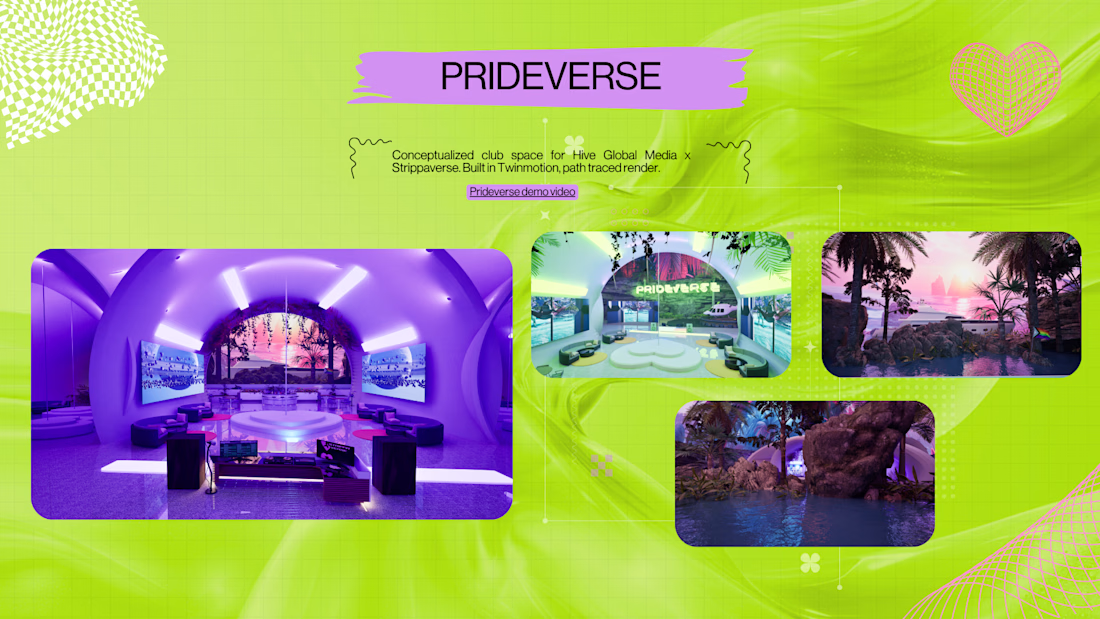
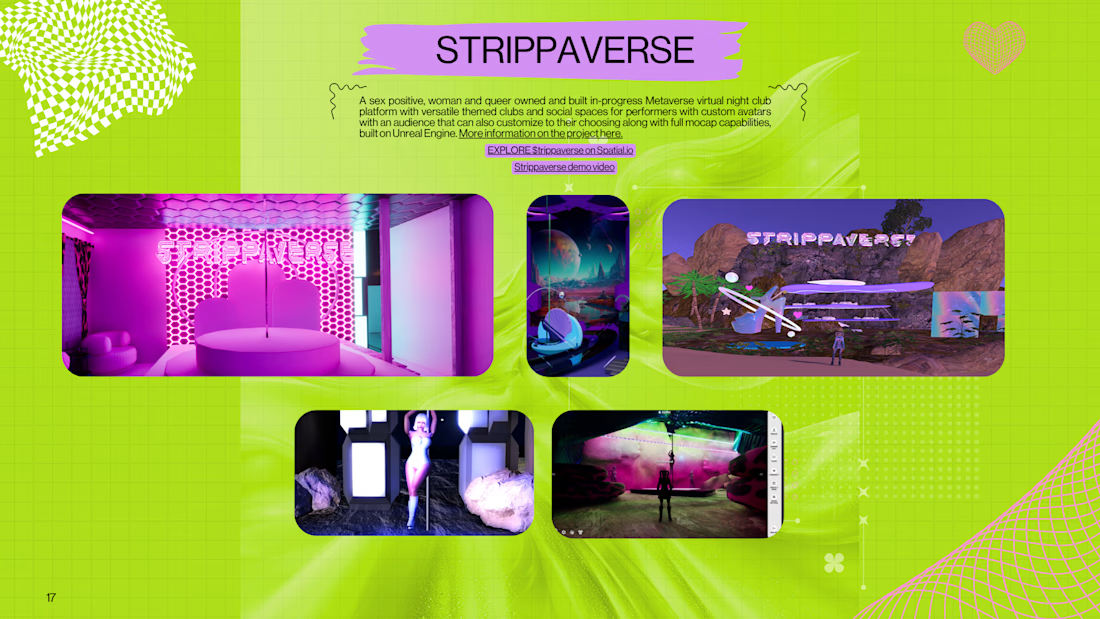
As social-virtual spaces, Metaverse platforms blur the line between community, creativity, and commerce, giving people new ways to gather, collaborate, and express themselves on a global stage.


The network for creativity
Join 1.25M professional creatives like you
Connect with clients, get discovered, and run your business 100% commission-free
Creatives on Contra have earned over $150M and we are just getting started




Related posts

I spent the last week challenging myself to design, brand and 3D model a minimal supplement. I experimented with compositing nodes to add a blur in some renders, which one do y'all like more?
14 voted
44%
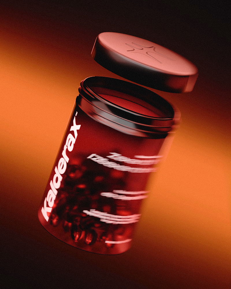
18 voted
56%
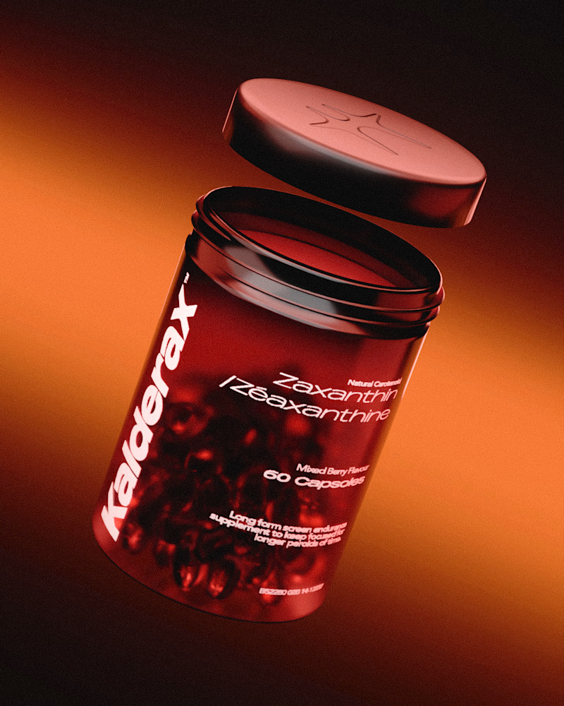
32 votes
Closed

Exploring 3D interactions and brutalist scale for Kinetix — a portfolio concept centered on design systems and digital products.
Focused on balancing heavy typography with fluid, tactile motion so the 3D element feels integrated rather than decorative.
Curious to hear your thoughts: does the 3D rotating showcase feel smooth and intuitive, or do you prefer flat, high-speed interactions for portfolio heroes?


The rotating 3D works here precisely because you kept it integrated, not decorative, so it reads as intent rather than showing off. For a portfolio hero I usually lean flat and fast, but this earns the motion. That heavy Kinetix wordmark has real physical weight.

Help me decide the best visual direction for this 3D Product Hero Section:
Option A: Bold red accent with high visual impact
Option B: Subtle orange tone with smooth lighting focus
If you're building luxury e-commerce platforms, which UI aesthetic do you prefer?
Let’s hear your thoughts below! 👇


16 voted
52%
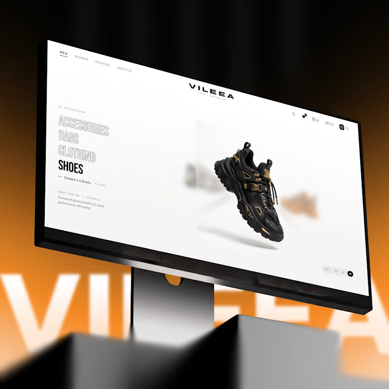
15 voted
48%
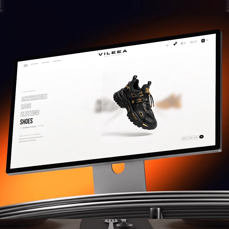
31 votes
Closed


Option A commands immediate attention for high-impact visual campaigns, but Option B feels much more aligned with luxury e commerce. A subtle, warmer tone creates a refined, high end look that keeps the product front and center without overwhelming the interface.