The network for creativity
Join 1.25M professional creatives like you
Connect with clients, get discovered, and run your business 100% commission-free
Creatives on Contra have earned over $150M and we are just getting started
Back to feedPost
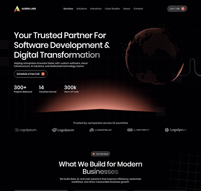
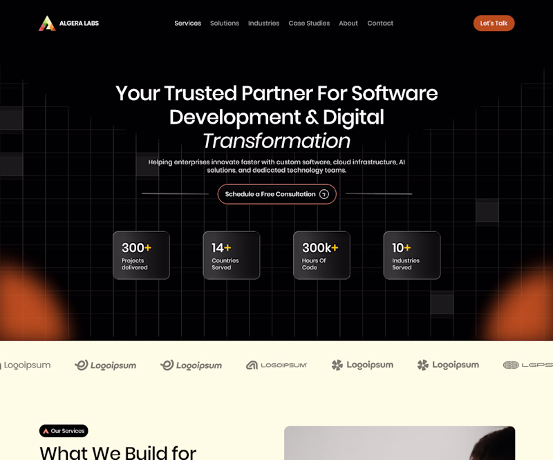
Taste Test
Dark follows with dark. A option. Feels like a continuation of the story! Sick stuff!
This looks amazing!
Really love the dark theme!
A is so much more cohesive
Amazing design !
Voting for B. The centered hierarchy and contained metric cards make the data significantly easier to scan and digest. Plus, using the lighter band for the logo ticker serves as a brilliant structural anchor. It creates a clean visual break that transitions beautifully into the...
A
I agree with leaning toward A. The asymmetrical layout looks super clean, and continuing the dark theme into the next section keeps the visual flow really smooth.
Nice work as usual! I’m leaning heavily toward Concept A the structure is incredibly clean. As a web designer, that’s exactly the kind of crisp layout I love building out and animating in Framer. Keep it up!
Both looking premium but A is grabbing attention.
The network for creativity
Join 1.25M professional creatives like you
Connect with clients, get discovered, and run your business 100% commission-free
Creatives on Contra have earned over $150M and we are just getting started
Related posts
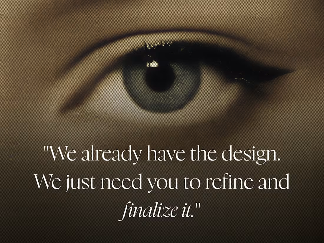
One of my favorite client phrases is:
"We already have the design. We just need you to refine and finalize it."
Every time I hear that, I know I'm about to redesign the whole thing. 😅
If it isn't working, that's not polishing.
That's design!!
Sometimes it's even harder than starting from scratch because you're working around decisions that already exist.
And usually... it's an AI image they generated.
What's your "favorite" client phrase?
I agree! My favorite phrase is "we want to share a more specific visual direction that feels closer to the brand identity." and they proceed to edit the designs I made with AI
How it works section for Ember 🙂↕️
Smooth animations with the abstract illustrations, the best 👌🏽
Taking new projects.
Send a DM or book a call - https://cal.com/daniel-design/15min
Loved the Design :)
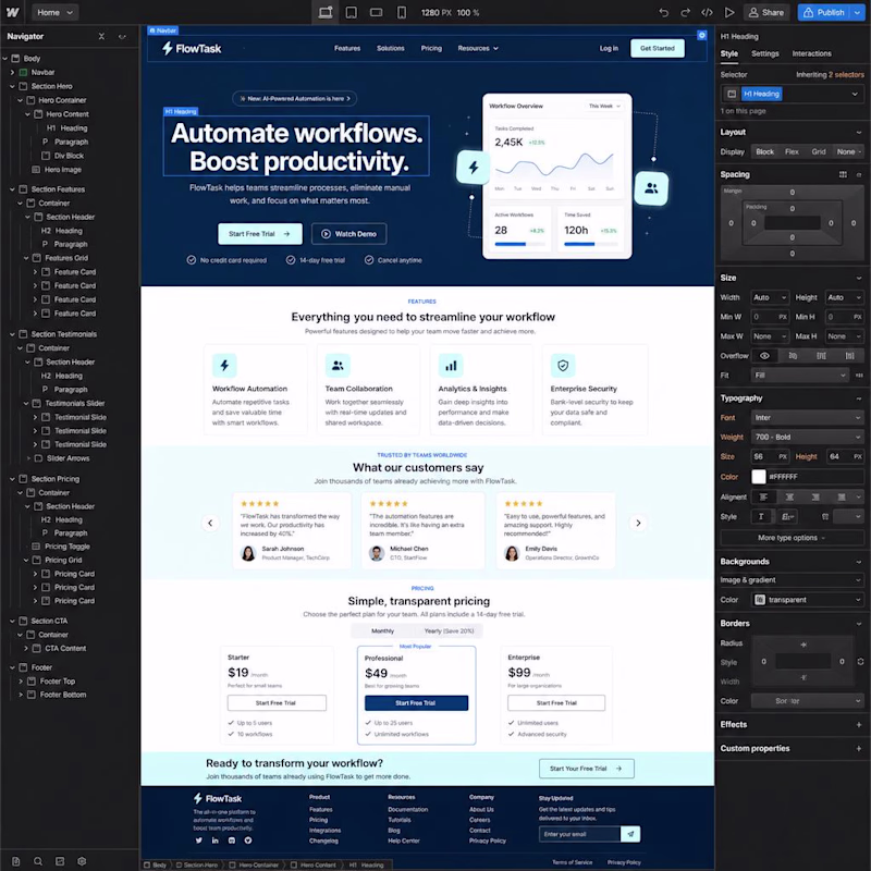
If you had to choose one based on the overall look and feel, which would you pick?
👇 Vote below:
🅰️ Figma
🅱️ Webflow
I will love to know what caught your attention
6 voted
60%
4 voted
40%
10 votes
Closed
Going for figma design
Trending
Claude
Claude has entered the design space. How are you using Claude Design?
Contra University
Learn from expert creatives how to earn more using next-gen AI tools.
MagicPath
The canvas is infinite, and exploration is becoming the workflow. How are you using MagicPath?
creativeaiflow
Creative AI workflows are evolving. What tools do you use, and what are their strengths and weaknesses?
freelancerlife
Freelancer life is wins, pivots, and everything in between. What’s yours right now?