The network for creativity
Join 1.25M professional creatives like you
Connect with clients, get discovered, and run your business 100% commission-free
Creatives on Contra have earned over $150M and we are just getting started
Back to feedPost

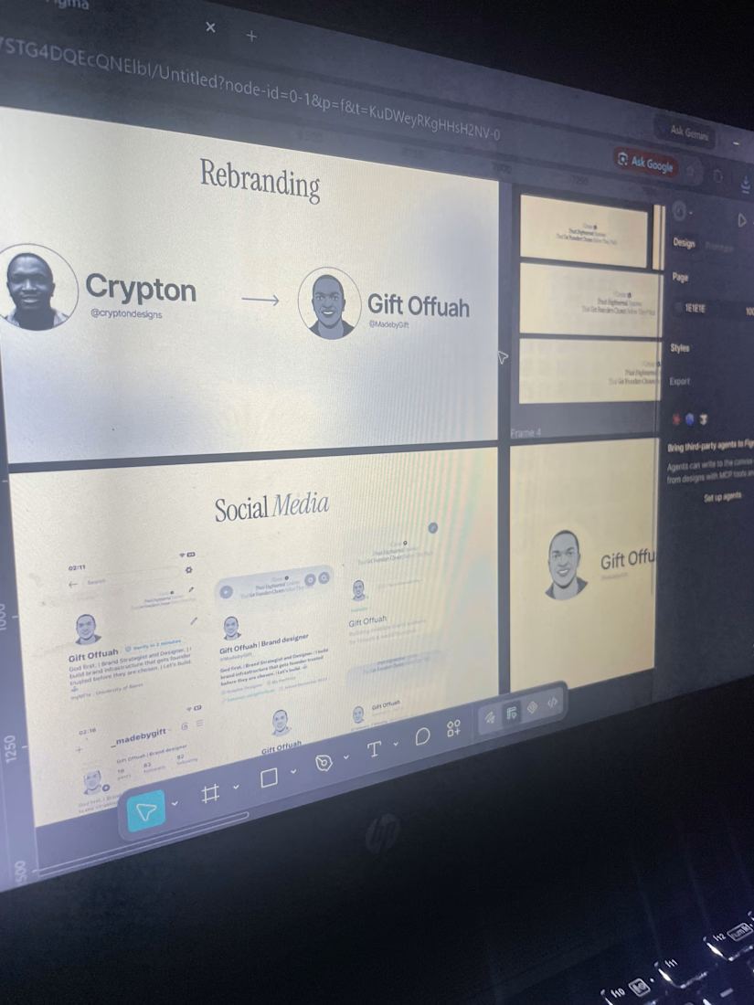
It’s a new week🥂
Still in the process of figuring out the maneuver this platform, gradually getting the hang of it.😂
Incase you’re seeing my profile for the first time, yeah.
I’m Gift. A strategic and creative brand designer in the fintech, Ai and web3 industry.
I design systems that engineers trust and get founders chosen even before they pitch
If you’re founder in fintech, AI and web3 industry looking to build trust engineered product, I’m the designer you need on your team!
The network for creativity
Join 1.25M professional creatives like you
Connect with clients, get discovered, and run your business 100% commission-free
Creatives on Contra have earned over $150M and we are just getting started








Related posts


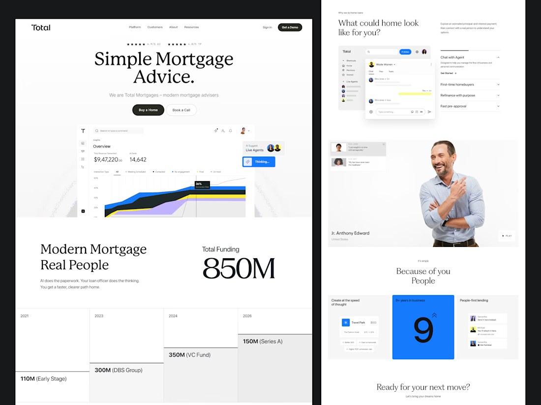
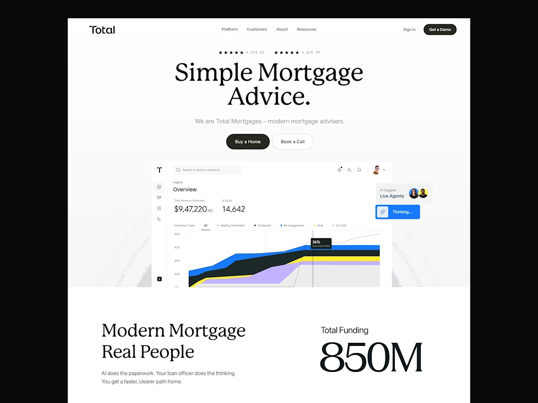
Build a mortgage experience that turns more visitors into qualified borrowers.
At Dstudio, we design AI-powered mortgage platforms, lending products, loan application flows, borrower dashboards, mortgage websites, and complete digital lending experiences — from lead generation and eligibility checks to loan applications and approval journeys.
Our focus is simple:
→ Better UX
→ Simplified mortgage journeys
→ Higher conversion rates
→ Seamless borrower experiences
→ AI-powered lending experiences
→ Scalable design systems
We help mortgage companies, lenders, fintech startups, and AI-driven financial platforms turn complex lending processes into intuitive, conversion-focused digital products.
If you're building an AI mortgage platform, mortgage website, digital lending product, or home loan application, let's talk.
#Mortgage #AIMortgage #MortgageDesign #MortgageUX #MortgageUI #MortgageWebsite #MortgageWebDesign #MortgageSoftware #MortgageTechnology #DigitalLending #LendingPlatform #FintechDesign #FintechUX #FintechUI #AIProductDesign #ProductDesign #UIDesign #UXDesign #WebDesign #SaaSDesign #MortgageDesignAgency #FintechDesignAgency

✨ Creative Ideas into Beautiful Designs! 🎨
Every design is a new opportunity to learn, grow, and create something amazing. 💻✨
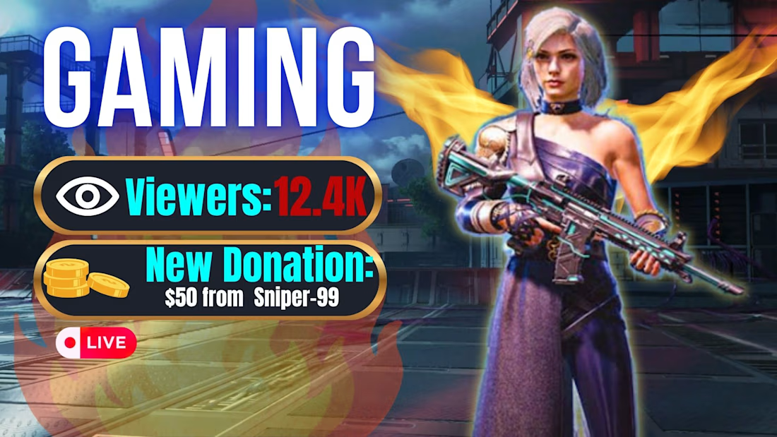
I’m passionate about creating eye-catching YouTube thumbnails and social media posts that help brands stand out and grab attention.
🚀 Learning every day. Improving every design. Building my creative journey!
#CanvaDesigner #YouTubeThumbnail #SocialMediaDesign #GraphicDesign #CreativeJourney




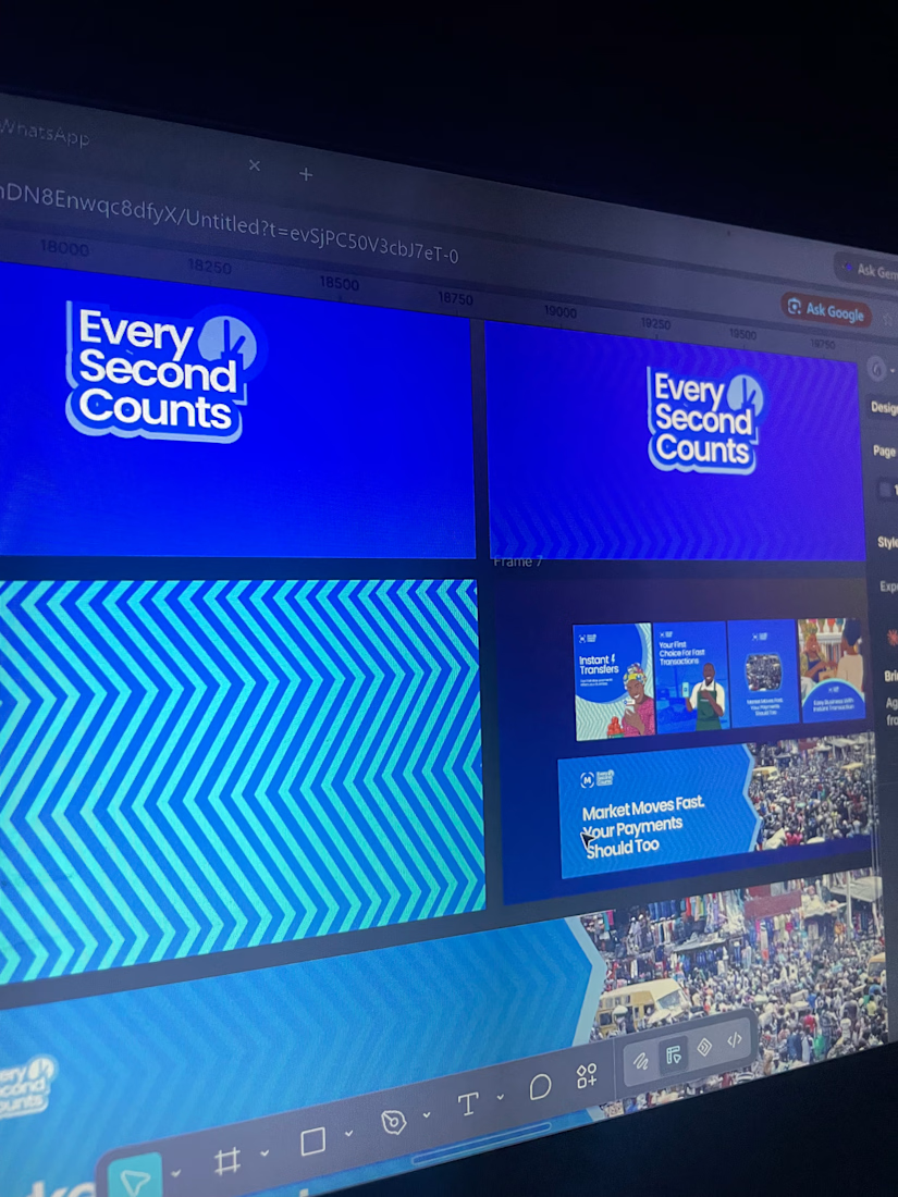
New case study is up on my profile! A fun passion project I worked on earlier this year🚲


super cool project! the typographic work is impeccable and super interesting

