The network for creativity
Join 1.25M professional creatives like you
Connect with clients, get discovered, and run your business 100% commission-free
Creatives on Contra have earned over $150M and we are just getting started
Back to feedPost

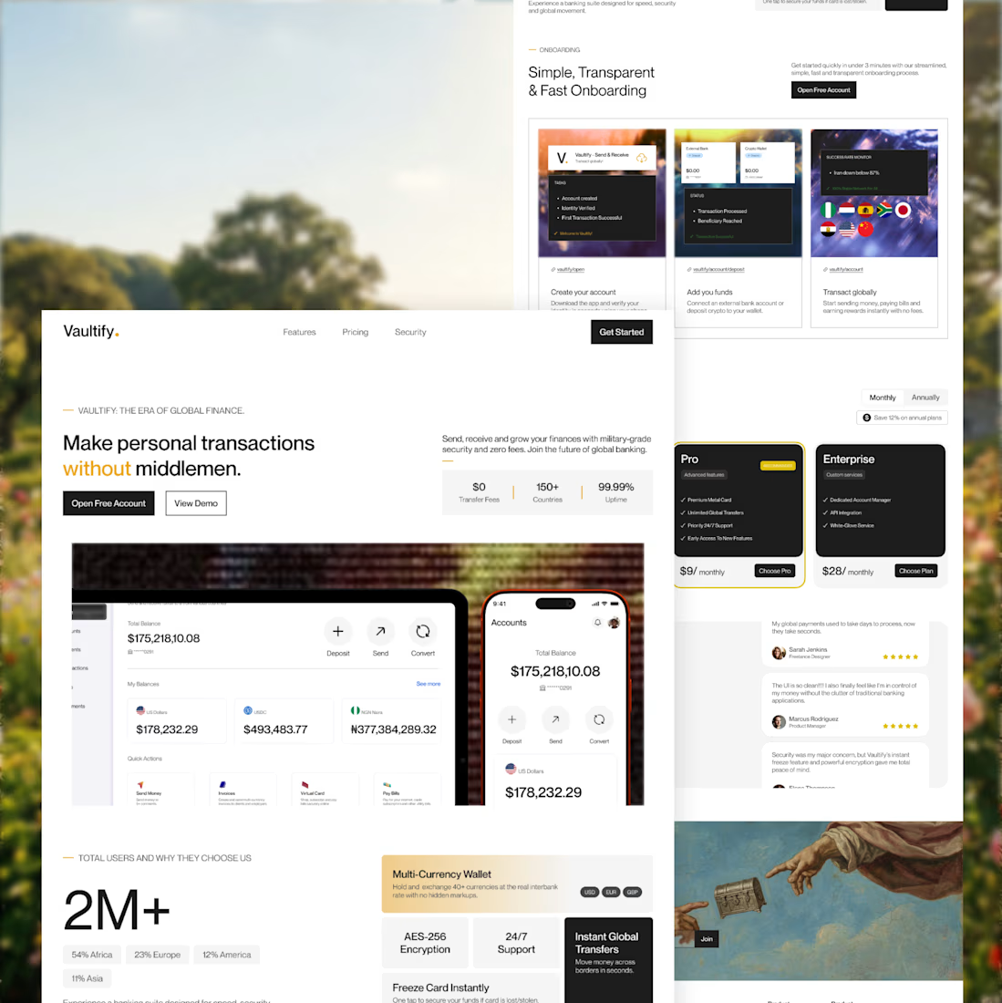
Here's a breakdown on specific segments and implementations in the redesign I did for an initially AI designed fintech landing page.
Slide 1. Hero Section needed a little bit of work, at least something that would stand out immediately on first view. With an updated header and additional information in proper place and better layout. Included screenshot images of the app interface accross a mobile device and iPad.
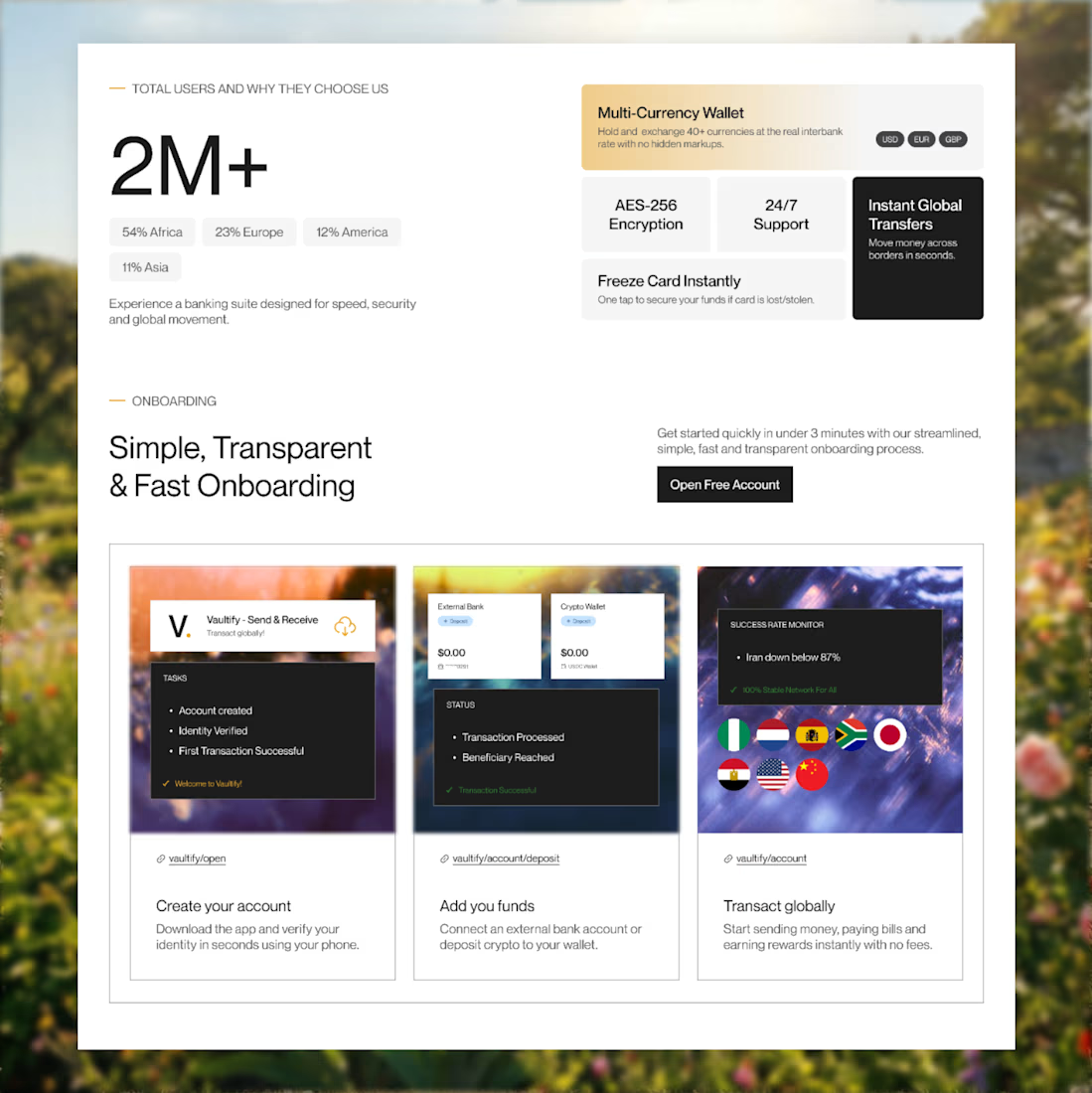
Slide 2 - First Part: The aim is to simply communicate the value the product provides and how many people benefit from it. Not too much language or unneccessary layouts and grids, a simple "why choose us and how many people already do."
Second Part: An onboarding process was included in the initial AI design, but no solid conversion from that stage, what if we told users how smooth the onboarding and also made new users see for themselves? Hence, the included quick links at the top of each copy heading. e.g Create Your Account - An underlined link above that takes them straight to the create account/sign in flow - "vaultify/account". Also each onboarding process had simple UI elements/images to communicate better and for visual support and beauty.
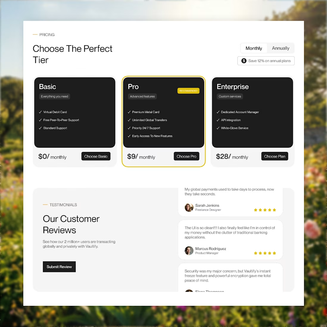
Slide 3. Pricing and Testiomonials section had to be tweaked!!!! I redesigned the pricing cards to be simple and very informative and I also included a toggle for users to view and choose between monthly and annual subscription.
For the testimonials section, I implemented a simple scroll animation for existing reviews and I included a button for users to also submit reviews as well.
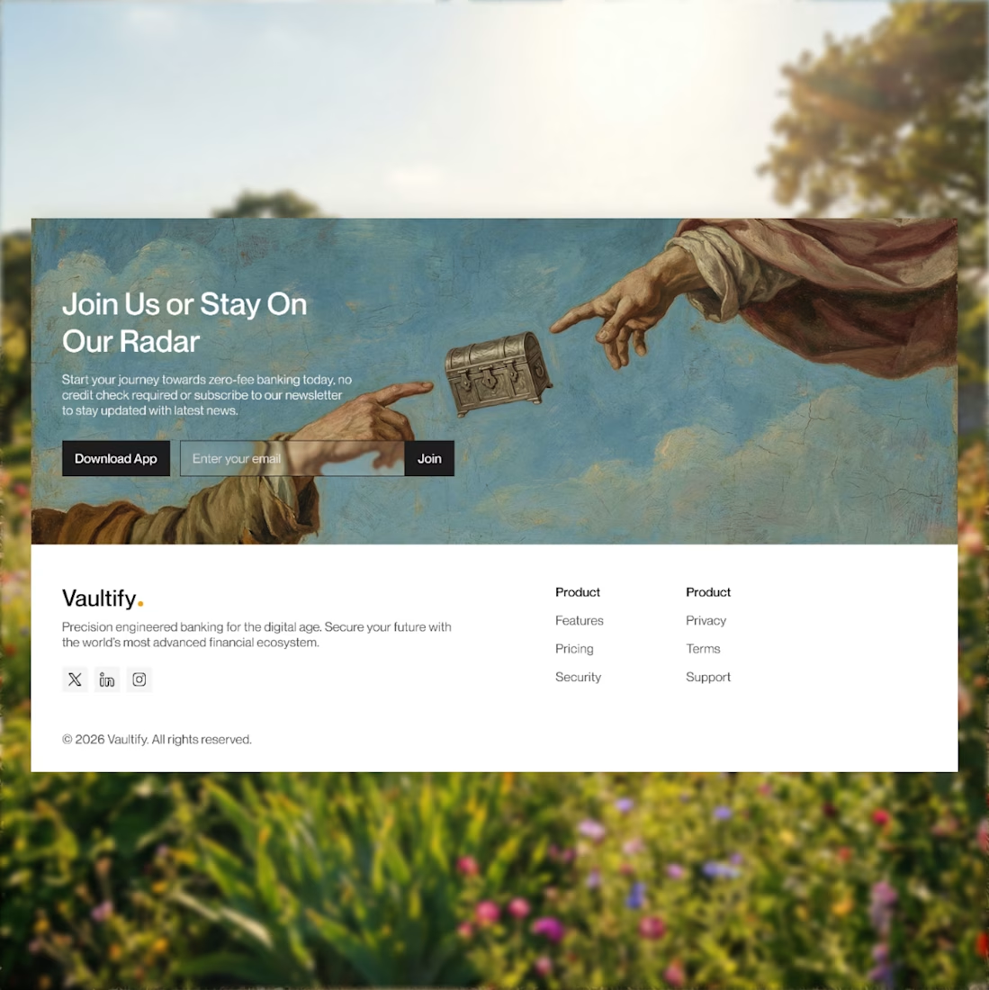
Slide 4. The Footer!! I had to make the footer very "not-so-boring"... I hate boring footers. But still had to make it simple as well. I implemented final CTAs (Download App and Join Our Newsletter), hinting at the chance of doing both. I had an idea to also implement a pop-up triggered by the Download App button that dispays a QR code for simple device scanning that takes you straight to the App Store for people who want to download but are viewing on their PC, to make the process smoother and easier for them but a link would still be in the pop-up, regardless.
Comments, retweets and follows would be very much appreciated. But retweets especially, share your thoughts with me too.
Divine Sam.
If you want to see the initial AI design, let me.
All in all, what are your thoughts?

The network for creativity
Join 1.25M professional creatives like you
Connect with clients, get discovered, and run your business 100% commission-free
Creatives on Contra have earned over $150M and we are just getting started

Challenges
View all


Related posts

Same data, two different ways to experience it 🤔
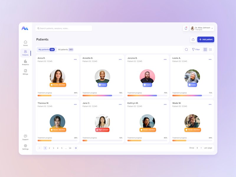
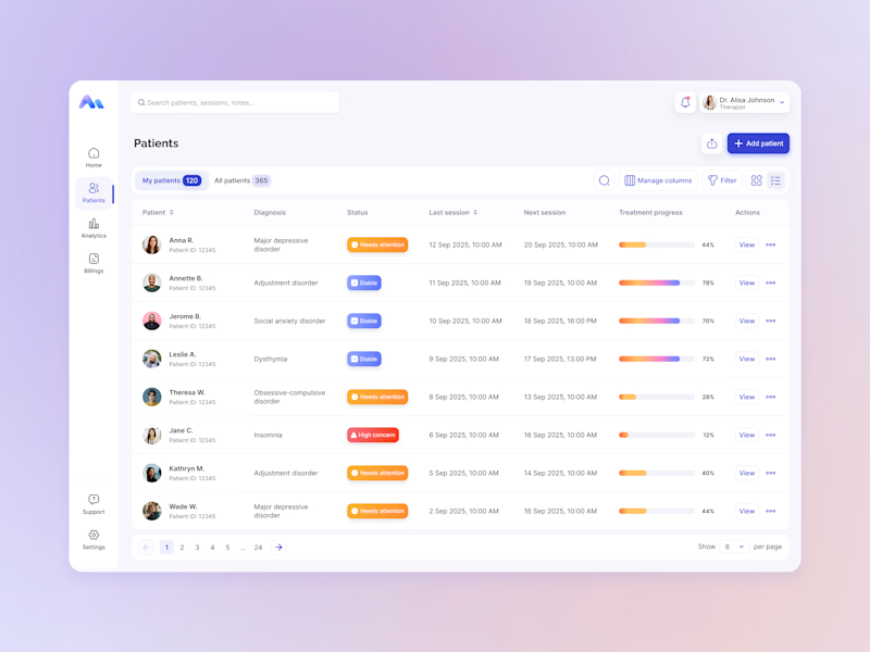
I explored two patient list layouts for a mental health platform: a card view and a table view.
Cards feel more visual and personal, but space is limited and adding more information can quickly make them crowded. For complex enterprise products, I often find tables more practical — they’re easier to scan, compare, sort, and can support more columns when users need greater visibility.
For this kind of workflow, I’m leaning toward the table view. Which would you choose — cards or table?
11 voted
55%
9 voted
45%
20 votes
Closed

For a mental-health patient list the choice isn't really card vs table — it's scan-speed vs context. The card wins the first meeting because the photo and name set the clinician's mental model before they touch the row, but the table is what holds up under the daily rhythm of...


In recent days I’ve been practicing designing around an image.
Sometimes an image can have great potential and reinforce the message we want to convey. I’m not saying this is the correct way to prepare a strategy, it’s simply an exercise. As a result, I created these three hero section designs, which I’ve published in the Figma community where they can be freely used for experimentation.
If you use them, I’d love to see the outcome, so make sure to tag me!

So beautiful


Product first or brand first? 🤔
We're cutting the promo reel for our case study and can't agree on its start. ✨
Which product ad opening would make you stay past the first 3 seconds?
Vote and tell why! 👇
Product DesignSoftware DevelopmentAdobe After EffectsCinema 4DFigmaBrand DesigncreativeaiworkflowUX Design


15 voted
25%
46 voted
75%
61 votes
Closed

I think both is important, but good product first.