The network for creativity
Join 1.25M professional creatives like you
Connect with clients, get discovered, and run your business 100% commission-free
Creatives on Contra have earned over $150M and we are just getting started
Back to feedPost

a men's skincare brand that hasn't even launched yet. (now has launced)
What I loved about this one is how restrained the design already was. just clean product shots, and really simple text to highligh the premiumness.

The network for creativity
Join 1.25M professional creatives like you
Connect with clients, get discovered, and run your business 100% commission-free
Creatives on Contra have earned over $150M and we are just getting started





Related posts

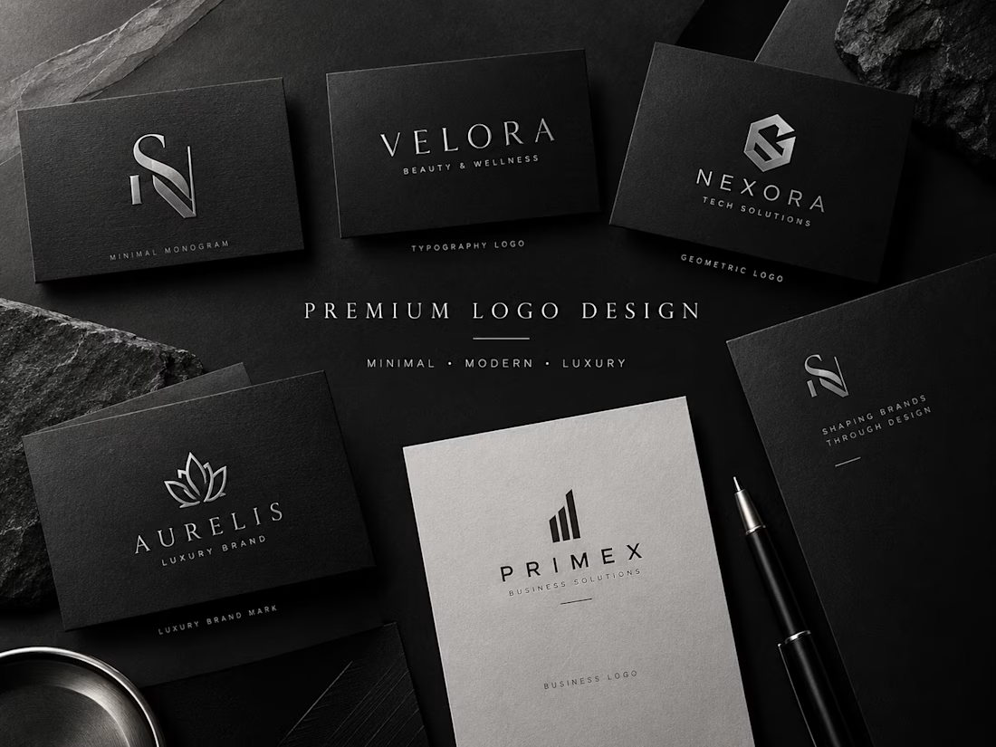
Premium & Minimal Logo Design for Modern Brands
A strong logo creates the first impression of your brand.
I design premium, minimal, modern, and luxury logos tailored to each brand’s personality and audience. Every concept focuses on clean typography, balanced composition, refined shapes, and a professional visual identity.
Whether you are launching a new business, building a personal brand, or refreshing an existing identity, I create logos that are clean, distinctive, timeless, and ready to represent your brand professionally.
Available styles:
• Minimal & clean
• Premium & luxury
• Modern & geometric
• Typography-based
• Custom monogram
• Professional business logos
Designed with attention to detail and a strong focus on visual consistency.
Available for freelance projects and brand identity work.


Very classy and premium look! Top-notch branding presentation.

A premium, cinematic 25–30 second vertical ad created for a skincare studio specializing in permanent hair removal. Built in the style of a high-end beauty commercial, the video follows a skin-concern-to-reveal narrative - consultation, treatment process, and transformation - using realistic texture, warm studio lighting, and minimal reliance on dialogue or AI-generated faces. Designed to drive consultation bookings and build brand trust for a premium aesthetics business.

Awesome Video

Luxury Gold Serum - Instagram Ad | 4:3 Premium Product Video
Premium Skincare Product Ad – 24k Gold Serum
I created this luxury Instagram ad (4:3 / 1080x1350) for a Korean skincare brand. Focused on clean, minimal & premium aesthetic.
Tools Used: CapCut, AI Enhancement, Lightroom
Features: White podium, soft studio lighting, bamboo elements for natural feel, gold serum highlight.
Designed to grab attention in 3 seconds and convert viewers into customers. Perfect for Instagram Feed & Stories.


good