The network for creativity
Join 1.25M professional creatives like you
Connect with clients, get discovered, and run your business 100% commission-free
Creatives on Contra have earned over $150M and we are just getting started
Back to feedPost

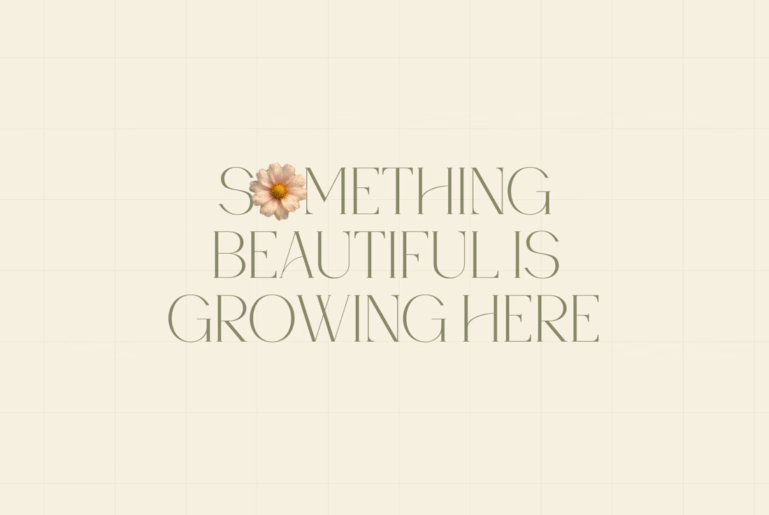
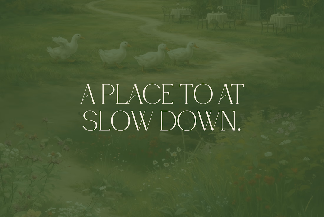
Do people still buy custom fonts?
Finally bought my first one and I must say. I’m fairly pleased.
Anyone bought a font? If so which one.

The network for creativity
Join 1.25M professional creatives like you
Connect with clients, get discovered, and run your business 100% commission-free
Creatives on Contra have earned over $150M and we are just getting started
Challenges
View all


Related posts


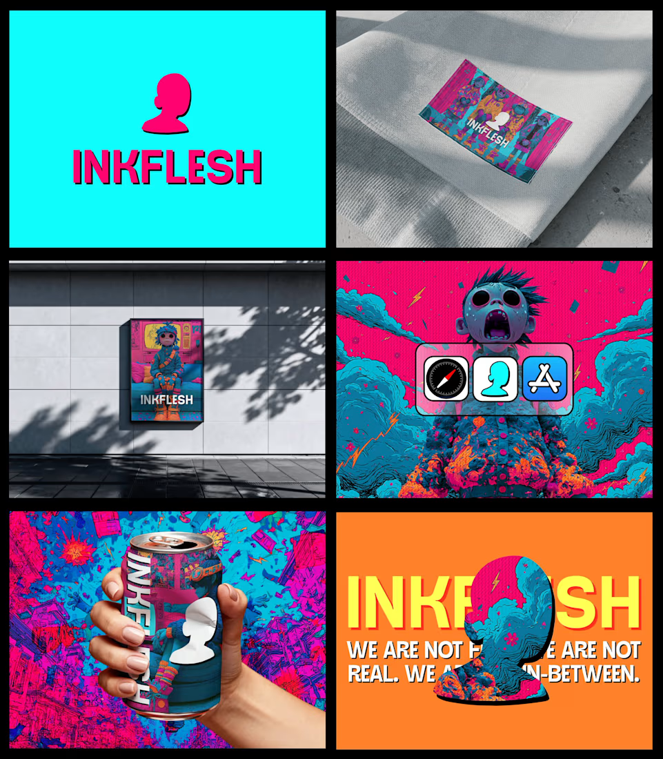
In my INKFLESH identity work, the wordmark runs off the can's curve and gets partly hidden behind artwork on posters. That crop asks the rest of the identity to carry more recognition. The mark has a job when the name is only partly there.

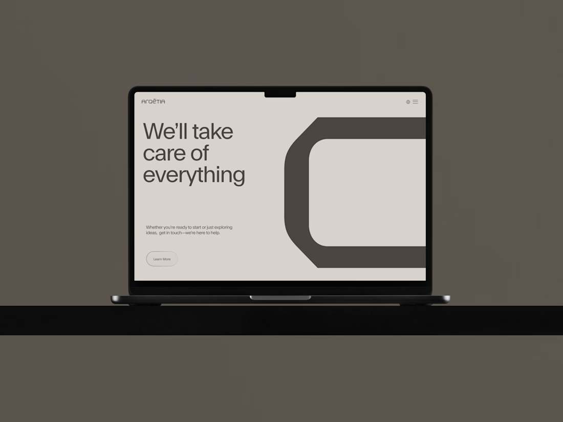
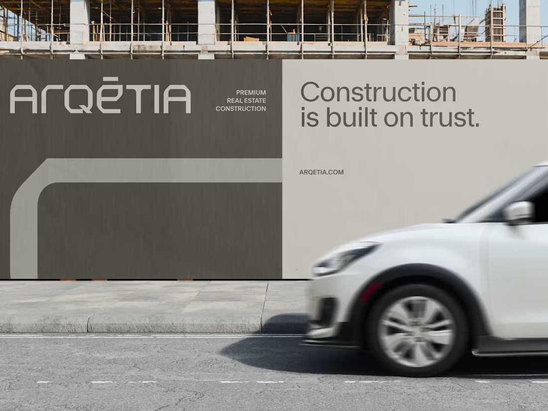
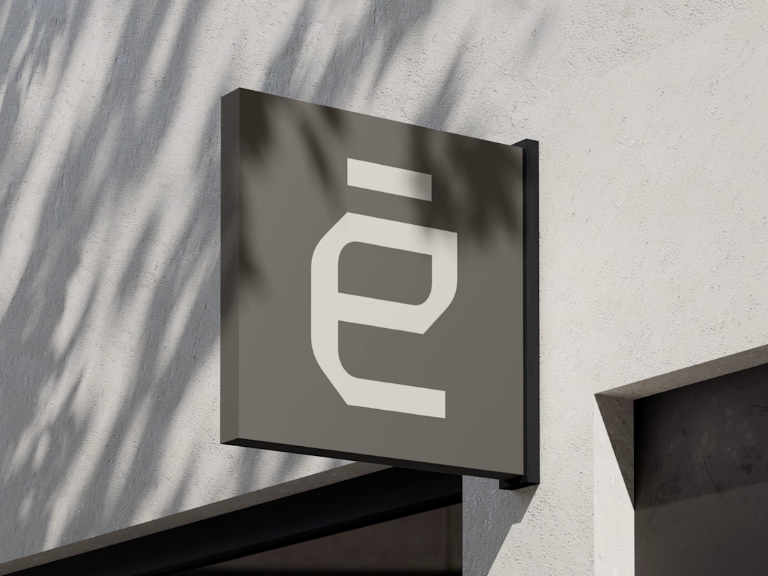
What if construction felt as clear as the space it creates?
For Arqētia, we built a visual identity around one of the industry's most important client needs: transparency. A direct response to the uncertainty often associated with construction, from unclear processes and budgets to timelines and decision-making.
The concept makes transparency tangible, translating it into a visual system that feels open, structured and precise.
check it out


Very clean identity work

Hi :) This is a journey through asteroids into the heart of a star. Built with Three.js, React Three Fiber, and custom GLSL shaders. Liquid images, interactive particle typography, and a core that opens under your cursor.


Man... this is cool. 😍