The network for creativity
Join 1.25M professional creatives like you
Connect with clients, get discovered, and run your business 100% commission-free
Creatives on Contra have earned over $150M and we are just getting started
Back to feedPost

Estate Haven — Luxury Real Estate Website Redesign
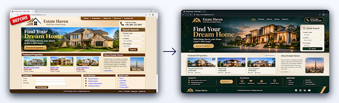
A complete visual transformation of Estate Haven, taking an outdated real estate website and reimagining it as a modern, premium digital experience.
The goal was to create a sophisticated online presence that reflects the quality of a luxury real estate brand while making property discovery easier and more engaging.
What Changed?
1. Modern Luxury Branding
Introduced a refined forest-green, warm ivory, and champagne-gold color palette.
Created a more elegant visual identity with sophisticated typography.
Improved spacing, alignment, and overall visual consistency.
2. Redesigned Homepage
Created a premium hero section featuring luxury property imagery.
Improved navigation and introduced a more polished header.
Added a prominent property search experience.
3. Featured Property Showcase
Redesigned property cards with larger imagery and cleaner layouts.
Improved presentation of property names, prices, bedrooms, and bathrooms.
Added a more organized featured-properties section.
4. Improved User Experience
Created a clearer content hierarchy.
Organized the About, Services, and Contact sections.
Improved readability and made important information easier to find.
5. Refined Footer
Reorganized contact information, services, and quick links.
Introduced a cleaner, more professional finishing section.
The Result
A complete transformation from a dated, cluttered layout into a polished luxury real estate homepage with a stronger brand identity, improved content organization, and a more engaging property-browsing experience.
Design Direction: Modern Luxury · Minimalism · Premium Real Estate
Project: Estate Haven — Before & After Website Redesign
This post showcases a website redesign concept and visual transformation.
The network for creativity
Join 1.25M professional creatives like you
Connect with clients, get discovered, and run your business 100% commission-free
Creatives on Contra have earned over $150M and we are just getting started



Related posts

Rebuilt my portfolio with AI and added new case studies.
Brand, web, and product UI. All custom coded, all in one page.

One page with brand, web and product UI together is a strong move. Clients see the range without clicking around. Rebuilding mine with AI coding tools taught me the same thing: the speed lets you spend the saved time on the case study writing, which is what actually wins work.

Photographer Portfolio Website
"Capturing light, emotion, and the moments you never want to forget." That line set the tone, and the layout follows it.
The hero is one motion-blurred portrait washed in red. The photographer's name runs across the bottom in a condensed white face, so large the screen cuts it off. The photo keeps its soft focus, and the name still reads first.
Thin grid lines split the page into narrow columns, and the small copy sits justified inside them. The loose photo gets a strict structure to lean on.
A single round red button with an arrow sits right on the letters and marks where to go next.
Designed by the Hue & Machine team.
#WebDesign #Photography #PortfolioWebsite #EditorialDesign #Typography #UIDesign #ProductDesign #CreativeDirection #ResponsiveDesign #FigmaDesign


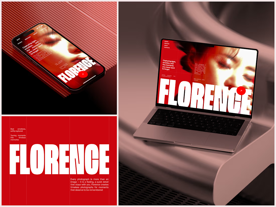

The heavy condensed white FLORENCE over the red portrait is bold, and keeping the same red across phone, laptop and type tile makes the case study read as one system. Did the red come from the photographer's own work, or was it your call?

A website hero and motion identity concept for Cycle.
The experience takes the viewer through seven historical eras in one continuous forward journey, while the logo, camera path and core composition remain consistent.
The concept explores how a static identity can become a living digital experience through motion, environment and interaction.
Workflow included Spline, Claude via MCP, Midjourney and SeaDance.
Available for brand identity, motion and digital design projects.


I fall in love, It is like Encarta, but 1000% better