The network for creativity
Join 1.25M professional creatives like you
Connect with clients, get discovered, and run your business 100% commission-free
Creatives on Contra have earned over $150M and we are just getting started
Back to feedPost

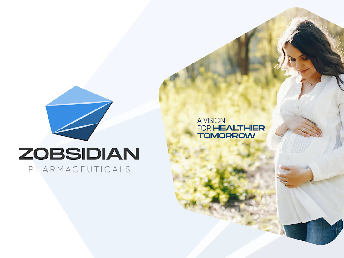
Zobsidian Pharmaceuticals-Brand & Visual Identity
Just as natural obsidian fractures into the sharpest, most precise edge known, Zobsidian Pharmaceuticals applies razor-sharp scientific precision to crafting specialized therapies for women’s health, fertility, and nutritional care.
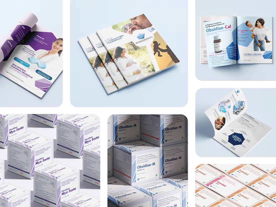
Historically revered as a protective shield, obsidian reflects their singular purpose: to act as an unyielding guardian of health during life's most precious milestones. By refining raw science into highly targeted treatments, they deliver a comprehensive product basket that adheres to the highest standards of safety. They provide a flawless shield of well-being for women navigating the critical paths of pre-pregnancy, fertility, and post-natal recovery with absolute clinical excellence.
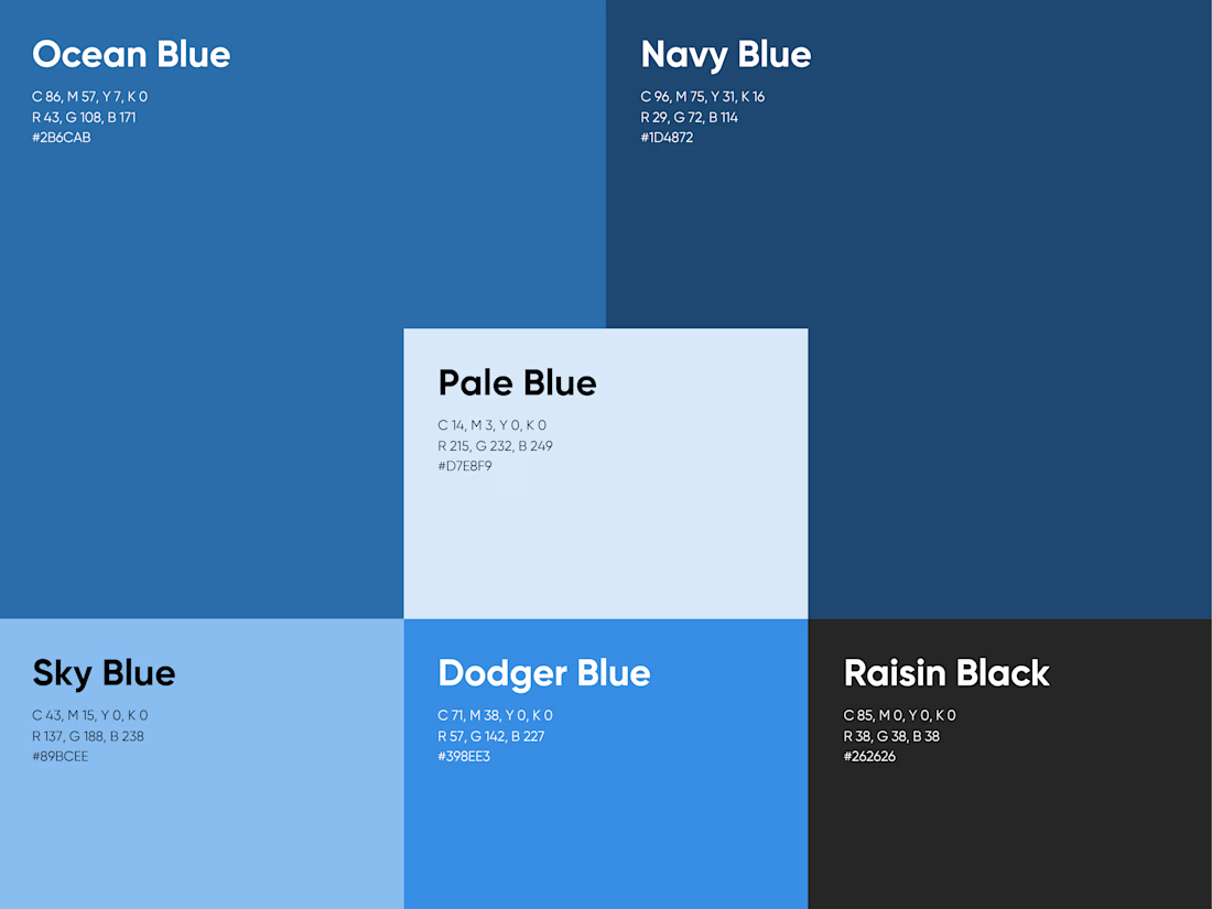
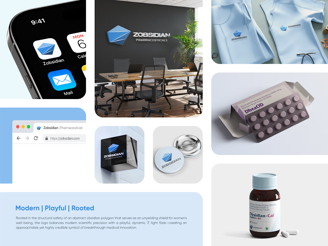
As a Brand Strategist & Designer, I developed the visual identity for Zobsidian Pharmaceuticals to bridge clinical precision with protective maternal care. The logo—an abstract obsidian polygon—symbolizes structural safety, while the 'Z' light flare represents the breakthrough illumination of medical innovation. This design strategically communicates the brand's core mission: providing an unyielding shield of well-being for women through fertility and pregnancy.

The network for creativity
Join 1.25M professional creatives like you
Connect with clients, get discovered, and run your business 100% commission-free
Creatives on Contra have earned over $150M and we are just getting started
Trending

Claude
Claude has entered the design space. How are you using it?

Contra University
Learn from expert creatives how to earn more using next-gen AI tools.
Brand Design
The best brand designers are on Contra. Scroll to see what's trending in brand design. What are you building?
creativeaiflow
Creative AI workflows are evolving. What tools do you use, and what are their strengths and weaknesses?
freelancerlife
Freelancer life is wins, pivots, and everything in between. What’s yours right now?




Related posts



love these


Kindly help me decide the footer, which design works best?


6 voted
100%
0 voted
0%
6 votes
Closed

White one looks great