The network for creativity
Join 1.25M professional creatives like you
Connect with clients, get discovered, and run your business 100% commission-free
Creatives on Contra have earned over $150M and we are just getting started
Back to feedPost

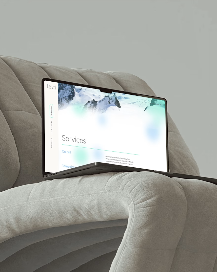
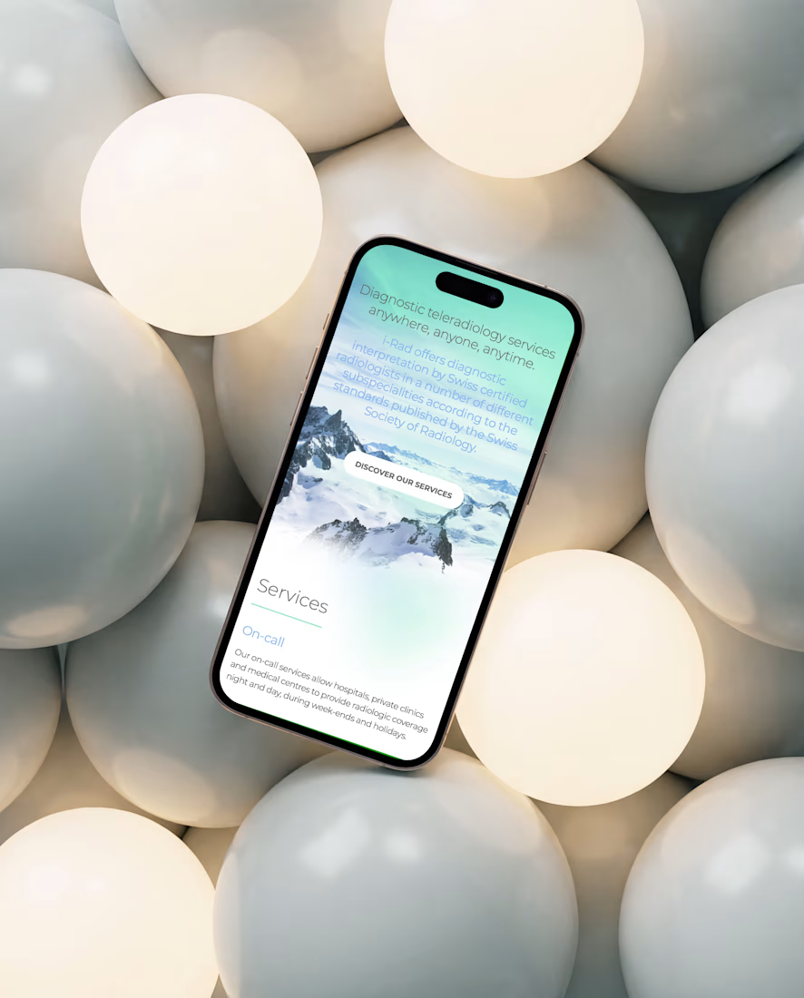
iRad website. Minimal, soft and essential. This medical website had to be nice and friendly. We played with a few colors and...bubbles! The outcome is extremely clean and modern. I particularly love some details like the vertical navigation and the footer on reveal.


The network for creativity
Join 1.25M professional creatives like you
Connect with clients, get discovered, and run your business 100% commission-free
Creatives on Contra have earned over $150M and we are just getting started





Related posts

How minimal can a fintech website get before it starts losing personality?
Version 01 of a recent Verlo Finance exploration.
Focused on strong type, clarity and keeping everything else out of the way.
Would you keep it this minimal?


Definitely the new one. Seems more fluid and easier to interact with


Light or dark—which Kajabi library would you choose?
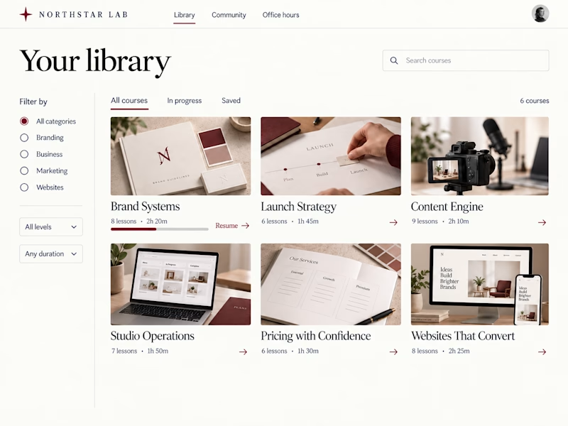
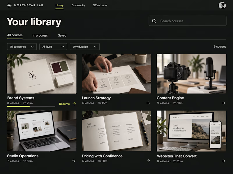
Two concepts for Northstar Lab, a fictional creative education brand. Same courses, two ways to browse:
A — Light Editorial: warm tones, serif type, and sidebar filters.
B — Dark Studio: charcoal, chartreuse accents, and compact dropdown filters.
Which would you rather learn in—and why?

27 voted
56%
21 voted
44%
48 votes
Closed

Clean and professional. I prefer the light editorial style.