The network for creativity
Join 1.25M professional creatives like you
Connect with clients, get discovered, and run your business 100% commission-free
Creatives on Contra have earned over $150M and we are just getting started
Back to feedPost

Most design systems break down right at the handoff stage.
A button or a modal looks flawless in Figma, but once it touches code, spacing shifts, interactions feel sluggish, and responsive breakpoints turn into a compromise.
We’re experimenting with a dual-sided component approach:
For Designers: Real interactive behavior, fluid animation states, and living layout patterns instead of static frames.
For Developers: Clean, accessible React / Next.js / Tailwind code structured for sub-second load times and zero layout shift.
The idea is simple: design decisions shouldn't have to be re-interpreted or rebuilt from scratch in engineering.
To the designers here: what is the one interaction or layout element you design in Figma that developers almost always get wrong in production?
The network for creativity
Join 1.25M professional creatives like you
Connect with clients, get discovered, and run your business 100% commission-free
Creatives on Contra have earned over $150M and we are just getting started







Related posts

Designed the website for Dovora — an agency that builds businesses for creators, not brand deals. "We don't represent brands, we don't split focus" is basically the whole pitch, and I wanted the site to feel just as uncompromising.
So no polished stock creator-economy visuals. The hero is a wall of real streamer/podcast footage arranged in overlapping diamonds and rounded frames — actual creators, mid-stream, mid-laugh — with a glowing gradient orb behind bold "WE BUILD CREATOR BUSINESSES" type. It reads more like a highlight reel than a landing page, which felt right for an audience that lives on camera.
The second section flips the energy completely — dark, minimal, almost aggressive typography ("BUILT EXCLUSIVELY FOR CREATORS. FULL STOP.") paired with huge chrome-and-neon 3D letterforms spelling out CREATORS. It's loud in a completely different way than the hero, and that contrast is intentional — this isn't a buttoned-up agency deck, it's built for people who make content for a living.
Genuinely fun brief to lean all the way into.


Day 12/30 of my hero section challenge.
Another day of prioritising the visuals and imagining a company that doesn't exist. I promise the next one is a tech brief with barely any imagery at all, I've leaned hard on beautiful photography for twelve days straight.
Concept: a mycelium materials company producing leather, packaging and foam grown from fungal networks. The design deliberately inverts the category's defaults; biotech branding tends toward dark, clinical and electric blue, so this one goes warm and botanical, with a subtle looping video of spores drifting and mushrooms emerging. The copy pulls hard the other way: plain, technical, B2B-direct, anchored by two concrete numbers instead of sustainability adjectives.
Twelve briefs across travel, food retail, personal branding, events, landscape architecture, pet services, hospitality, coffee, lighting, wellness, restaurants and now biomaterials.
12 down, 18 to go.
Built on the Viper template by Westhill Studio, adapted and customised by me.
Imagery and video generated with AI.


brilliant

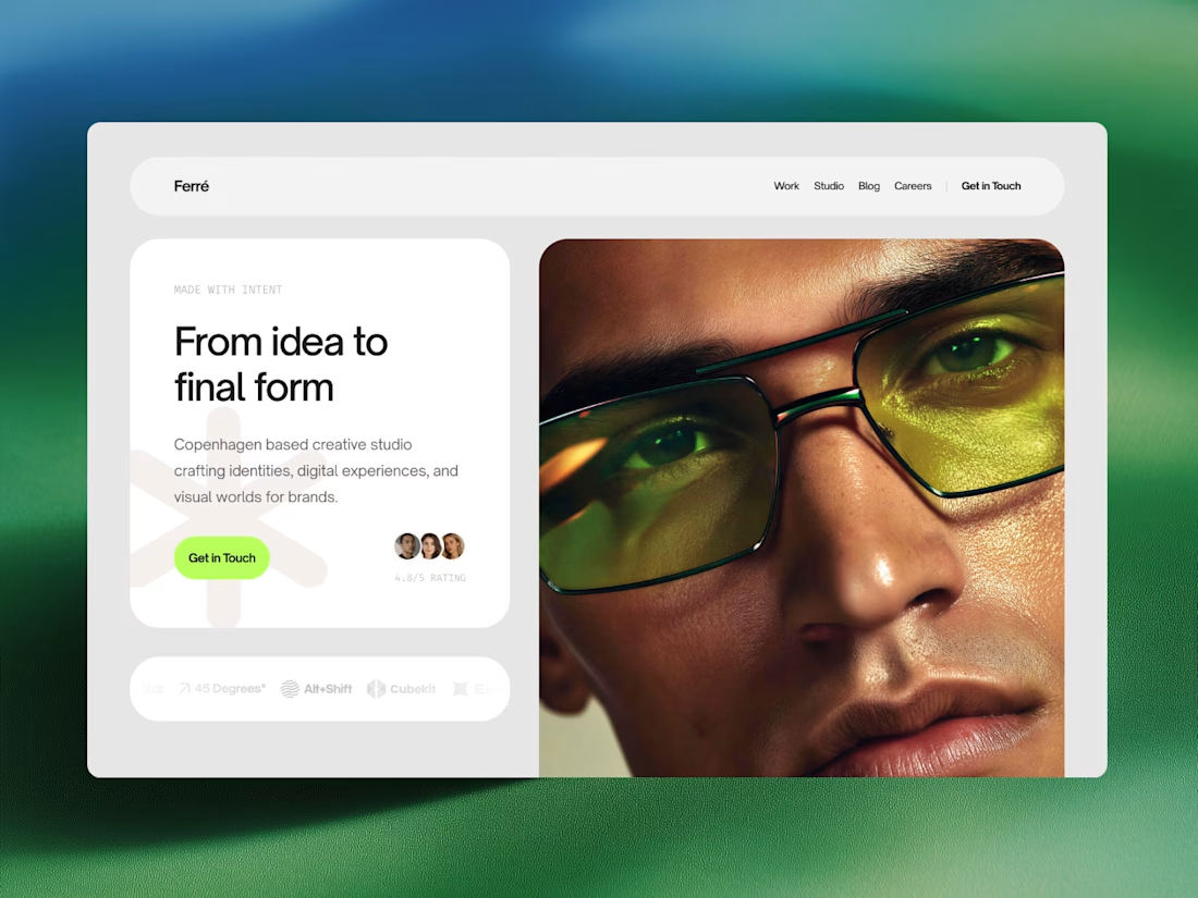
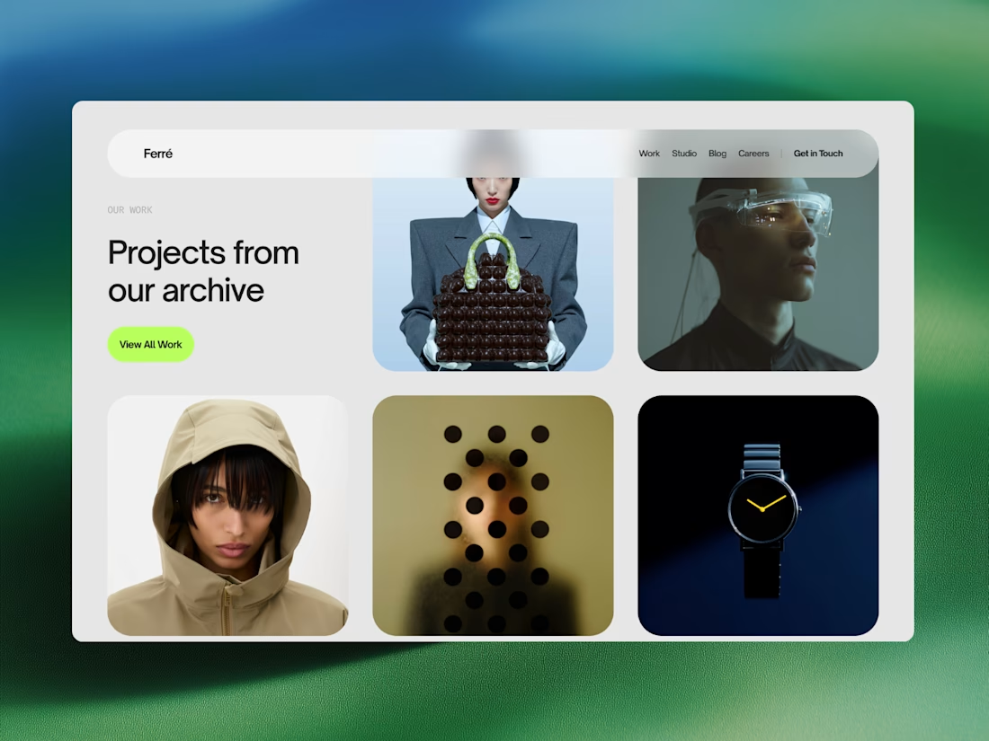
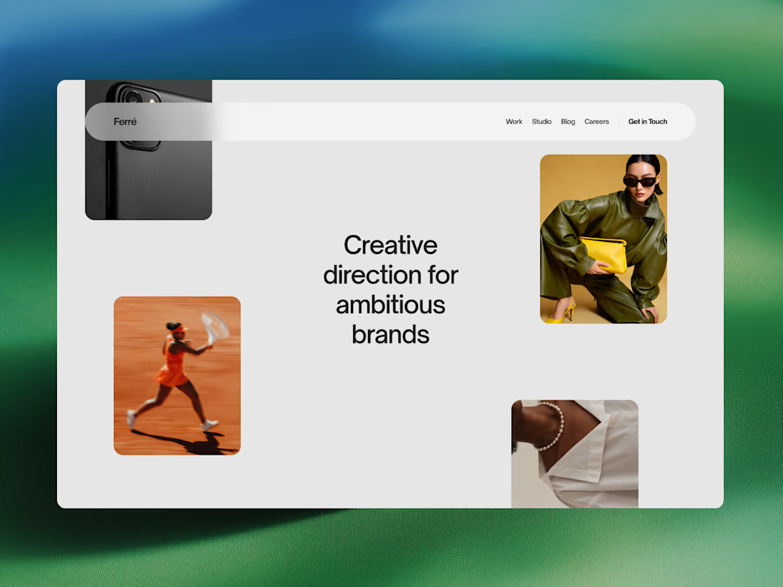
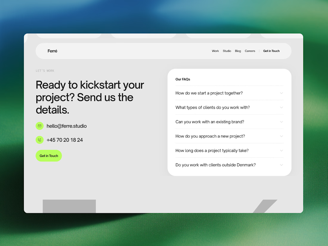
Ferré is an agency template designed for creative studios, design firms, and independent practices looking to present their work with clarity and confidence.
Built around an editorial visual language, this template combines bold typography, subtle interactions, and an immersive layout to create a sophisticated digital presence. Showcase your work, introduce your studio, share ideas through a journal, and give potential clients a clear sense of what you do.