The network for creativity
Join 1.25M professional creatives like you
Connect with clients, get discovered, and run your business 100% commission-free
Creatives on Contra have earned over $150M and we are just getting started
Back to feedPost
Most of our digital lives are built for the 'now'—disposable feeds and cluttered cloud folders. But what if software felt like stone?
I built Monumentum with Figma Make to bridge the gap between generations. It’s a digital sanctuary where memories aren't just uploaded; they are sealed.
The Story:
I’ve always wondered how my grandfather lived, but those stories were lost because there was no place to 'keep' them. I designed this for the grandchildren I haven't met yet—a way to leave a celestial map of our lives.
Try it here:
https://buffet-run-99426884.figma.site
Figma Community File:
https://www.figma.com/community/file/1610069453057703519/monumentum-bridging-the-gap-between-generations


“Software is the new stone” is a powerful framing — especially in a world of disposable feeds.
Curious how you’re balancing poetic positioning with practical onboarding clarity for first-time users?

Thanks for the thoughtful question!
The poetic tone is mainly there to create emotion and curiosity around MONUMENTUM. I wanted people to feel the idea first.
But once they start interacting, everything becomes much more straightforward and guided. Clear steps, familiar patterns,...
That makes sense. Drawing people in emotionally first, then guiding them with clarity once they engage, creates a strong progression.
It’s a nice balance between inspiration and usability.
Thank you so much.
Did you tried to create your life journey map for your future generation? 😄
The network for creativity
Join 1.25M professional creatives like you
Connect with clients, get discovered, and run your business 100% commission-free
Creatives on Contra have earned over $150M and we are just getting started





Related posts

Made it to the top 1% of creatives on Contra.
My discovery points are still going up, with one more case study left to write.
Grateful for the people I’ve met through Contra, the projects we’ve worked on, and the opportunity to keep growing together. 🎉
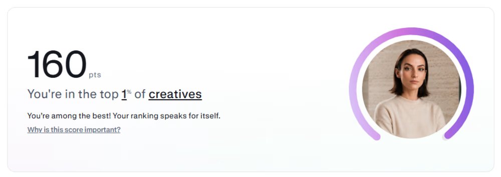

Congratulations!🎉 🚀

Which hero visual feels right for this brand?
While working on the homepage for Halfspace, a website design and SEO agency, I explored two different hero visuals for the same headline and layout. Same message, same structure, just a different visual metaphor and mood.
Option 1 - Rocket Launch. Bold, literal, and energetic, visually reinforcing the "launch your business" message with motion and fire.
Option 2 - Glass Cube. Abstract, sleek, and premium, giving a more refined, tech-forward feel without relying on a literal metaphor.
Would love your honest UX/UI take, which direction feels more impactful, memorable, and aligned with a web design/SEO brand, and why?
11 voted
41%
16 voted
59%
27 votes
Closed

Both design are great; it's hard to choose one


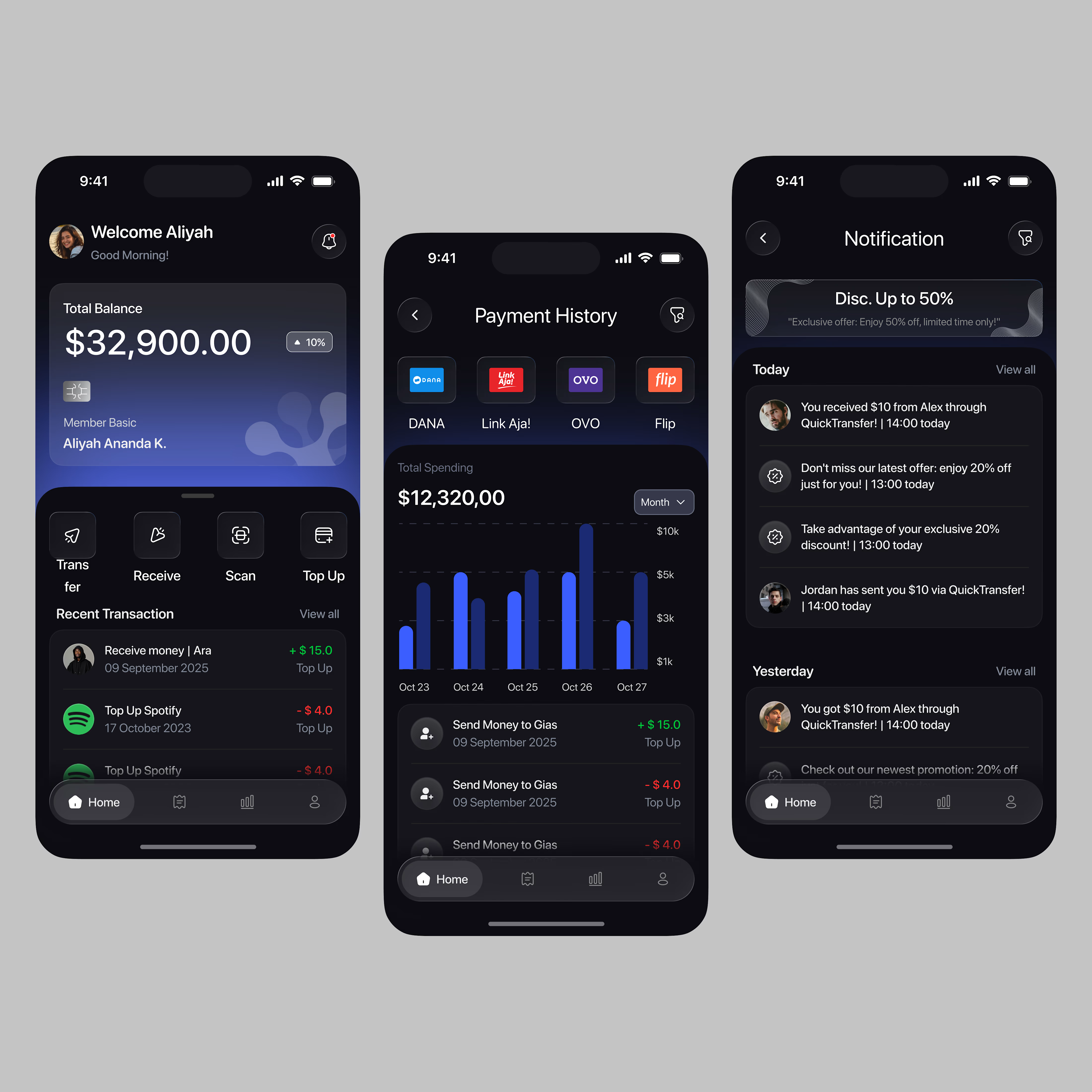
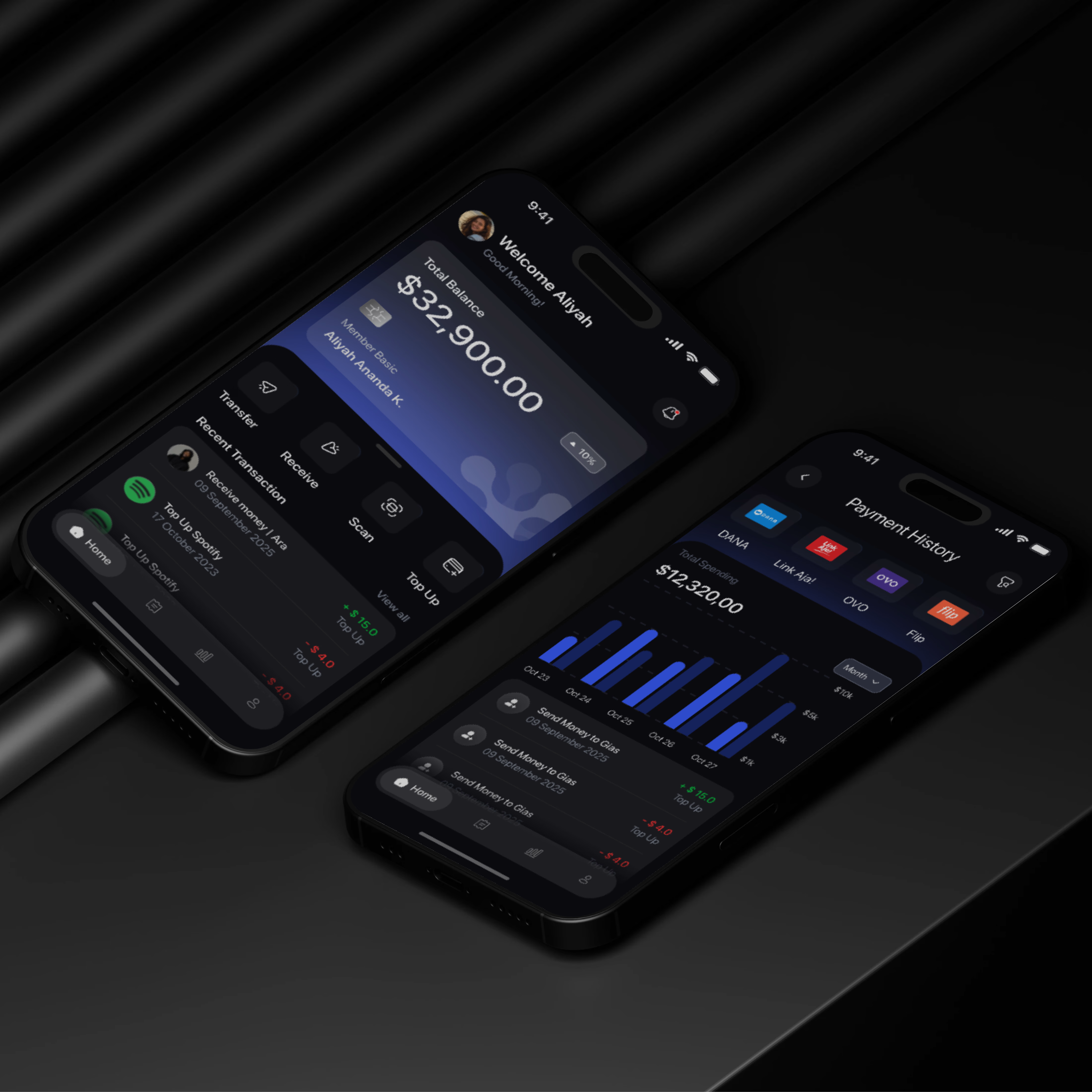

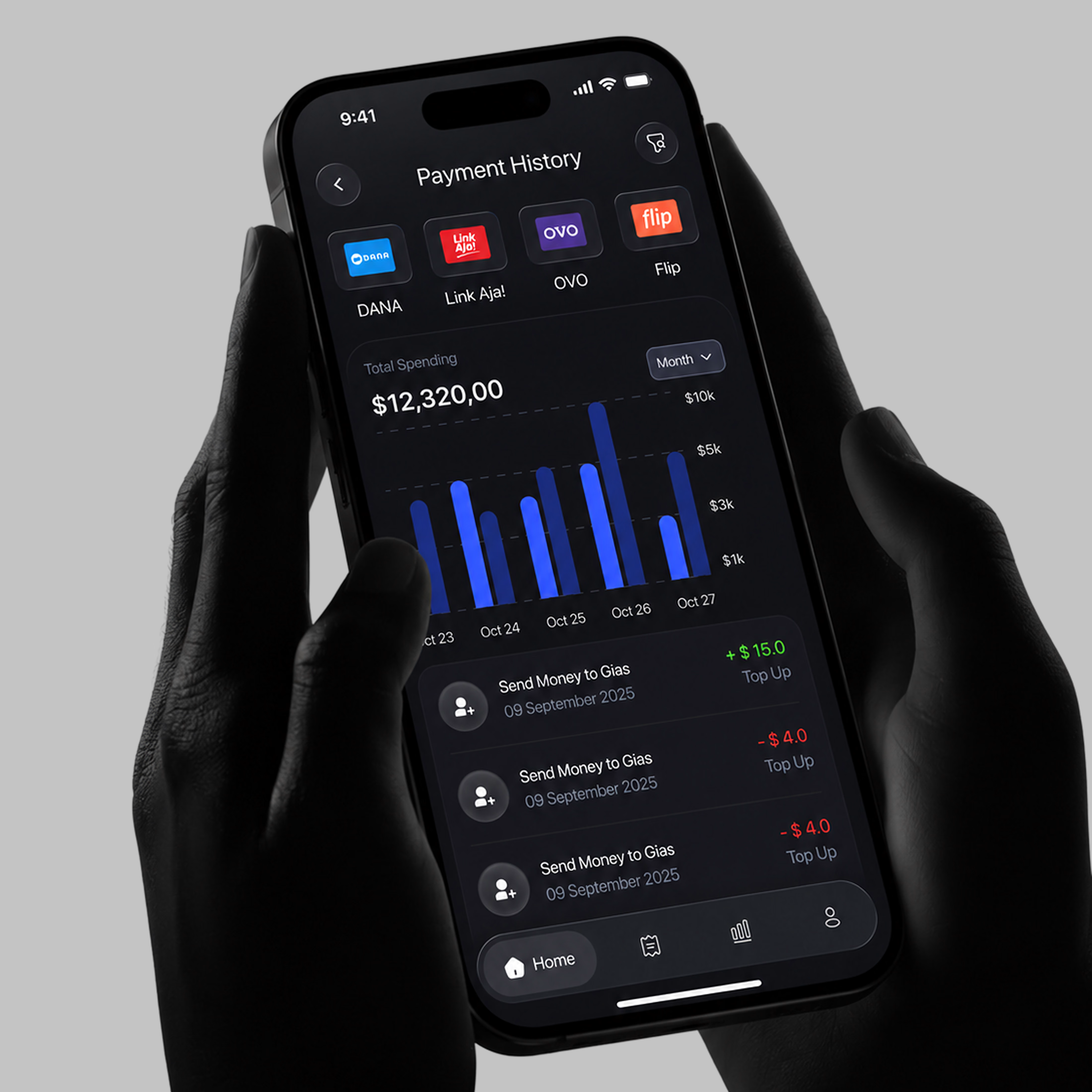

A little sneak peek at what I’ve been working on!