The network for creativity
Join 1.25M professional creatives like you
Connect with clients, get discovered, and run your business 100% commission-free
Creatives on Contra have earned over $150M and we are just getting started
Back to feedPost
Culture Pop Soda: “Soda vs Culture Pop” Email Campaign
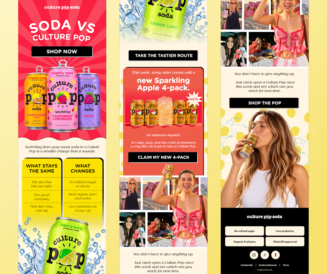
I designed a 3-part email for Culture Pop Soda’s “Soda vs Culture Pop” campaign. The goal: make switching from regular soda feel easy and fun, not like giving something up.
What I focused on
A bold pink sunburst hero with the flavor cans front and center
A simple “What stays the same / What changes” comparison
A launch section for the new Sparkling Apple 4-pack
Real lifestyle photos to make the brand feel social
Consistent black CTA buttons that stand out on every section
Skills: Email Design, Layout Design, Brand Design, Visual Hierarchy


Fun angle for an email.

Thanks so much, Vansita! Glad the angle landed. 😊
The network for creativity
Join 1.25M professional creatives like you
Connect with clients, get discovered, and run your business 100% commission-free
Creatives on Contra have earned over $150M and we are just getting started



Related posts

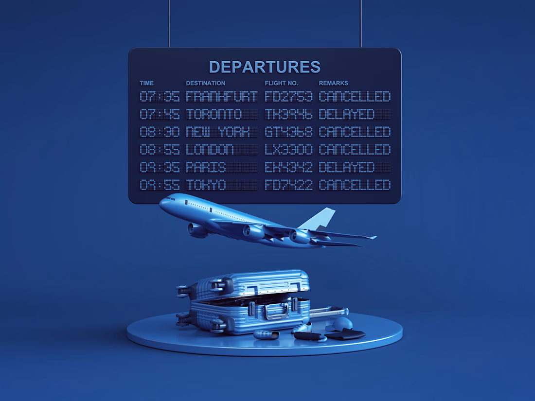

Your body is ready for sleep. But is your mind ready to switch off?
That’s the moment Elivara is designed for.
Instead of another endless scroll, imagine opening an experience that makes slowing down feel natural.
Because better rest starts with how you end your day.
Would you trade 20 more minutes of scrolling for 20 minutes of peace?
#SleepApp #UIUXDesign #ProductDesign #WebDesign #MotionDesign


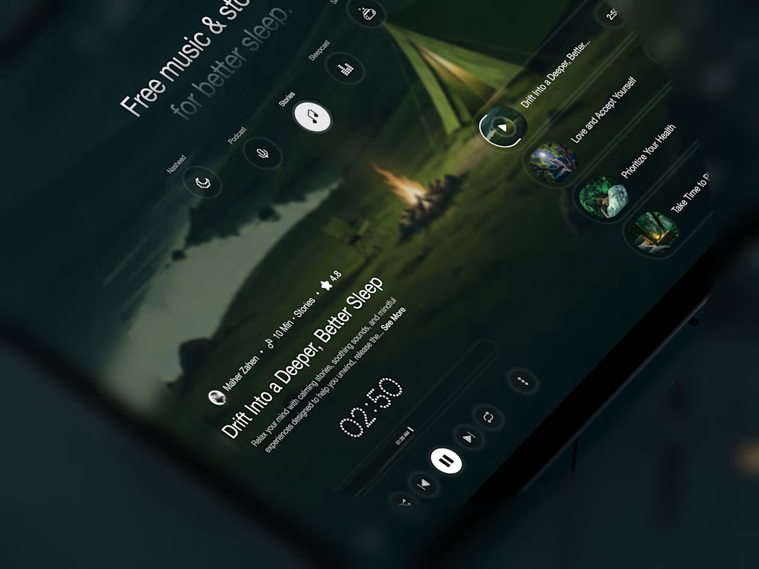
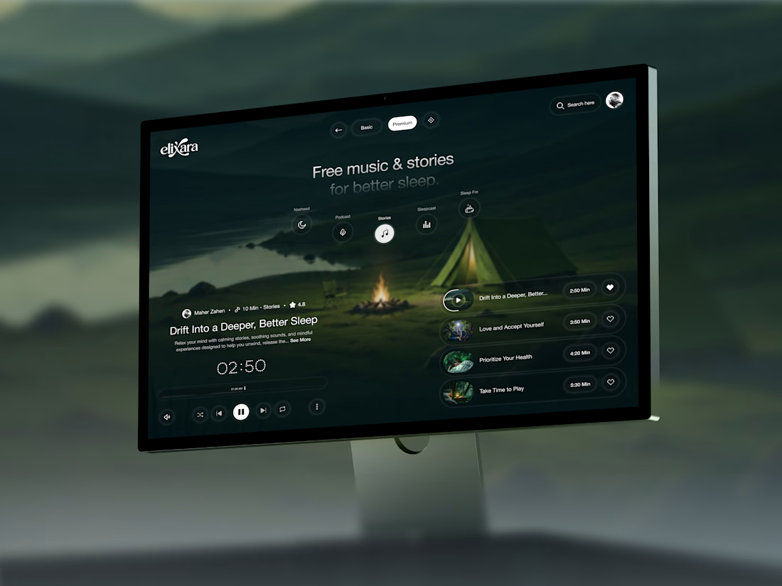

Great UX understands the user's state of mind, not just what they want to click.

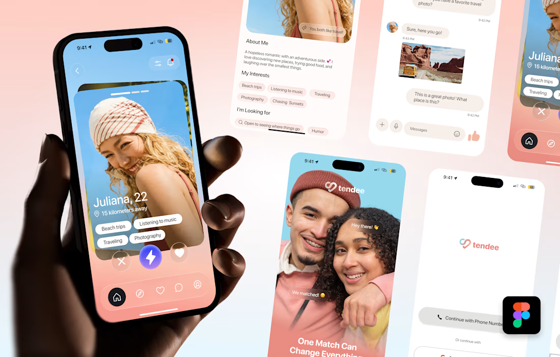
Tendee - Dating App UI UX Design
A mobile app UI design showcase focused on discovery, profiles, matching and conversation.
The visual challenge was to bring profile content, interest tags, primary actions and messaging into a consistent mobile experience. The design uses a soft lavender and coral palette, clear typography, rounded cards and recognizable navigation.
The selected mockup presents a profile discovery screen, detailed profile information, chat, onboarding and sign-in views. These screens demonstrate visual hierarchy, consistent interface styling and attention to mobile interactions.
Personal portfolio showcase. Project cost is an illustrative quote for comparable design work, not a past client payment. The date marks this showcase's preparation in October 2026; duration is an estimated production timeframe.

Love the colors!