The network for creativity
Join 1.25M professional creatives like you
Connect with clients, get discovered, and run your business 100% commission-free
Creatives on Contra have earned over $150M and we are just getting started
Back to feedPost

Turning YouTube Traffic Into Course Enrollments
👉 Read the full case study here: Check it out
Cody, an acting coach, wanted a structured platform to deliver his program and grow his audience the right way.
I built and designed his online course, lead generation funnel, and Kajabi community, creating a clear path from YouTube content to email subscribers to paid enrollments.
After launch, he began promoting his lead magnet through YouTube and steadily grew his list while enrolling new students into his course.
Content creates attention. Funnels create students.
Ready to turn your audience into enrollments?
Book a FREE strategy call here 👇👇👇


This is solid, it feels both clean and engaging. If someone wanted to create something at this level, what would you say matters most in your process?
The network for creativity
Join 1.25M professional creatives like you
Connect with clients, get discovered, and run your business 100% commission-free
Creatives on Contra have earned over $150M and we are just getting started


Related posts


Same course. Same content.
But two completely different feelings ✨
Which version would you choose?
18 voted
31%
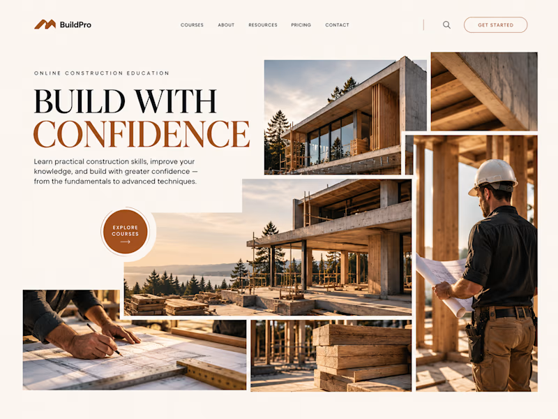
40 voted
69%
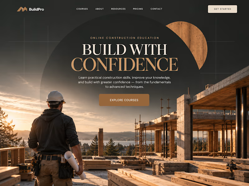
58 votes
Closed

option 2 feels a bit more cinematic, the confident feeling is embedded into the layout!
What happens when one website has to talk to two different people?
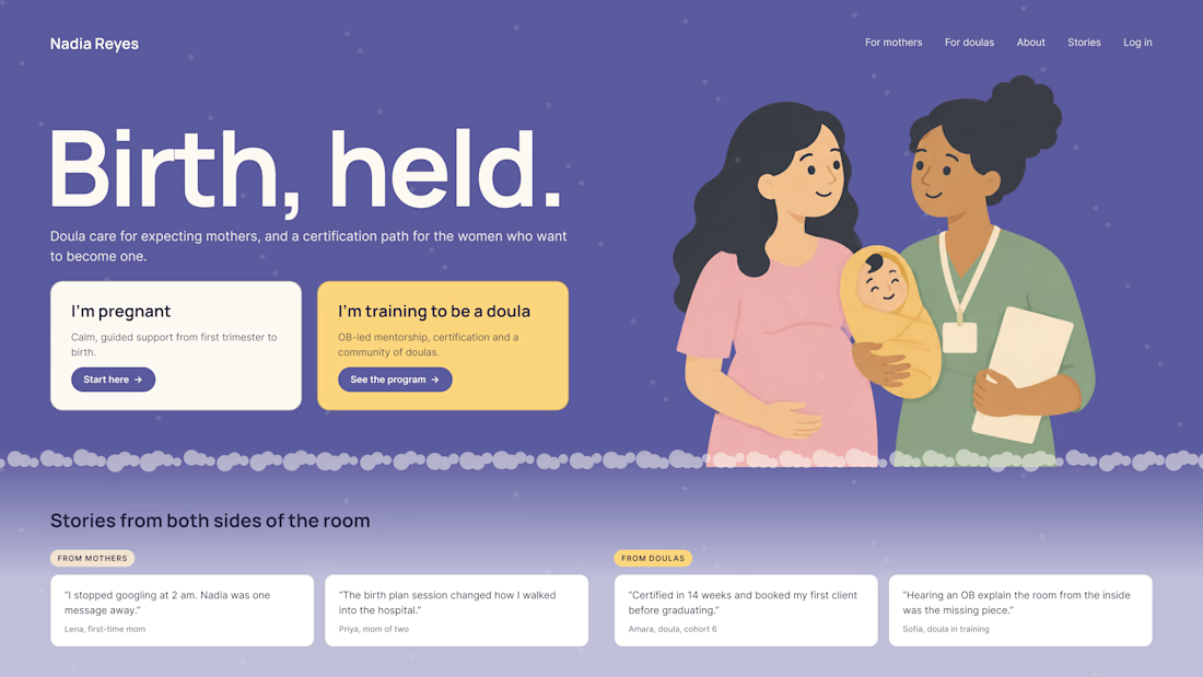
A client of ours teaches two audiences at once: expecting mothers who want a calm pregnancy, and women who want to become doulas. One brand, one site, two very different reasons to visit.
The usual fix is a hero that speaks to "everyone" and lands with no one. We designed it as a fork in the road instead:
1. Two doors in the hero. "I'm pregnant" and "I'm training to be a doula", side by side, equal weight. The visitor picks a path in one click, and the headline above them stays about the shared value.
2. One voice, two tones. The mothers' path is softer: fewer words, more room, gentle photos. The doula path is more structured: modules, certification, dates. Same fonts, same colors, different rhythm.
One proof section, split in two. Testimonials from mothers on the left, from doulas on the right. Each visitor sees people like them before the price.
Writing for everyone is writing for no one. Give each reader a door.
Have you ever designed a page for two audiences at once? How did you split it?

Really great point! Designing for two distinct audiences under one brand is always a challenge. Excited to see your approach to solving it.

The MacWhisperer | Kajabi Website Design for Online Courses & Memberships
I designed The MacWhisperer website using Kajabi, creating a professional online platform that helps users learn how to use Apple technology with greater confidence, simplify everyday tasks, and improve productivity.
The design focuses on making technology education approachable through a clear website structure, engaging content sections, and a user-friendly experience. I aimed to help visitors understand the value of the training, explore educational resources, and discover the available courses and membership opportunities.
What I Focused On
Kajabi Website Design: A professional website layout aligned with the brand's identity and educational mission.
Course Presentation: Clear organization of learning content to help visitors explore technology training.
Membership Experience: Structured presentation of membership benefits and learning opportunities.
User-Friendly Navigation: An intuitive browsing experience that makes important information easy to find.
Trust Building: Strategic presentation of testimonials, brand information, and service benefits.
Conversion-Focused Design: Clear calls to action that encourage visitors to explore courses, memberships, and contact options.
The goal was to create an engaging digital learning platform that builds trust, communicates the value of online education, and makes it easier for visitors to take the next step.
Platform: Kajabi
Service: Website Design
Industry: Technology Education, Online Courses & Memberships
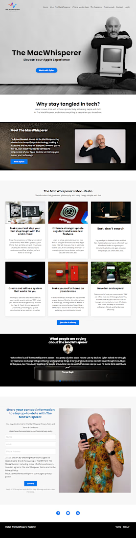

For technology training, I’d make the course-versus-membership choice explicit: solve one specific problem with a course, or get ongoing help through membership. Showing who each path suits beside its CTA could reduce the decision load for someone who already feels unsure about the technology.