The network for creativity
Join 1.25M professional creatives like you
Connect with clients, get discovered, and run your business 100% commission-free
Creatives on Contra have earned over $150M and we are just getting started
Back to feedPost
Why I chose the brand?
I chose Etat Libre d'Orange's "You Or Someone Like You" because it holds a deeply personal meaning for me. It’s not just a scent; it’s a story about memory. The name itself—ambiguous and longing—feels like a film title waiting to be visualized.
Narrative + Visual Design Direction:
My concept is "The Scent Architecture"—using fragrance notes to reconstruct a fading memory of a person.
Visual Logic: I visualized the perfume's structure literally: The cool Mint top notes become a pool filled with leaves; the Rose heart notes transform into an underwater bloom.
Narrative: It follows a protagonist trying to "distill" a lost lover from these elements, only to find that the scent itself is the only ghost that remains. It’s a visual poem about how smell is the closest thing we have to time travel.


Magical stuff!

Thaks:)
The network for creativity
Join 1.25M professional creatives like you
Connect with clients, get discovered, and run your business 100% commission-free
Creatives on Contra have earned over $150M and we are just getting started

Challenges
View all


Related posts

AI cinematic short film: Hide and Seek


Top notch

What happens when AI pulls you into a field you know nothing about
I started this project knowing nothing about chemistry. I finished it reading molecular structures.
VALENCE is a speculative fragrance brand, but really it was an experiment: can AI help you go deeper into a concept, not just faster to a pretty image?
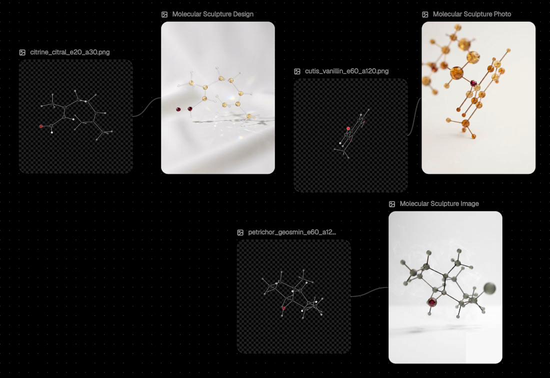
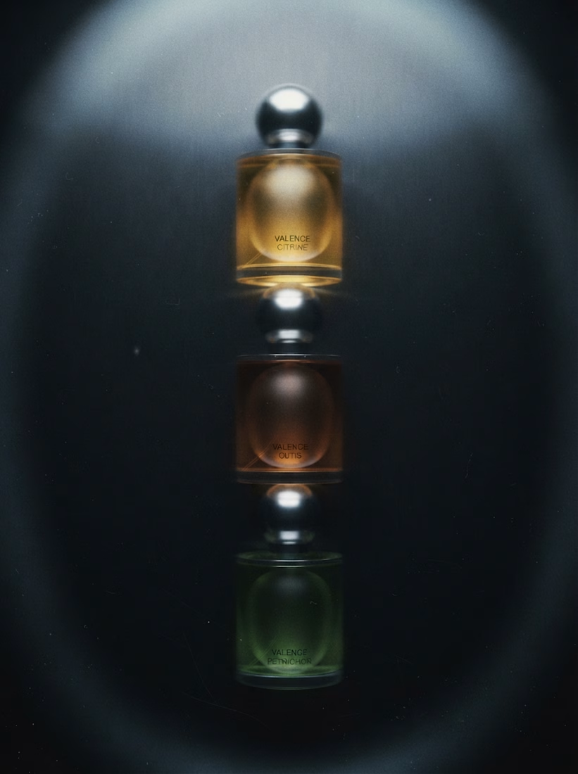
Every perfume is a formula, a handful of real molecules with real shapes. So instead of inventing a "scientific look," I built the whole brand from the actual chemistry. Three scents, nine molecules, all verified in PubChem. Geosmin, the molecule behind the smell of rain on dry earth, gave the scent Petrichor its name.
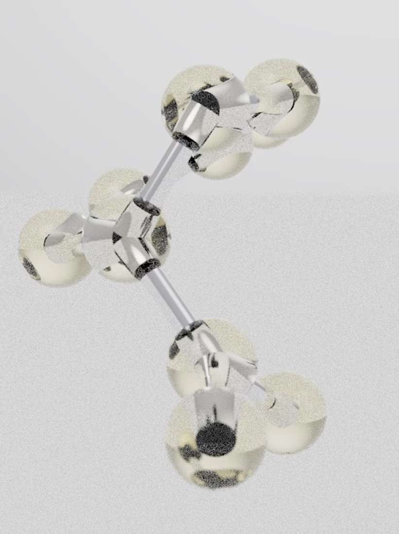
The process went one way only: from real data to image, never the other way round. Molecular geometry calculated in RDKit, molecules rendered as glass sculptures with a Python path tracer built together with Claude, and those renders used as references for AI-generated campaign visuals, motion and packaging. The bottle went through many iterations before it landed on one calm form: clear glass, a chrome sphere, each scent told apart only by its colour.
What I took away: an AI workflow can connect design with fields that seem far from it, and turn that connection into a campaign.
Tools: RDKit, Python, Claude, Midjourney, Flora, Kive




starting with zero chemistry and ending up reading molecules is wild. thats the best kind of rabbit hole

WARNING: This video contains strong strobe effects. ⚡
I recently watched The Moment, the Charli xcx mockumentary. I really liked the strobing typography layered over the footage, so I tried recreating it for the Contra × @Invideo challenge.
Everything was done directly in the new invideo Editor timeline. Although, to be fair, Agent Two did most of the work. I supplied the assets and creative brief, then watched it go.
And it did a freaking good job. Not perfect on the first try, but the fixes only needed a conversation in chat.
Watch the original effect in The Moment’s official teaser: https://www.youtube.com/watch?v=9-LlnenSEF4


