The network for creativity
Join 1.25M professional creatives like you
Connect with clients, get discovered, and run your business 100% commission-free
Creatives on Contra have earned over $150M and we are just getting started
Back to feedPost
Meet Quax Studio, a stealth-mode architecture and interiors studio based in Australia, specialising in highly modern, futuristic spaces.
The brief was simple: no generic architecture website. The projects had to take centre stage, with minimal copy, a clean white aesthetic, and modern typography that lets the visuals speak for themselves.
So, I built the experience around:
1- Minimal layouts with plenty of breathing room
2- Refined typography and a clean visual hierarchy
3- Project-led storytelling, with less content and more focus on the work
The architectural imagery currently uses visuals from HD images platforms while the studio’s project photography is being finalised.
Would you explore a futuristic architecture studio through a minimal website like this?


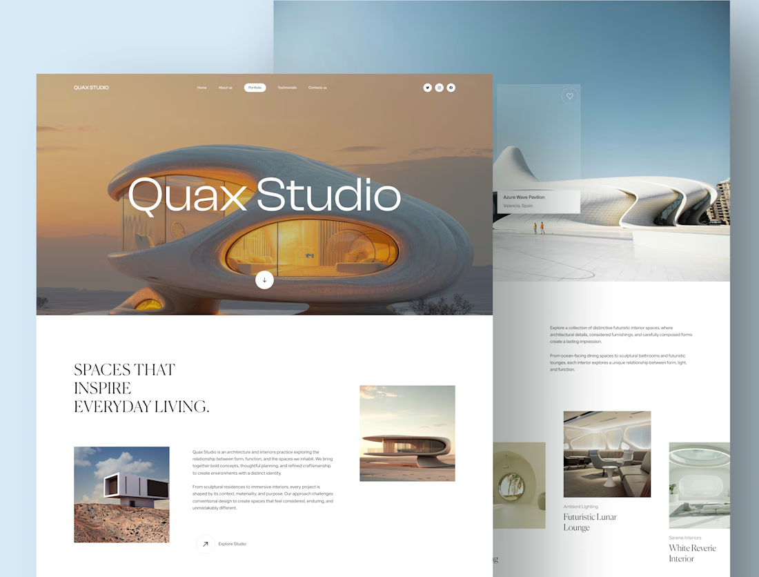

The use of stock visuals as a placeholder is a smart move to maintain design integrity before project photography is ready. It prevents the site from looking unfinished while the actual content is being finalized.

Thank you! 😊 Yes, it really helps, especially when presenting the initial design to clients while the actual project photography is still being finalised.

The serif headings on that white background look so good. Clean work.
Thank you so much😍 . It's Canela Trial font, incase you were wondering.

Excellent work @gayathri p great balance of colors and visual hierarchy
Thankyou so much😊

Wow that just lovely prices of creative work
Thanks Murad!!!😊
The network for creativity
Join 1.25M professional creatives like you
Connect with clients, get discovered, and run your business 100% commission-free
Creatives on Contra have earned over $150M and we are just getting started
Related posts

Made some project page fixes on my Framer template in progress and made the project index page responsive before going to bed tonight.
To keep the UX feeling nice I added a scroll snapping effect to the project video panes so that they never appear only partially, but one pane at a time is always fully on screen as the user scrolls. 🔧


Really inspiring work! 😁


wow, impressive work

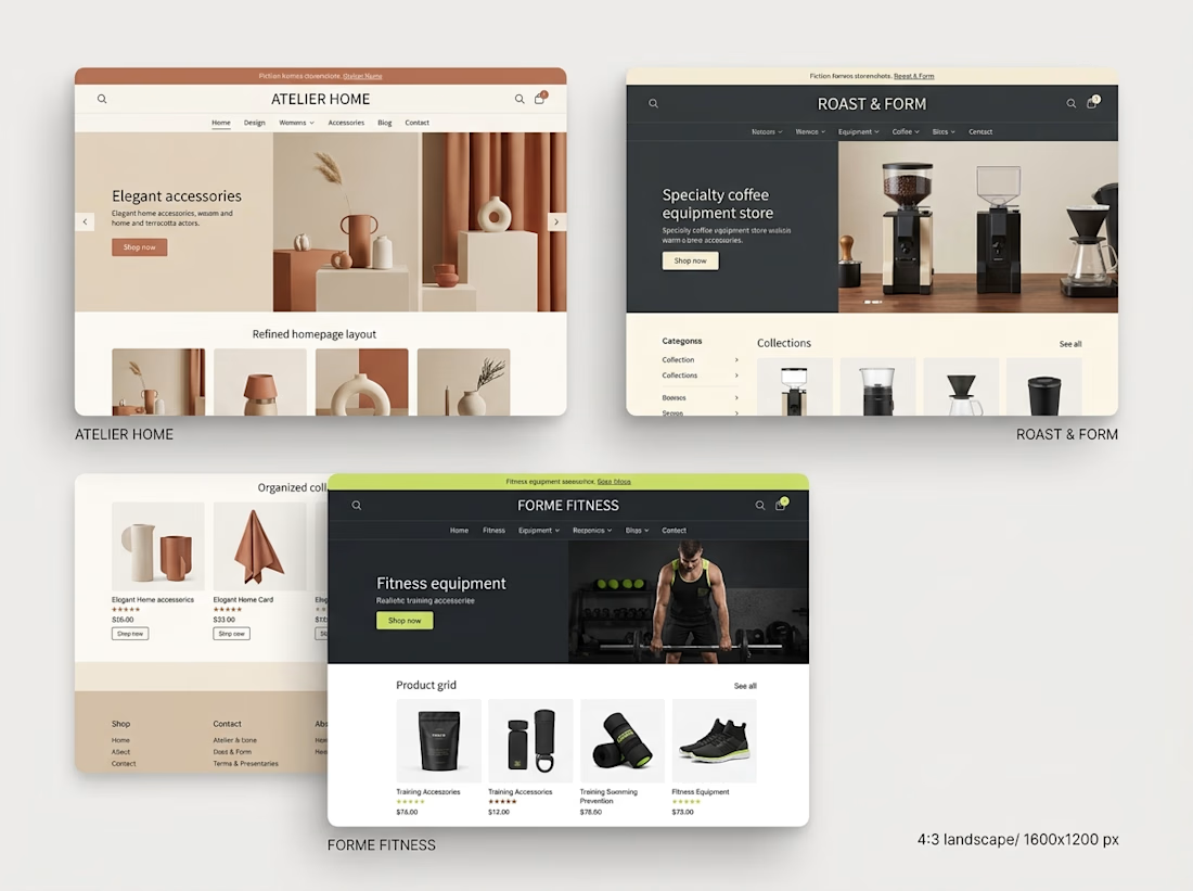
Over the past month, I've been spending more time exploring Shopify store design and thinking about what makes an online store work well.
One thing that stands out to me is that good e-commerce design involves much more than appearance.
I've been paying closer attention to:
→ How a homepage guides visitors
→ How product pages present important information
→ How collections help customers discover products
→ How navigation affects the shopping experience
→ How a store adapts to mobile screens
→ How consistent design builds a stronger brand experience
I'm also learning to think more carefully about the purpose behind each section instead of designing just because something looks good.
Every page should have a reason to exist, and every design decision should contribute to the overall experience.
I still have more to learn and improve, but each project gives me another opportunity to practice, experiment, and develop my approach.
My biggest takeaway so far: good Shopify design brings visual presentation, usability, and the customer's journey together.
What's one thing you believe every e-commerce designer should understand?

Understanding customer behavior is key to creating better shopping experiences. 👏


