The network for creativity
Join 1.25M professional creatives like you
Connect with clients, get discovered, and run your business 100% commission-free
Creatives on Contra have earned over $150M and we are just getting started
Back to feedPost

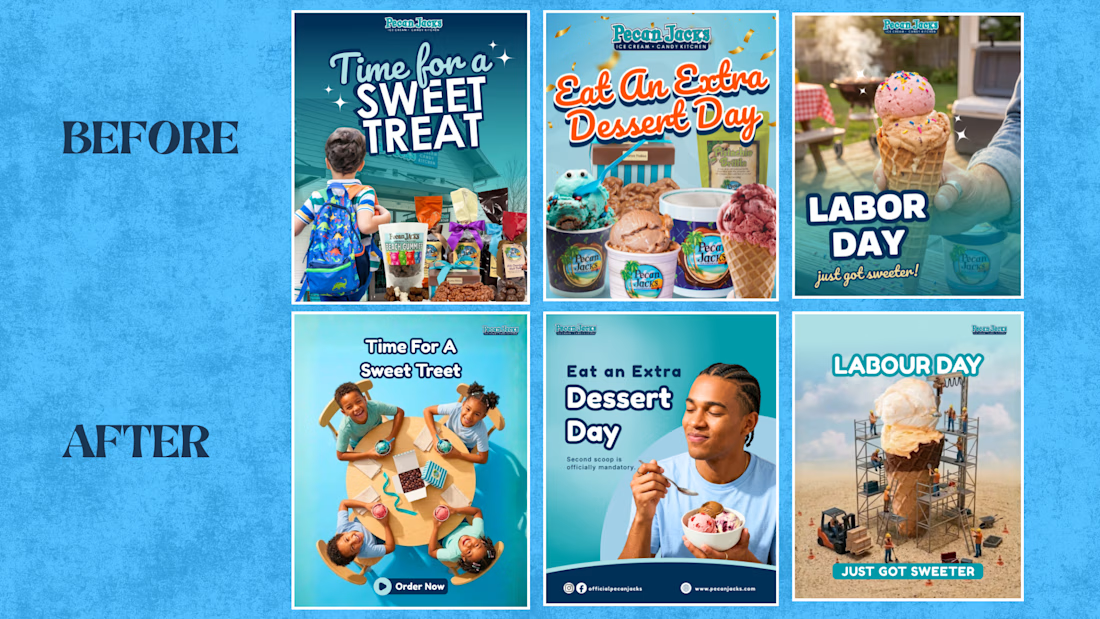
I redesigned the sweetest brand with the most forgettable Instagram.
Pecan Jacks.
I found their page while scrolling for inspiration, not looking for work.
Good product, cute name, ice cream and candy that photographs itself.
Then I opened their feed and felt nothing.
Every post looked like it was made in five minutes between other tasks.
Logo crammed in a corner.
Text fighting the photo for space.
Sparkle graphics doing a job the product should have been doing on its own.
None of it was broken exactly. It just wasn't saying anything.
So I picked three of their real posts and rebuilt them from scratch.
Same brand. Same products.
I just gave each one a single job to do instead of five.
The school backpack photo became four kids laughing over ice cream at a table, shot from above, nothing else competing for attention.
The extra dessert post became one guy actually enjoying a bowl of it, with a line under the headline that sounds like something a person would say out loud.
The Labor Day post turned into a giant scoop being built by tiny construction workers, because a boring holiday deserves a reason to look twice.
Nothing about the offer changed.
What changed was whether anyone would stop scrolling long enough to read it.
That's the whole job most brands are missing.
Not more content. Direction.
If your feed looks like the before version I just described, follow Umair Ansari and send me a message.
I'll show you what the after could look like.


The network for creativity
Join 1.25M professional creatives like you
Connect with clients, get discovered, and run your business 100% commission-free
Creatives on Contra have earned over $150M and we are just getting started











Related posts

🎬 DEBUT
A launch-day ad that rolls out the red carpet for your product.
Friday, October 20. Premiere night.
A limo glides up to the carpet.
A perfume takes the spotlight.
"Who are you wearing?"
It was wearing the night.
Saturday, a skateboard walked the same carpet.
"Can you do it again?"
It landed it.
Sunday, a soda can cracked open in front of the press.
"What's the flavour?"
Nobody would say.
None of them were real.
All of them got a premiere.
🎟️ Every launch deserves a red carpet.
Most of them get a story post.
So I built the whole premiere.
The marquee. The press pen. The fans. The limo.
A rooftop across the street to watch it all from.
I had way too much fun with this one.
Built the street in Blender, then rolled the cameras in SVGator with the MCP.
Six premieres.
One template.
Zero redraws.
Swap the logo and the product.
Every marquee, wall and shot follows.
Retype the headline, the date and what the press shouts.
Every word is live text. Every layer has a name.
The cameras never change.
So who's walking the carpet next?
The flashes never stop. ✨
🛠️ Built in SVGator with the MCP, staged in Blender. 1,429 named layers, 3,917 keyframes.
Use the template 👇
DEBUT · Red-carpet launch ad


the motion looks so fine-

Your stationery is more than paper — it's an extension of your brand identity.
I design premium, classic, and modern stationery for businesses of all sizes, creating cohesive designs that reflect your brand's personality and professionalism.
My stationery design services include:
✦ Business cards
✦ Letterheads and envelopes
✦ Corporate folders and presentation sets
✦ Notepads and compliment slips
✦ Custom branded stationery collections
From individual stationery pieces to a complete corporate identity suite, every detail matters.
Looking to give your brand a more polished, professional appearance? Let's connect!
#StationeryDesign #BrandIdentity #GraphicDesign #BusinessBranding #CanvaDesigner #CorporateDesign #BrandDesign

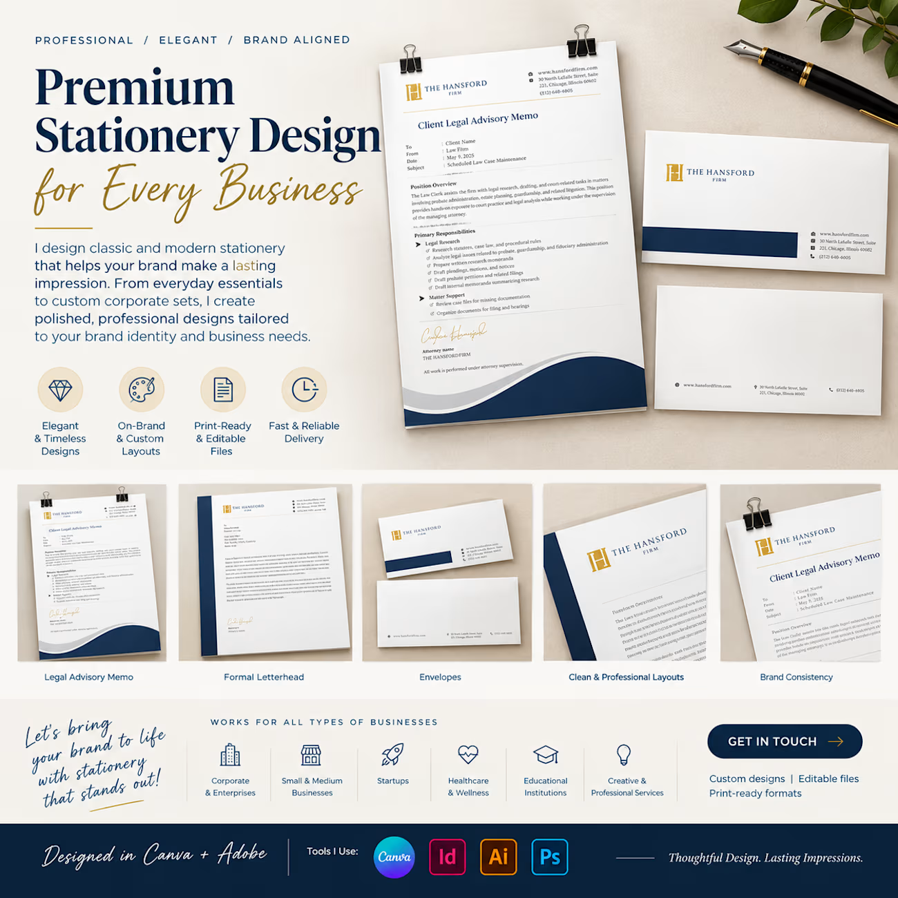

Clean layouts and a very cohesive brand look across every piece. The Hansford set looks really polished. Nicely done, Sheena!

A refreshing color palette inspired by each flavor, paired with bold yet minimal typography, creates strong shelf presence while maintaining a natural and premium feel.

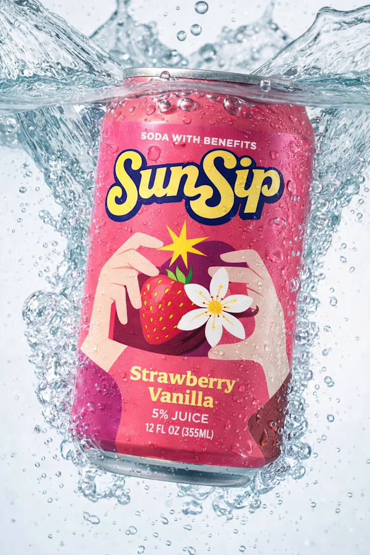

Flavor-led palettes are such a smart system for soda packaging, Umar. The SunSip strawberry can reads bright and playful while that bold minimal type keeps it feeling premium rather than loud.