The network for creativity
Join 1.25M professional creatives like you
Connect with clients, get discovered, and run your business 100% commission-free
Creatives on Contra have earned over $150M and we are just getting started
Back to feedPost


Such amazing work!

Thank you !
The network for creativity
Join 1.25M professional creatives like you
Connect with clients, get discovered, and run your business 100% commission-free
Creatives on Contra have earned over $150M and we are just getting started



Related posts

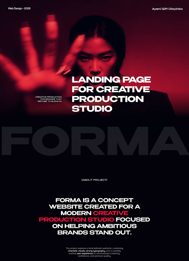
FORMA | Creative Studio Website Design
A bold, cinematic website concept for a modern creative production studio.
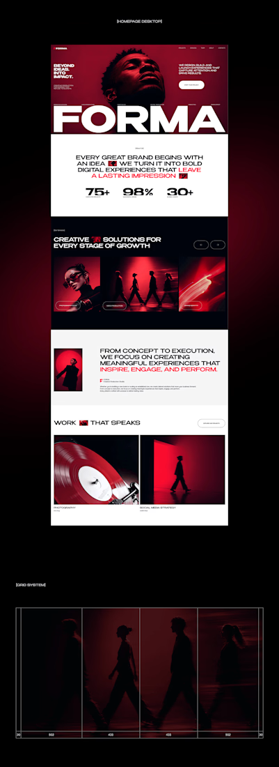
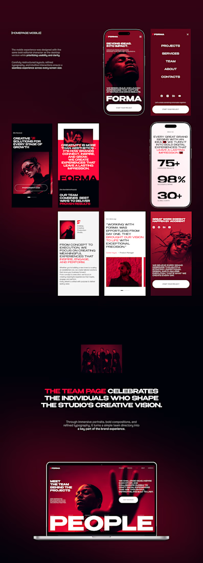
FORMA is a concept website that shows how strategy, design, and digital production come together in one immersive brand experience. The design is built on three things:
Editorial layouts that give the content room to breathe and set a confident, magazine-style rhythm
Cinematic red-lit photography that gives the brand a dramatic, memorable visual identity
Expressive typography that carries the studio’s voice and guides the eye through each section
The goal was a site that feels like the studio’s work: striking, intentional, and made to leave an impression.
My role: UI/UX Design, Visual Direction, Landing Page Design
Tools: [Figma / Photoshop / etc.]
#CreativeAgencyWebsite #CreativeStudio #LandingPage #WebDesign #WebsiteDesign #UIUX #UIDesign #EditorialDesign



Cool direction for the studio.


Website Redesign

Landing page for a Real estate Agency

"You want to own property. We understand." with just "Property" in red is a confident headline for real estate. The body text over the building photo is a bit hard to read, a stronger dark layer would help. Did the redesign change the main CTA?