The network for creativity
Join 1.25M professional creatives like you
Connect with clients, get discovered, and run your business 100% commission-free
Creatives on Contra have earned over $150M and we are just getting started
Back to feedPost

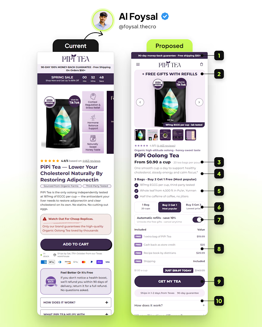
I removed a "Watch out for cheap replicas" box from this page.
It was costing the brand sales.
Every shopper has two brains:
The Gator wants it easy.
The Judge looks for a reason to leave.
A warning right above the buy button wakes the Judge up at the worst moment.
What else I changed:
Cut the countdown stuck at "00 hrs." Fake urgency kills trust.
Moved the free gifts to the top of the gallery.
Showed "From $0.90 a cup" instead of a bare price.
Turned a paragraph into 3 bullets.
Added 3 bundle options with "Most popular" in the middle.
Put the subscription benefit inside the toggle.
Stacked the offer with values.
Changed "Add to cart" to "Get my tea."
The buy box belongs to the Judge.
Keep it simple.
Save this for your next PDP review.

Putting the subscription benefit inside the toggle helps people compare the choice where they make it. I’d keep the renewal price, frequency and cancellation terms equally visible there. The offer is easier to trust when the benefit and the ongoing commitment are clear together.
Agreed on keeping those details together. The shopper should be able to understand the ongoing cost without opening a separate FAQ. Thanks for spelling out the price and frequency details.
The network for creativity
Join 1.25M professional creatives like you
Connect with clients, get discovered, and run your business 100% commission-free
Creatives on Contra have earned over $150M and we are just getting started






Related posts

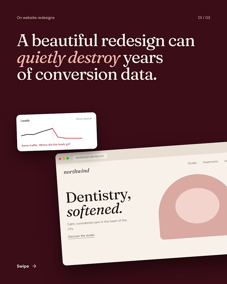
A beautiful redesign can quietly destroy years of conversion data.
The new site launches, traffic holds, and leads seem to disappear. Usually nothing changed with demand. Four things broke without a sound:
URLs changed with no redirects.
Lead events stopped firing on the new forms.
The booking button moved where regulars never look.
Reviews and the phone number were cut as clutter.
Before you hit publish, map every URL, test every event, and keep what was converting.

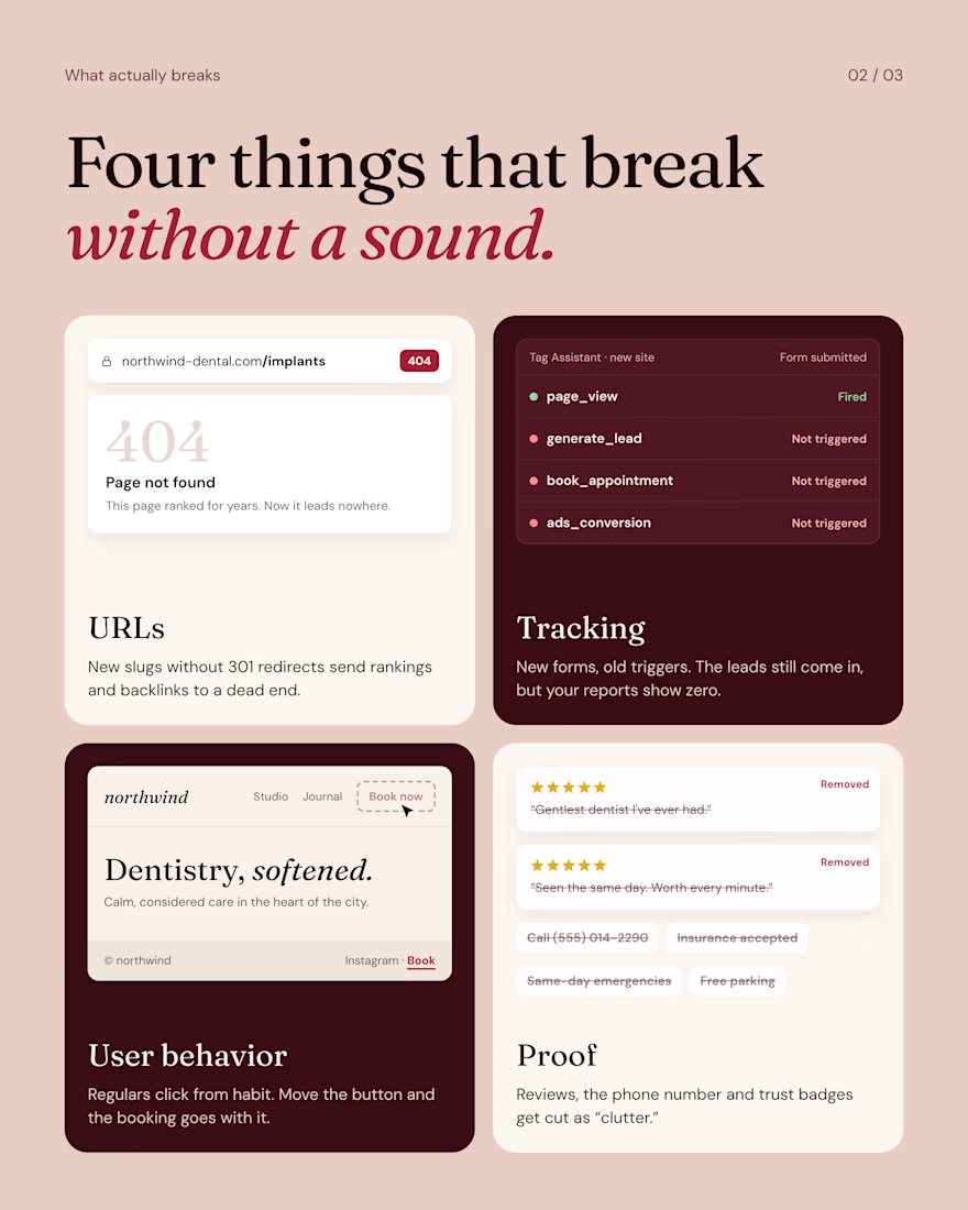
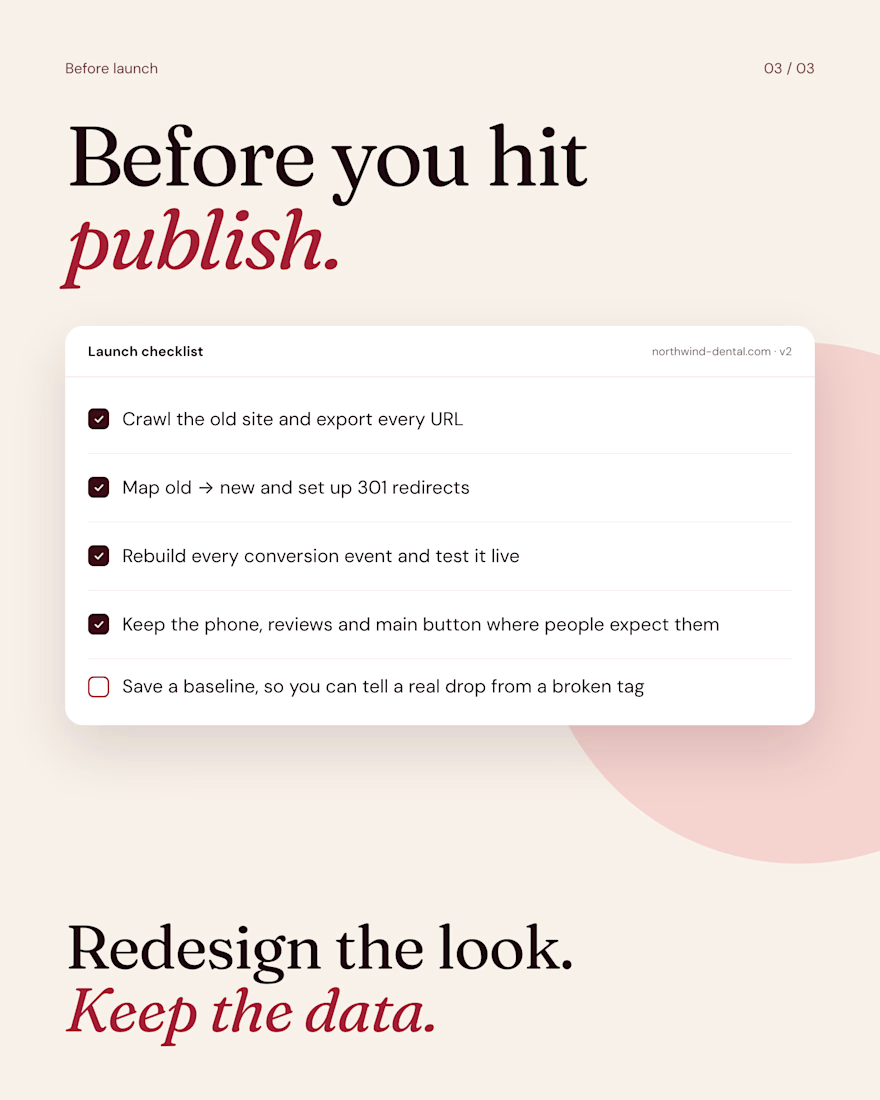

Lead events going silent is the one that hurts longest, because the site still looks fine. The same thing happens on the email side when a new form isn't connected to the list: signups drop to zero and nobody notices until a campaign goes out to fewer people. One test submission before launch catches both.


New case study🥤
Lifestyle-led Shopify for a daily supplement brand 🤸♀️

The mood of an athletic lifestyle is captured perfectly. The emotions and overall style convey a clear sense of it.

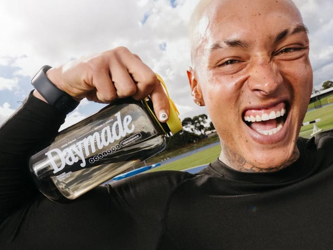
Shopify website design and development for DAYMADE, a daily supplement brand, combining lifestyle-led design, product storytelling and an easy subscription.