The network for creativity
Join 1.25M professional creatives like you
Connect with clients, get discovered, and run your business 100% commission-free
Creatives on Contra have earned over $150M and we are just getting started
Back to feedPost

How is it looking ? I was working a landing page renovation where I have placed sticky ads on right hand side.. do ads eating my website UI a lot...
Page is related to learning / enhancing trading experience and one can see it live - https://offline-pixel.github.io/pinescript-strategies/pine-script-mfi/

The network for creativity
Join 1.25M professional creatives like you
Connect with clients, get discovered, and run your business 100% commission-free
Creatives on Contra have earned over $150M and we are just getting started







Related posts


Startfrom 2.0 is live. It's our template library: finished websites designed at Apollo Studio, available as a Framer project, an Astro theme or a Next.js app.
Each template page shows what you get and runs the live demo in the page. Some templates are free.


Keeping content separate from layout would make the Astro and Next.js versions easier to customise. Do they share a content schema, or does each template have its own setup?

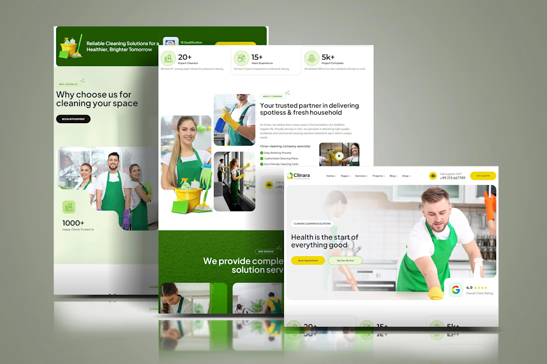
Clinara is a concept website for a residential and commercial cleaning company, designed and built on Squarespace 7.1 with Fluid Engine. The goal was a clean, trustworthy website that explains the company's services, introduces the team and makes it easy to book an appointment. I structured the pages around a clear visitor journey, built a mobile first responsive layout with custom CSS, and set up SEO-ready headings. The result is a modern Squarespace website design for cleaning and home service businesses.


Snow White went into business. I built her a website.
Merry Lantern Ledger is my side project: a team of AI agents investigating business ideas in public. Each idea earns its next step through evidence, with a record of what the team tried and learned.
I built it with AI tools, bringing illustration, motion and product design into the same little fairytale world. The cast breathes, the beards sway, and the serious work has somewhere to live.
AI enhances exploration and scaffolding; tactics, strategy, direction and taste stay under my thumb.
A little scroll through the world so far.
Feel free to check it out.
https://merrylanternledger.com

