The network for creativity
Join 1.25M professional creatives like you
Connect with clients, get discovered, and run your business 100% commission-free
Creatives on Contra have earned over $150M and we are just getting started
Back to feedPost

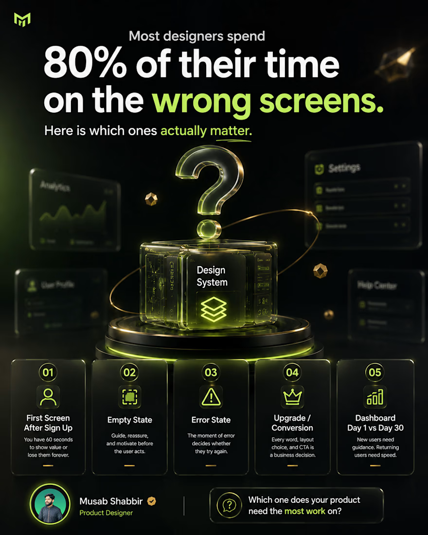
Most designers spend 80% of their time on the wrong screens. Here is which ones actually matter.
Early in my career I did the same thing.
Spent days perfecting the settings page. The profile section. The help center. Screens that look good in a portfolio but rarely decide whether a user stays or leaves.
After 150+ products here is what I know for sure.
These are the screens that actually matter.
The first screen after sign up. This is where most products lose users forever. If someone does not understand what to do in the first 60 seconds, they are gone. Design this one like your product depends on it. Because it does.
The empty state. What does the product look like before the user has done anything? Most teams skip this. The best products use it to guide, reassure, and motivate.
The error state. Users will hit errors. What they see in that moment decides whether they try again or close the tab. A cold error message kills trust instantly.
The upgrade or conversion screen. If you are building SaaS, this screen is revenue. Every word, every layout choice, every CTA placement is a business decision.
The dashboard on day one vs day thirty. They should feel different. New users need guidance. Returning users need speed. Most products design one and call it done.
The homepage gets all the attention. These five screens get all the results.
Which one does your product need the most work on?
#uiux #productdesign #saasdesign #uxdesign #figma #uidesigner #designprocess #startupdesign #aidesign #freelancedesigner
The network for creativity
Join 1.25M professional creatives like you
Connect with clients, get discovered, and run your business 100% commission-free
Creatives on Contra have earned over $150M and we are just getting started

Challenges
View all


Related posts


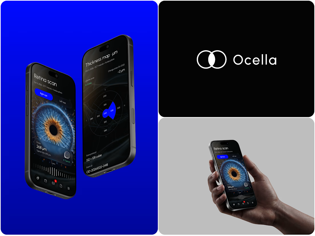
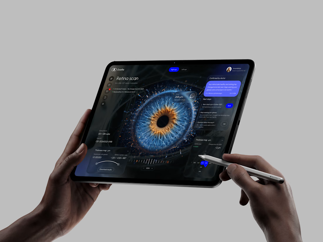
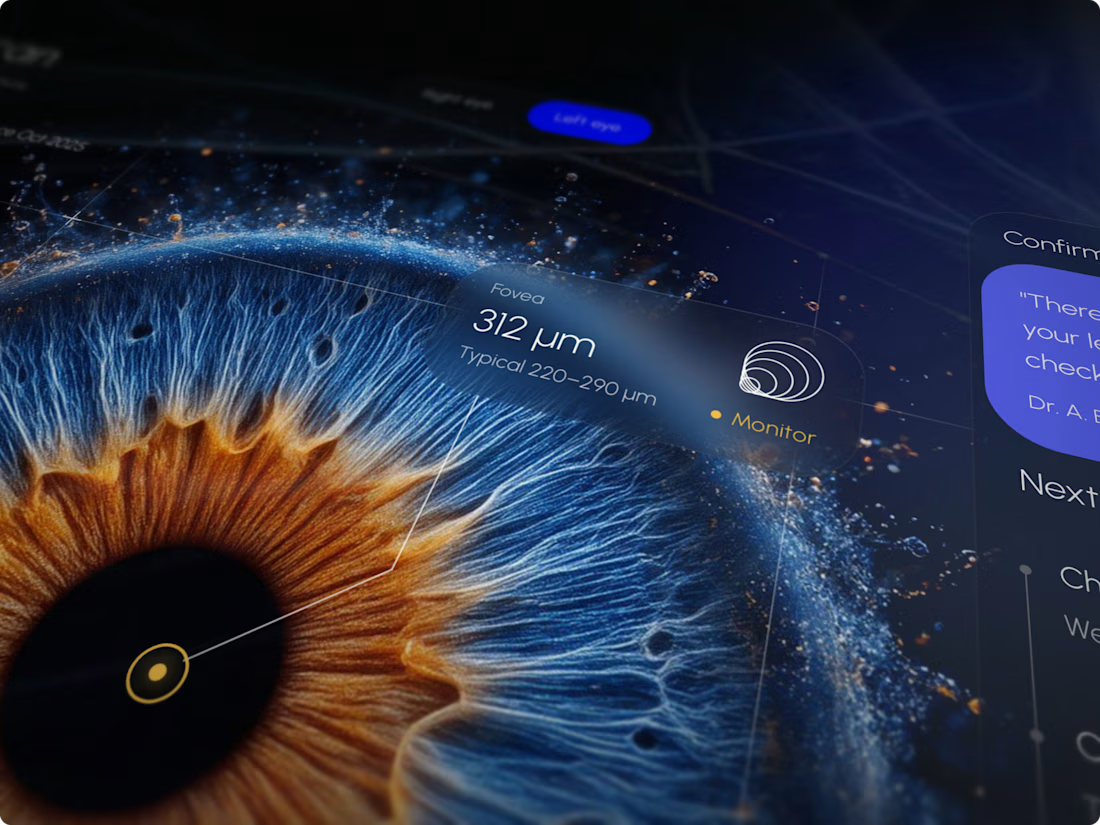
Ocella Eye Exam Results Portal
Clear results build trust. Patients know what their exam means and what to do next, and doctors spend less time explaining the same numbers.



I never see design like this before thats unique 🎉🎉🔥🔥


45 screens for a running app with that level of polish is massive work! Love the bold orange + black combo and the data viz. Guessing this was a premium project - easily 4-5k+ for this system? Super clean motion design.

Luxury Lighting E-commerce Website Design for Modern Home Decor
A modern luxury lighting e-commerce website concept crafted to showcase premium statement pieces through a refined, immersive, and editorial-inspired digital experience. The design combines warm ambient lighting, bold typography, cinematic imagery, and clean minimalist layouts to create a sophisticated online presence for a high-end home decor brand. Every element is thoughtfully designed to enhance product storytelling, improve user engagement, and deliver a seamless shopping experience across all devices.

really nice design