The network for creativity
Join 1.25M professional creatives like you
Connect with clients, get discovered, and run your business 100% commission-free
Creatives on Contra have earned over $150M and we are just getting started
Back to feedPost

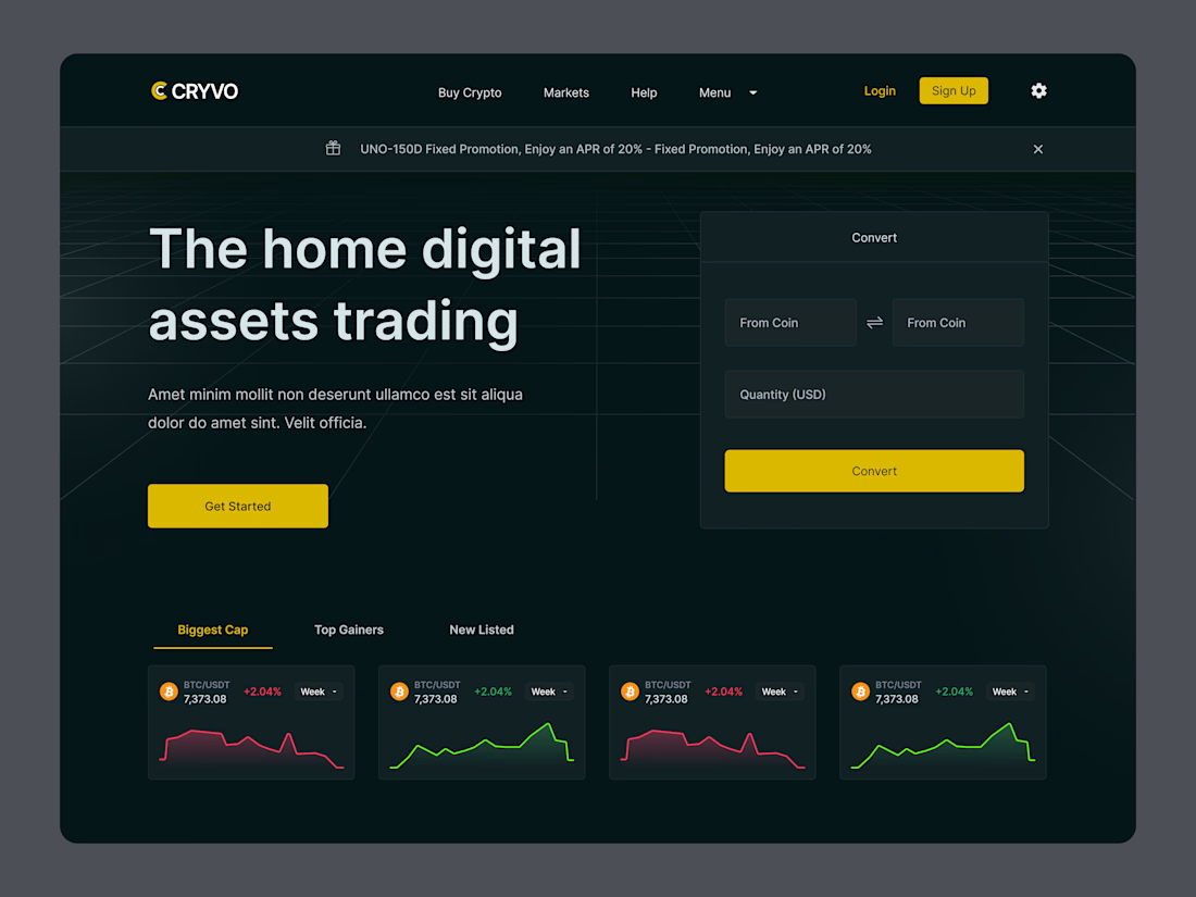
Crypto trading, minus the chaos. 🚀
Meet CRYVO! A sleek, dark-themed trading platform designed to make crypto feel less complicated and a lot more intuitive. 📈
Dark UI + bold yellow accents. Yay or nay? 👀
#CryptoDesign #Fintech #UIUX #WebDesign #DesignTwitter
(1/5)
Less clutter, more clarity. ⚡
We brought crypto conversion, market charts, and trading features into one clean interface.
Because great trading UX should make complex data easier to understand, not harder. 👀
(2/5)
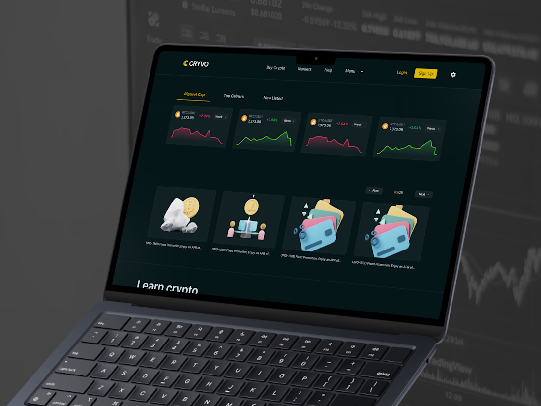
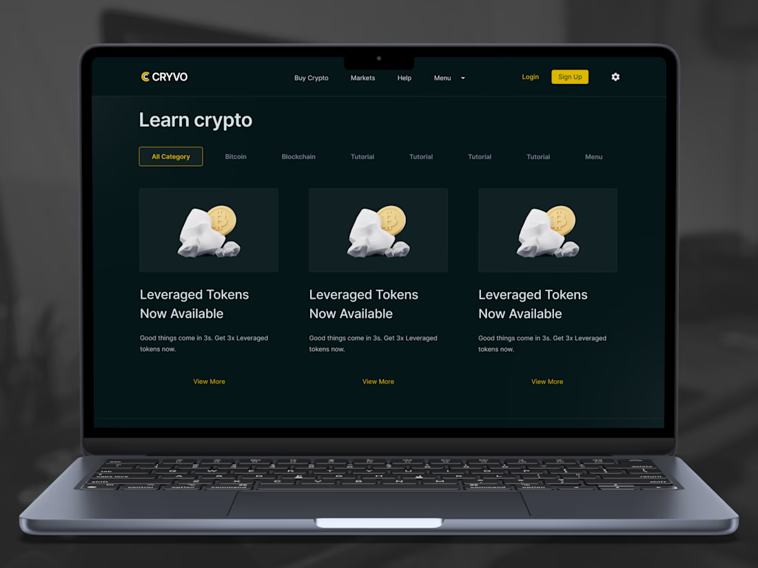
Looks even better on a laptop. 💻✨
Dark backgrounds, sharp typography, and just the right amount of yellow.
Every detail is designed to keep the experience focused, readable, and easy to navigate.
Would you trade on this interface? 👀
(3/5)
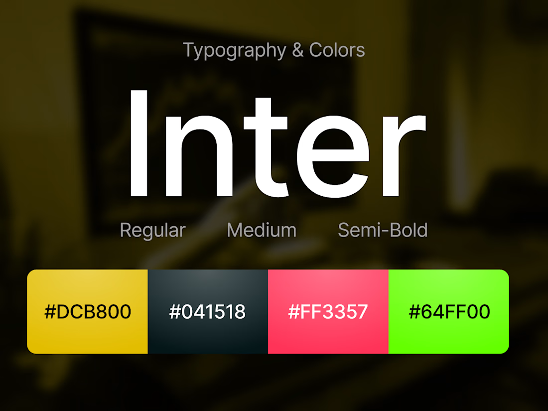
A little yellow goes a long way. 💛
We paired deep dark tones with bold yellow CTAs, clean typography, and consistent cards to create a trading experience that feels modern without being overwhelming.
Sometimes less really is more. ✨
(4/5)


yay on the yellow. the dark ui does the heavy lifting
The network for creativity
Join 1.25M professional creatives like you
Connect with clients, get discovered, and run your business 100% commission-free
Creatives on Contra have earned over $150M and we are just getting started


Related posts

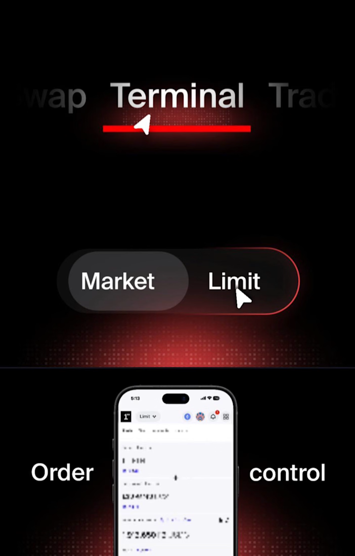
I worked a product video concept for 1inch Limit orders feature.
designing for crypto products require a special kind of touch few designers can perfectly execute.
Let’s work together on yours.


That's a really cooool effect👌

