The network for creativity
Join 1.25M professional creatives like you
Connect with clients, get discovered, and run your business 100% commission-free
Creatives on Contra have earned over $150M and we are just getting started
Back to feedPost
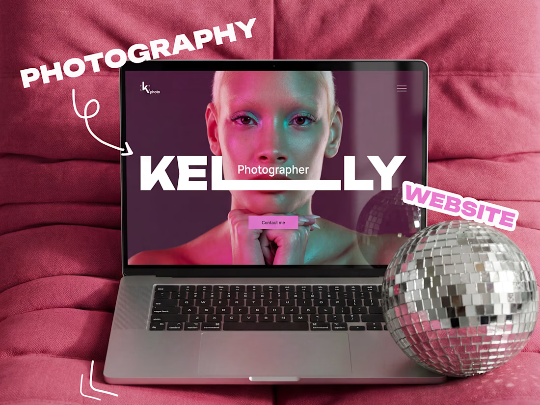
A photo shoot without panic? Easy! This case shows all the stages of a photographer's work - from meeting to the finished shot. The animation on the site immerses you in the atmosphere and creates a mood, and the inner pages add details. This presentation removes fears and shows that shooting is easy and even fun


🔥 🔥 🔥

Amazing 🎉

Thanks ✨

Це так красиво😍
Thanks a lot🫶


😍 🔥 🔥 дуже гарно

wow wow, looks amazing 🙌


Looks amazing😍

Wow! Nice work🔥
The network for creativity
Join 1.25M professional creatives like you
Connect with clients, get discovered, and run your business 100% commission-free
Creatives on Contra have earned over $150M and we are just getting started









Related posts


A luxury property deserves a presentation that does it justice.
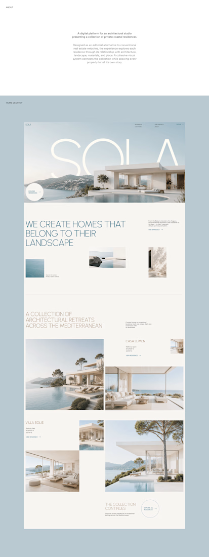
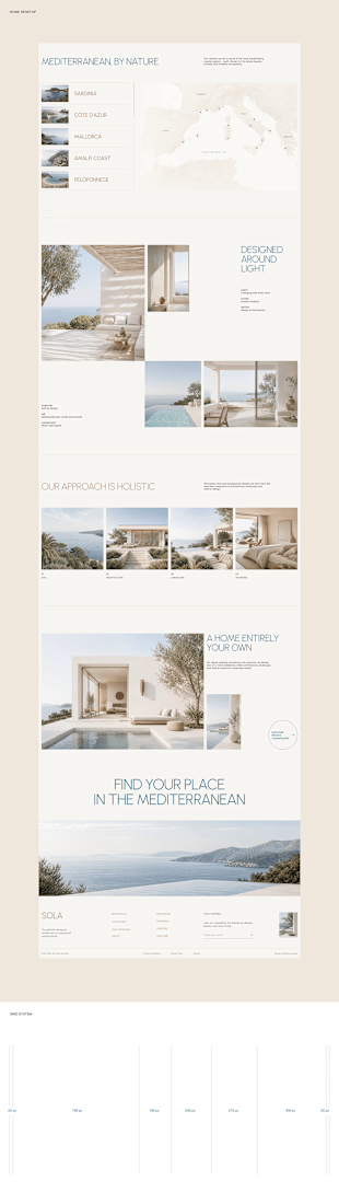
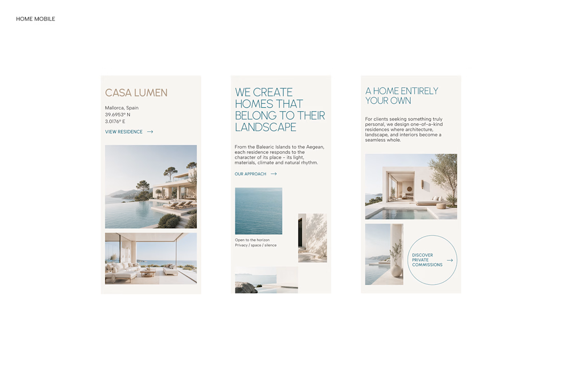
With SOLA – Architecture Studio & Luxury Real Estate, I wanted to bring the beauty of modern coastal architecture into the website itself.
From the large property images and soft blue tones to the clean layout across desktop and mobile, every part of the design helps create a calm, premium feel while making the homes the centre of attention.
I like how the website brings architecture and digital design together, giving visitors a chance to explore the properties before making an enquiry.
If you were looking for a luxury home, would a website like this make you more interested in the property?
#WebDesign #Architecture #LuxuryRealEstate

Incredible work, you transformed SOLA into a premium property brand.


Every element feels perfectly placed! 👏

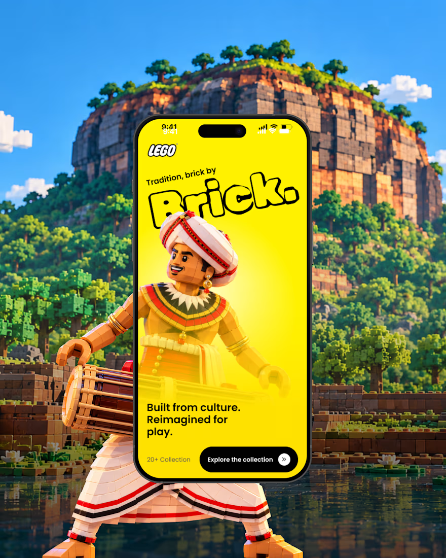
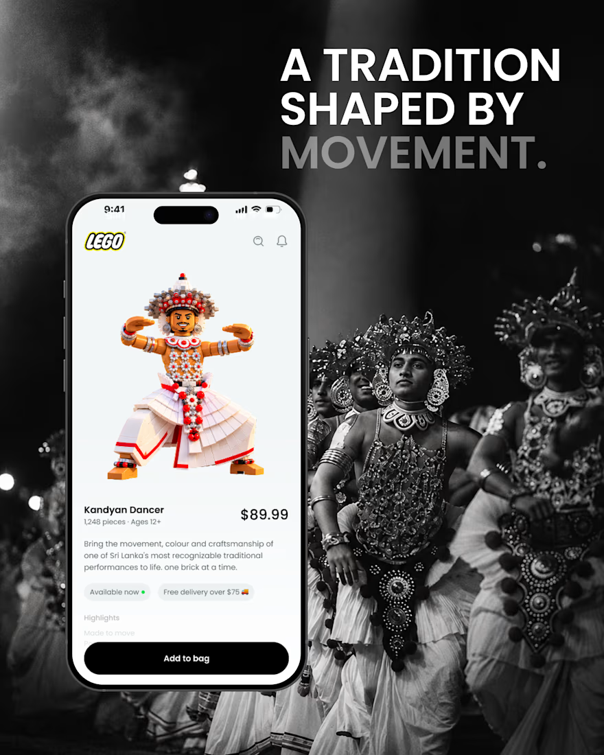
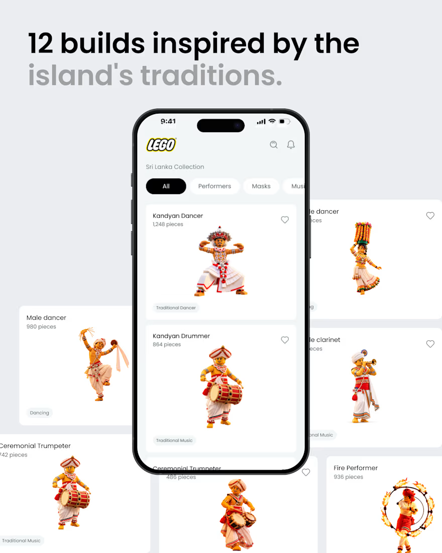
What if Sri Lankan tradition found its way into the LEGO app? 🇱🇰🧱
A small product design exploration.
Had a small idea and decided to visualize it. ✌️
I reimagined a few elements of Sri Lankan culture traditional dancers, masks, musicians, and instruments as brick built characters, then explored how they might live inside a LEGO style mobile experience.
Just a hypothetical design experiment combining culture, product design, and a little AI-assisted exploration.
Not affiliated with or endorsed by LEGO.
#ProductDesign #UIDesign #DesignConcept #DesignExploration #CreativeAI #SriLanka #SriLankanCulture #LEGO

That's awesome great job 🎉🎉