The network for creativity
Join 1.25M professional creatives like you
Connect with clients, get discovered, and run your business 100% commission-free
Creatives on Contra have earned over $150M and we are just getting started
Back to feedPost

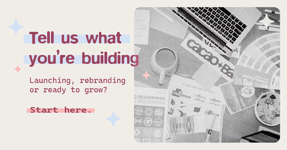
Thinking about rebranding? We want to hear your story! :)
https://cacaobats.com/tell-us-your-story/
The network for creativity
Join 1.25M professional creatives like you
Connect with clients, get discovered, and run your business 100% commission-free
Creatives on Contra have earned over $150M and we are just getting started
Related posts

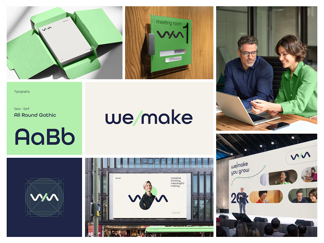
Most rebrands start with a mood board. This one started with a punctuation mark.
For we make the slash in the name became the logo, the monogram, the layout tool and even the campaign line: "we make you grow."
When one small idea can carry a whole brand, every new touchpoint designs itself.
Founders does your name have a hidden idea like this?


Every brand has a story to tell.
From logo marks to full visual systems, we design identities that hold up on screens, merch, and apps alike.
Watch the showcase and tell us which one is your favorite.
#BrandIdentity #LogoDesign #GraphicDesign #VisualIdentity

Great work

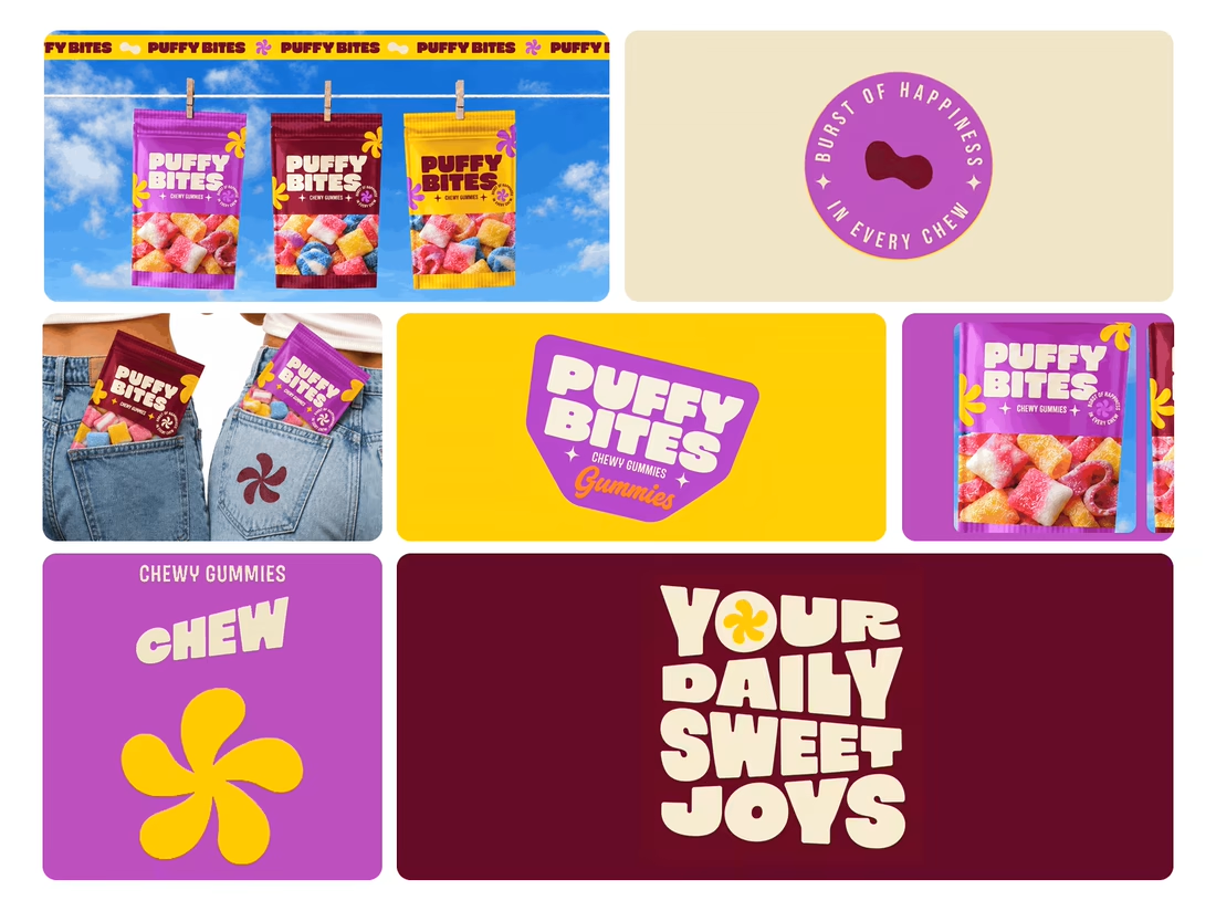
What makes a candy brand recognizable across every pack?
For Puffy Bites, I built the identity around rounded lettering, expressive symbols, and a palette of burgundy, purple, yellow, and cream.
The same visual language carries through pouch packaging, smaller wrappers, campaign imagery, and an animated brand showcase.
One design decision that ties it together: the packaging color changes, while the logo placement, product descriptor, and supporting graphics maintain a consistent structure.
I handled the full client project, from logo and visual identity to packaging and campaign applications.
Which colorway would catch your eye first—purple, burgundy, or yellow?
Explore the full Puffy Bites case study. If you’re developing a candy or snack brand, I’m available for branding and packaging projects.

Great breakdown! The rounded lettering + expressive symbols is exactly what makes a candy brand stick. Love the palette choice - burgundy, purple, yellow, cream feels playful but still premium, not childish. And carrying the same visual language across pouch, wrappers, campaign...