The network for creativity
Join 1.25M professional creatives like you
Connect with clients, get discovered, and run your business 100% commission-free
Creatives on Contra have earned over $150M and we are just getting started
Back to feedPost
GOLDEN vs SKY BLUE - Which one is more premium? ✨
Created 2 color variants for my Global Street Food Thali Menu concept for Jaynshika Designs.
Left: Golden - For a classic, luxury, 5-star hotel vibe
Right: Sky Blue - For a modern, fresh, Instagrammable cafe vibe
Same layout, different mood. Color changes the whole story!
👇 Tell me in comments - Team Golden or Team Sky Blue?
I'm a Poster & Menu Designer. DM me if you want your brand to stand out.
#MenuDesign #ColorVariant #FoodMenu #GraphicDesign #CanvaDesign #Branding #PosterDesigner #DesignPoll #JaynshikaDesigns #FreelanceDesigner

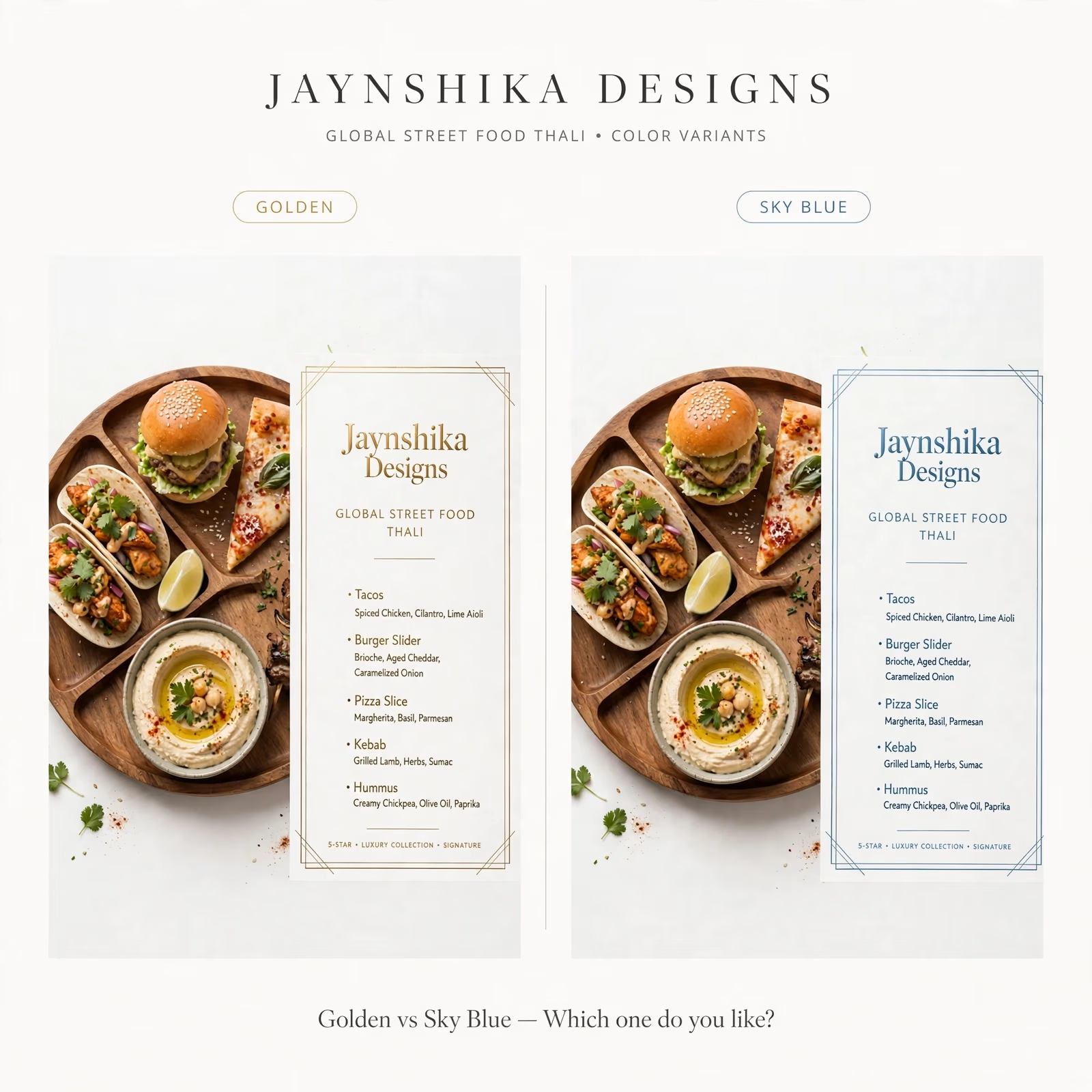

I'd lean Sky Blue for a street food concept. The cool tone makes the warm food photography pop, while the gold sits very close to the colors already in the dish. Curious which one the client picked?

Thanks Artur! You are right, Sky Blue makes the food pop more. Client loved it too!
The network for creativity
Join 1.25M professional creatives like you
Connect with clients, get discovered, and run your business 100% commission-free
Creatives on Contra have earned over $150M and we are just getting started





Related posts

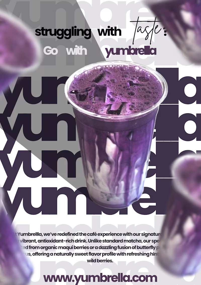
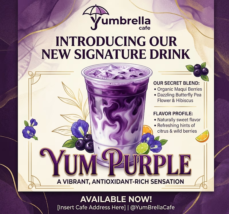
Yumbrellla Cafe recently commissioned a promotional poster for the launch of their new signature drink, "YumPurple," designed for both social media campaigns and in-store display.
To make things interesting, I’m putting this project to the "Taste Test."
On the right is my custom design, and on the left is an AI-generated concept.
Let's see which visual makes the stronger impact!
3 voted
50%
3 voted
50%
6 votes
Closed


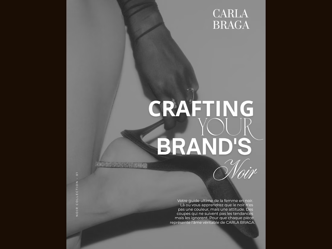
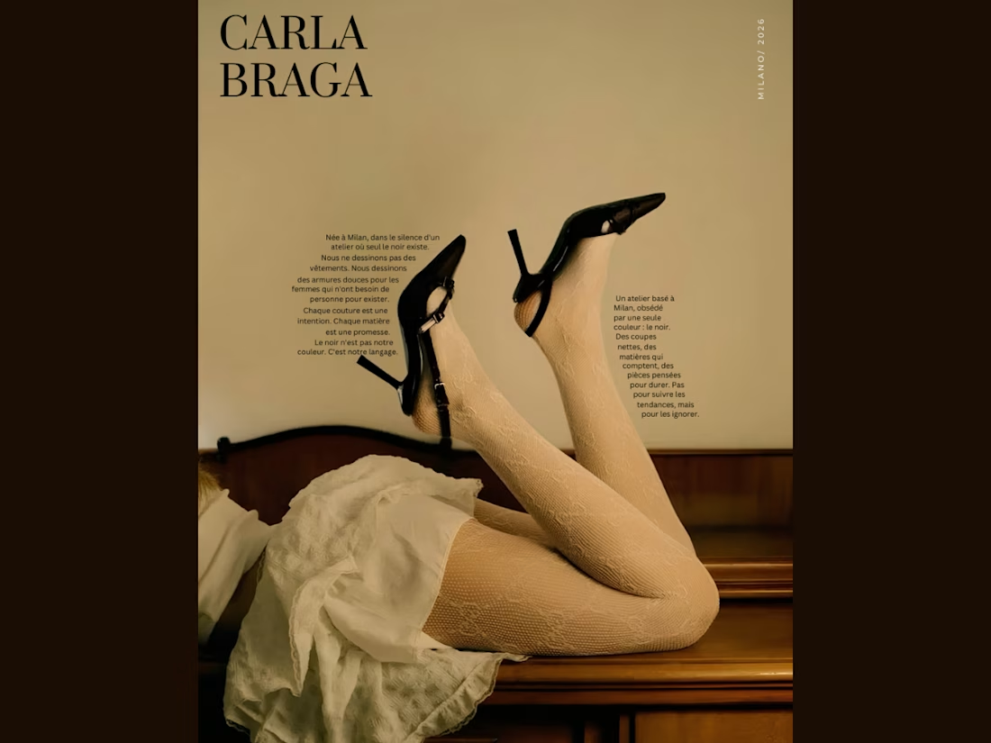
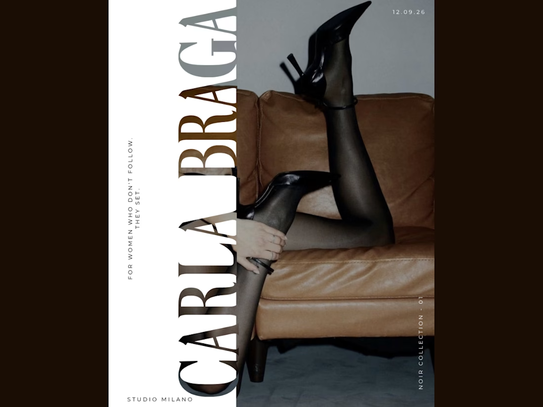
An editorial poster series I designed for CARLA BRAGA, exploring fashion through bold typography, vintage tones, and monochrome imagery. Each layout takes a different approach—from text following the contours of the image to oversized vertical lettering and layered font combinations. Black heels connect the series visually, while warm browns, soft neutrals, and spacious compositions create a cohesive luxury feel. Created in Canva with a focus on typography, contrast, and visual storytelling.

BEAUTIFUL WORK.

Happy to start a new chapter in my career as a Social Media Manager.
I’m excited to share my portfolio, featuring some of my work in social media management, content planning, design, and creative strategy.
I’m looking forward to working with new brands, building strong content systems, and creating social media that feels consistent, engaging, and intentional.
Here’s a quick look at my portfolio 🎥
mrohmanudin.y.id


Congrats on the new chapter! Your portfolio looks like a great start.