The network for creativity
Join 1.25M professional creatives like you
Connect with clients, get discovered, and run your business 100% commission-free
Creatives on Contra have earned over $150M and we are just getting started
Back to feedPost
LUMINA STUDIO - Business Card Design (Concept)
Luxury business card for creative agency. Minimal gold logo on black. I designed logo + card layout.
Tool: Canva
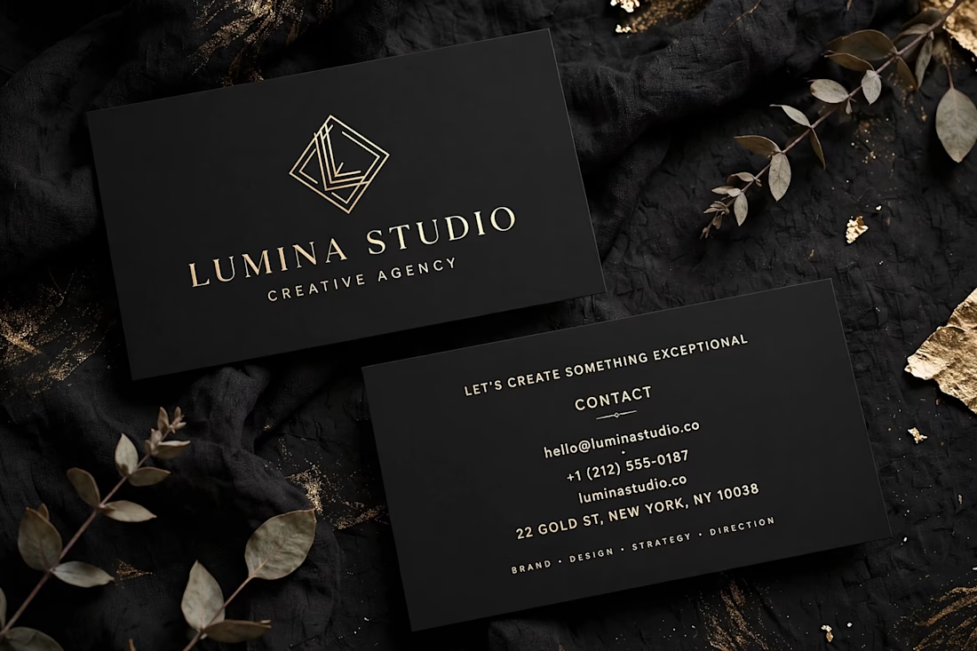

Thin gold type on black looks great on screen, but small contact lines can fill in on press. Would you put foil on the logo only and keep the details in a slightly heavier matte weight?

Thanks for the feedback Artur! You're right — I'll increase the minimum size for contact lines to 7pt and bump up the tracking for print legibility. Really appreciate the eye.
The network for creativity
Join 1.25M professional creatives like you
Connect with clients, get discovered, and run your business 100% commission-free
Creatives on Contra have earned over $150M and we are just getting started



Related posts

Motif One — Modern Logo Design for a Next-Gen Technology Company


𝗙𝗶𝘃𝗲 𝗿𝗲𝗰𝗲𝗻𝘁 𝘄𝗲𝗯𝘀𝗶𝘁𝗲 𝗽𝗿𝗼𝗷𝗲𝗰𝘁𝘀, 𝗳𝗶𝘃𝗲 𝘃𝗲𝗿𝘆 𝗱𝗶𝗳𝗳𝗲𝗿𝗲𝗻𝘁 𝗯𝘂𝘀𝗶𝗻𝗲𝘀𝘀𝗲𝘀.
🌸 Décor Lately: an event and interior décor studio in Lagos
🏡 Signature Gardens: a real estate development in Abuja
📡 GIGA by Prestabist: a bilingual (French/English) internet provider in Chad
🎤 BisiManuel: a gospel artist with music, events and a merch store
📶 Prestabist Telecom: a corporate telecom and digital services website
Each one was designed around what the business needs its website to do: book consultations, sell plots, explain internet plans, or grow a fanbase. And every one works just as well on a phone as on a laptop.
If your website isn't working as hard as you are, let's talk. Send me a message.
#WebDesign #WordPress #Elementor #WebDevelopment #SmallBusiness


Are you struggling to highlight your expertise on your website?
Are your visitors leaving even before they reach the service section?
Introducing Luven, our new Framer template.
Built for architectural and interior lighting studios.
With editorial layouts, immersive imagery, bold typography, and subtle motion.
It makes for a premium website to guide visitors towards consultation enquiries.
• Conversion-focused homepage.
• Focusing on selected work, process, testimonials, and an FAQ section.
• Project case details with location, area, and visuals.
• Responsive layouts, enquiry forms, newsletter signup, and CTA.
Check the comment for the link.


Nice work