The network for creativity
Join 1.25M professional creatives like you
Connect with clients, get discovered, and run your business 100% commission-free
Creatives on Contra have earned over $150M and we are just getting started
Back to feedPost

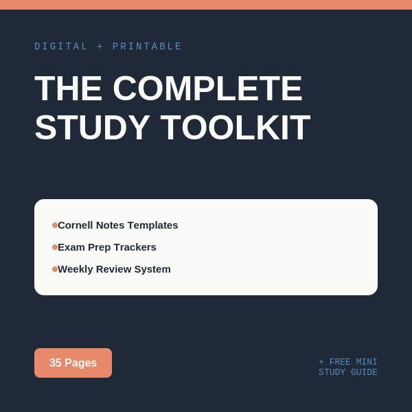
The Complete Study Toolkit gives you an actual system — one that combines proven note-taking methods with exam prep, weekly review, and deadline tracking, so nothing falls through the cracks this semester.
What’s inside (35 pages):
• 12 Cornell Notes templates — the research-backed note-taking method that builds real memory
• 5 Exam Prep Trackers — topic checklists, difficulty ratings, and practice logs per subject
• 5 Weekly Review Schedules — built-in spaced repetition so you’re never cramming
• Semester Overview — all your classes, professors, and deadlines in one place
• Master Deadline Tracker — every assignment across every class, at a glance
• Grade Tracker — know exactly where you stand, class by class

The network for creativity
Join 1.25M professional creatives like you
Connect with clients, get discovered, and run your business 100% commission-free
Creatives on Contra have earned over $150M and we are just getting started

Challenges
View all


Related posts







I’ve been razzmatazzing and flibbertigibbeting with Claude Code and somehow ended up with a new yels.dev.
It finally feels like me: simple on the surface, slightly complicated underneath, and very much alive.
You can see who I am, what I do, the work behind Herodot, RaptorLabs, CyberLink Security and Solmint, plus a selection of projects I’ve built across AI, cybersecurity, Web3, product systems, education, archives, and experimental digital spaces.
Built to be explored


The simple-on-the-surface, layered-underneath idea comes through so clearly in the presentation. I especially like how the project archive turns the site into something to explore rather than just a résumé of links.

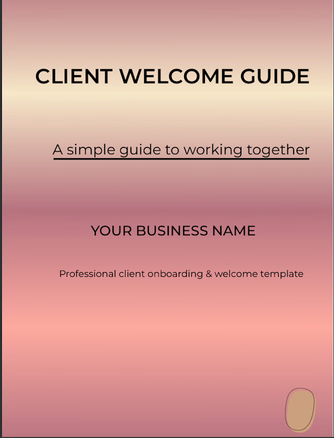
I designed this 9-page Client Welcome Guide in Canva with a clean, professional and welcoming visual style. The project focuses on organizing client information into clear, easy-to-follow sections while maintaining consistent typography, spacing and layout throughout the guide.
The goal was to create a practical digital document that businesses can use to introduce their process, communicate important information and create a polished first impression for new clients.

Nine pages feels like the interesting constraint — most onboarding docs either stop at two and leave people guessing or run to twenty and get skimmed. Did any section earn its page by killing a question that kept coming back over email?