The network for creativity
Join 1.25M professional creatives like you
Connect with clients, get discovered, and run your business 100% commission-free
Creatives on Contra have earned over $150M and we are just getting started
Back to feedPost

Sales Deck Design: 25 Premium Subscriptions Closed via Persuasive 10-Slide Pitch
Description: Designed a high-conversion B2C sales deck for ChatGPT Premium. Used sales psychology, ROI visuals, and objection-handling slides to turn cold leads into buyers. Result: 25 direct sales from one presentation.
Focus: Clear value prop, urgency CTAs, visual storytelling.
Tools: Canva Pro and PowerPoint


The network for creativity
Join 1.25M professional creatives like you
Connect with clients, get discovered, and run your business 100% commission-free
Creatives on Contra have earned over $150M and we are just getting started








Related posts

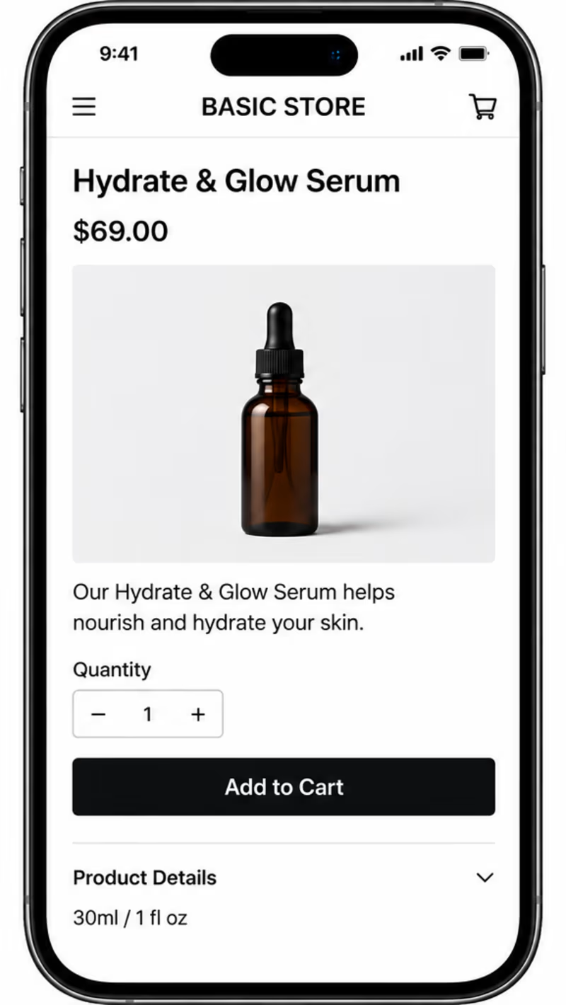
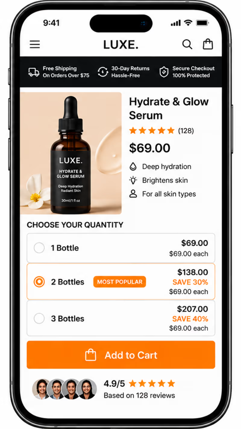
BEFORE vs AFTER
Which product page would make you more likely to buy?
Same product. Same price. Two different shopping experiences.
A — Before Elixir: A simple product page with a basic layout.
B — After Elixir: A more polished shopping experience with customer reviews, trust signals, product benefits, and quantity discounts.
As a developer interested in e-commerce and UI/UX, I believe great design should do more than look good — it should build trust and make buying easier.
👇 Which one would you choose: Before or After?
What makes the biggest difference to you: product presentation, reviews, trust signals, or discounts?
#Ecommerce #Shopify #UIDesign #ConversionOptimization #Figma #Canva #Framer #Adobe

4 voted
50%
4 voted
50%
8 votes
Closed

Customer reviews and trust signals make the biggest difference by far. For a $69 skincare bottle people need to see genuine ratings and money back guarantees before they hit buy. But the other elements still matter, better product photos make the brand look legitimate and bundle...


Pitch deck before, after
It was fun and challenging to work on iClosed pitch deck
I made it clear, to the point at the same time exciting with
Hook (Problem and Solution)
Market Opportunity
Traction and Proof
Business Model and GTM and Team
The rest pages are confidential


Nice work

Such a good skill for visual explainers. All SVG and animated.
https://github.com/wheresryan22/anatomy
Describe a machine in one line. Claude brings it to life.
🚀 Interactive isometric wireframes you can rotate, inspect and explore
🚀 WebGL shaders for fire, water, plasma and more
🚀 Real 3D motion, with individual parts that rotate and move
🚀 Install it as an agent skill. Fully open source.


one line in and you get a machine you can rotate. kind of nuts