The network for creativity
Join 1.25M professional creatives like you
Connect with clients, get discovered, and run your business 100% commission-free
Creatives on Contra have earned over $150M and we are just getting started
Back to feedPost

Your website doesn't need more animations.
It needs more clarity.
One of the biggest mistakes I see on business websites is trying to impress visitors instead of guiding them.
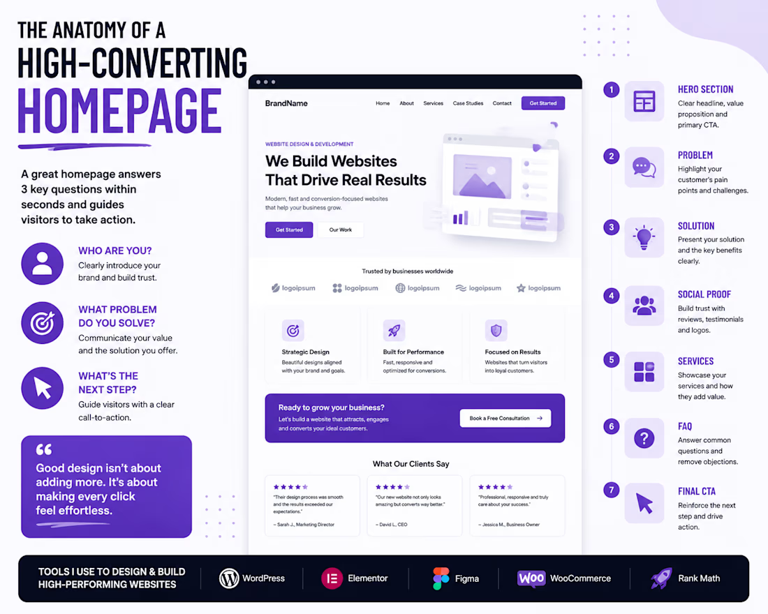
Before adding fancy effects, make sure your homepage answers these questions:
👋 Who are you?
Visitors should know who you are and what your business does within the first few seconds.
🎯 What problem do you solve?
Don't just list services. Explain the value and outcomes customers can expect.
👉 What's the next step?
Every page should have one clear call-to-action—whether that's booking a call, requesting a quote, or making a purchase.
A simple, well-structured website will almost always outperform a beautiful website that's confusing to navigate.
Good design isn't about adding more.
It's about making every click feel effortless.
What do you think is the biggest mistake businesses make on their websites?:



I totally agree to this.

You have a great point on this.👍
The network for creativity
Join 1.25M professional creatives like you
Connect with clients, get discovered, and run your business 100% commission-free
Creatives on Contra have earned over $150M and we are just getting started
Related posts

XPlace — Crypto-Backed Visa Card Website design
Designed the interface for XPlace — a platform that lets users borrow against their crypto holdings and spend through a Visa card, without selling assets or triggering taxable events.
The challenge:
Create a product that feels both trustworthy and premium — avoiding the typical "startup" look, and steering clear of the neon/gradient clichés so common in crypto design.
The solution:
A dark, cinematic mood built around a monochrome landscape backdrop, bold expressive typography, and a metallic Visa Platinum card as the central visual anchor. Minimal elements, maximum focus on one action: get the card.
What's in the interface:
— Full-bleed hero section with an atmospheric background
— Large-scale headline that communicates value in seconds
— 3D card render as a trust-building element
— Transparent glass-effect header
Built in Framer — this isn't just the landing page, there are several more screens and flows I'll share case study separately 👀




That design, scroll transitions and color palette is very well designed with a great presentation. I like how you blend different type of scroll animations in different sections. Fits my dark sci fi aesthetic, good work!

I build seamless Framer websites and help fix bugs, layout issues, and responsiveness problems so your site looks clean and works properly on every device.

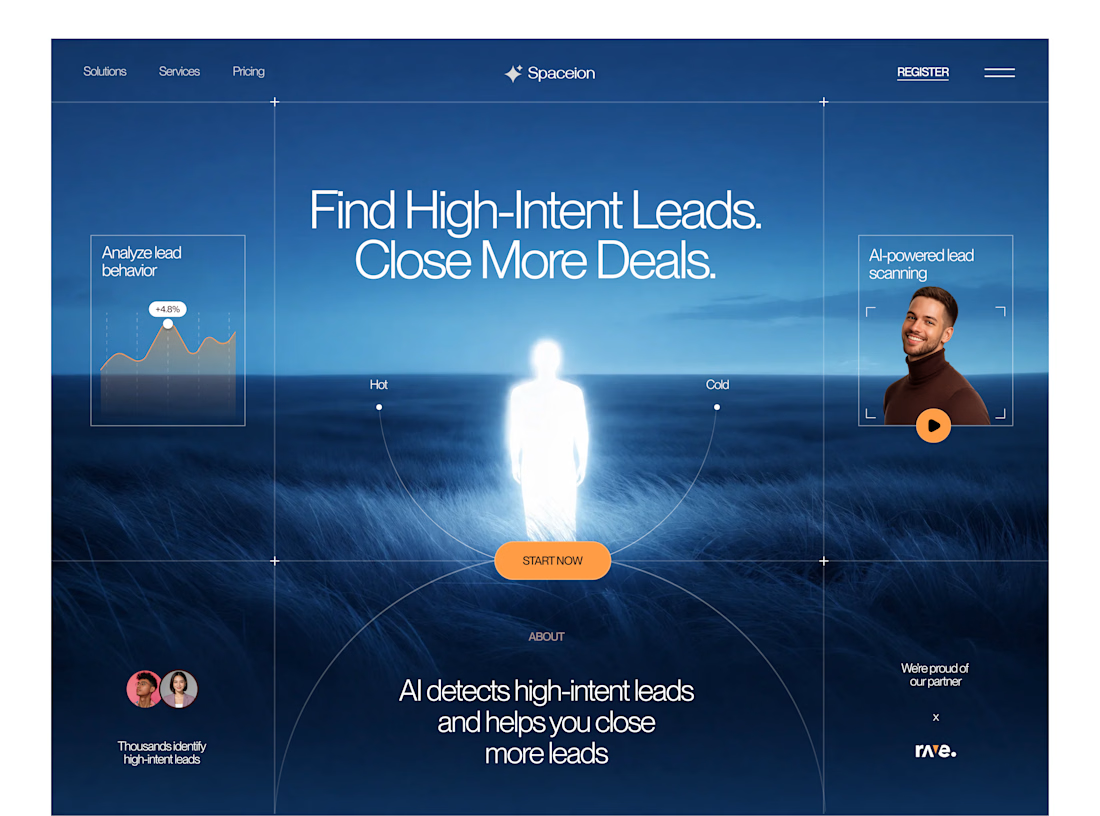

Awesome

A large set of components will be dropping soon on the framer marketplace.
We go all in on templates and components
Stay tuned
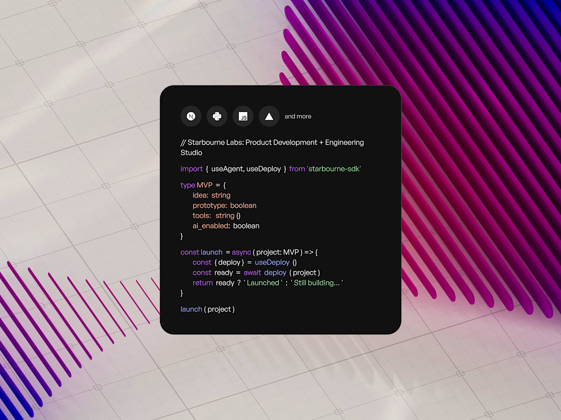

Waiting to explore









Trending

Claude
Claude has entered the design space. How are you using Claude Design?

Contra University
Learn from expert creatives how to earn more using next-gen AI tools.
creativeaiflow
Creative AI workflows are evolving. What tools do you use, and what are their strengths and weaknesses?
freelancerlife
Freelancer life is wins, pivots, and everything in between. What’s yours right now?