The network for creativity
Join 1.25M professional creatives like you
Connect with clients, get discovered, and run your business 100% commission-free
Creatives on Contra have earned over $150M and we are just getting started
Back to feedPost
Taste Test
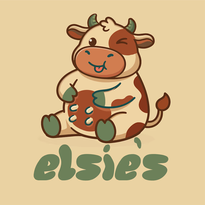
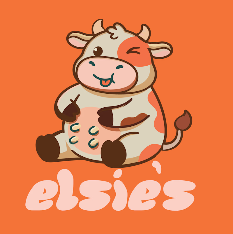
Meet Elsie’s 🐮🍊
Two logo variations, one happy little cow, and a whole lot of personality.
I’m exploring two directions for Elsie’s — a playful milk brand inspired by heritage, rustic charm, honest goodness, and nostalgia.
🌿 Version 1: Earthy, rustic, and rooted in tradition.
🍊 Version 2: Bold, cheerful, and full of playful energy.
Both bring their own character to the brand, but which one feels more like Elsie’s?
More branding and packaging coming soon. 🥛


5 voted
45%
6 voted
55%
11 votes
Closed

Both are so cute! 😍 I’d go with Version 1 for that warm, rustic milk brand vibe.


Thanks alot @Kishan Jotangiya


That’s a great point! 🙌 Version 1 definitely feels closer to the heritage and rustic direction I had in mind. I haven’t tested both at bottle-cap size yet, but that’s my next step to make sure the cow stays recognizable even at smaller sizes. Appreciate the thoughtful feedback! 🐮🥛 @Ali Sabir


Amaizing shivam so nice keep it♥️
Thanks alot @Sagar Nawaz

Going with Version 2, Shivam. The bold orange has more playful energy, which feels right for a milk brand built on charm and nostalgia. That happy little cow is a charmer in both directions though.
The network for creativity
Join 1.25M professional creatives like you
Connect with clients, get discovered, and run your business 100% commission-free
Creatives on Contra have earned over $150M and we are just getting started








Related posts

Logos & Marks — Volume 12
A curated selection of recent logo and identity work.
This collection brings together commissioned projects, unused concepts, and exploratory directions across technology, AI, finance, sports, retail, and other industries.
The work explores geometric symbols, custom typography, monograms, and abstract forms, with a focus on clarity, distinction, and strong visual character.
Selected marks are available for acquisition.
For licensing, customization, or brand identity inquiries, feel free to get in touch.
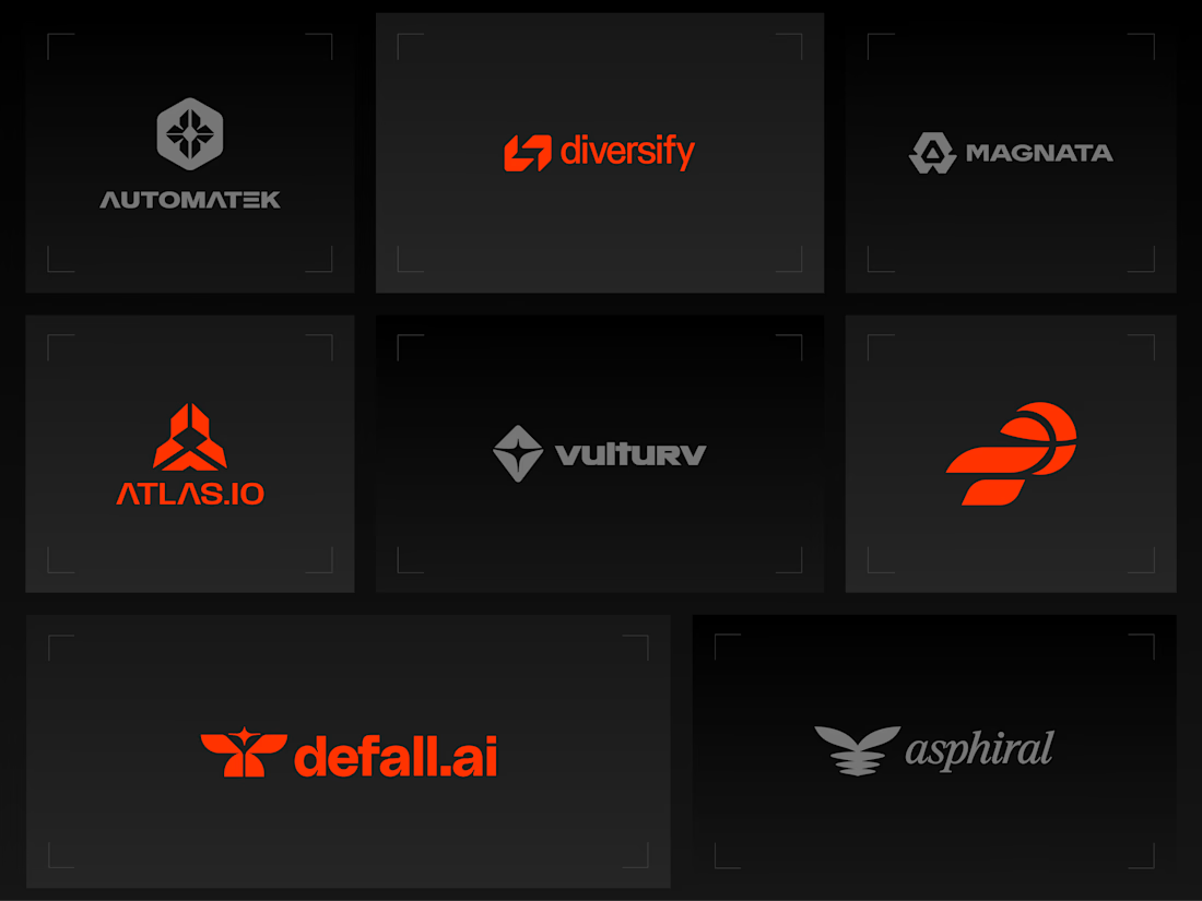
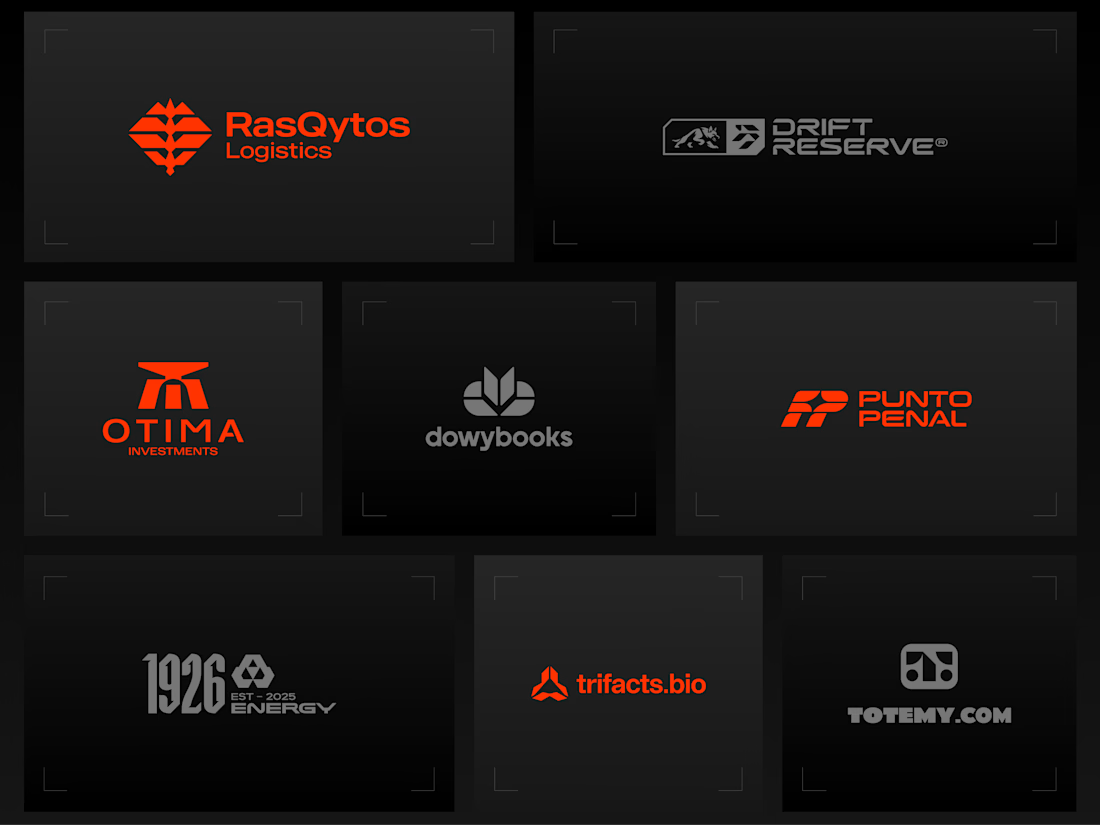
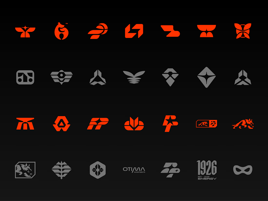


Holding the whole volume to one hot orange on charcoal makes the marks easy to compare, and the Otima symbol stacking a gate shape over the wordmark is my favorite of the set.

Recovery Brand Identity / Logo & Visual Direction
A new identity project for a recovery-focused brand that wanted to move away from the conventional clinical look of its category.
The direction combines clinical credibility with a more modern, movement- and performance-driven visual language.
First look at the logo. Full identity coming next.
Logo design and creative direction by Lepisov Branding
Social media Branding: collab with Mike Creative Mints


The freelancer starter pack for Contra that nobody gives you.
📚 Cuared portfolio with similar work than the clients that you want to get.
⏳ Save a couple minutes or hours a day to engage with the community and apply to Contra Jobs.
📄 Contract (protect yourself before you need to)
📊 Presentation template to stop rebuilding every one from scratch.
💸 Price list (custom quotes, yes. Starting from zero every time, no.)
📋 Client onboarding questionnaire (get the info before the chaos)
✉️ A few email templates for proposals, feedback reminders, and awkward payment conversations.
What would you add to the starter pack?


Great list. I'd add a simple handoff guide for the client, so they can keep the site updated after launch without coming back for every small change.