The network for creativity
Join 1.25M professional creatives like you
Connect with clients, get discovered, and run your business 100% commission-free
Creatives on Contra have earned over $150M and we are just getting started
Back to feedPost
Mobile UX is still the most overlooked area in Shopify stores.
Despite the majority of traffic coming from mobile devices, many stores are still designed and evaluated primarily on desktop.
In audits, I consistently come across the same issues:
• No persistent (sticky) Add-to-Cart on product pages
• Overly long, unstructured product content that’s difficult to scan
• Key information placed too far down the page
• CTA buttons positioned outside natural thumb reach
Mobile is not simply a scaled-down version of desktop.
It reflects a different user behavior altogether faster browsing, shorter attention spans, and a much lower tolerance for friction.
Users on mobile:
Scroll quickly
Make decisions faster
Exit just as quickly if something feels off
A store that performs “well enough” on desktop can still underperform significantly on mobile.
One practical exercise I often recommend:
Review your entire store experience exclusively on your phone navigation, product pages, and checkout flow.
The gaps become obvious very quickly.
When was the last time you evaluated your store purely from a mobile user’s perspective?

The network for creativity
Join 1.25M professional creatives like you
Connect with clients, get discovered, and run your business 100% commission-free
Creatives on Contra have earned over $150M and we are just getting started
Related posts
Awesome work! Highly functional, intuitive, and every pixel is exactly where it needs to be. Looking forward to seeing more projects! ✨🙌
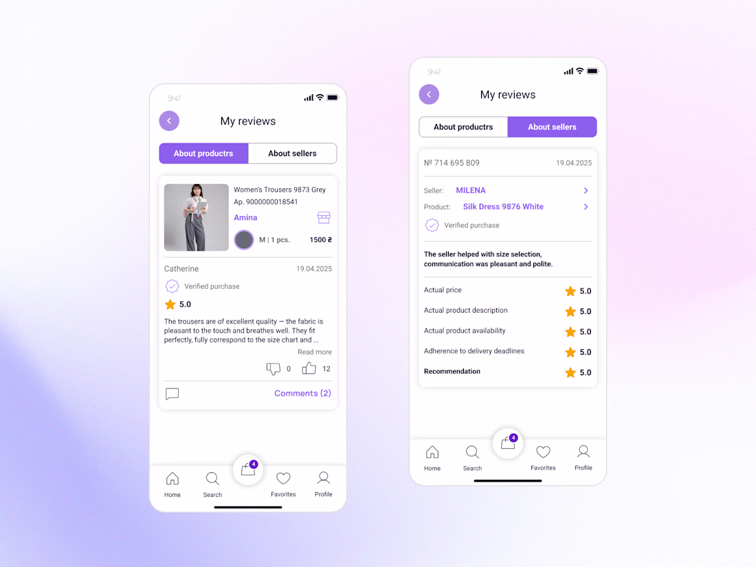
New design update: Reviews & Ratings for a Marketplace Buyer Profile🌟
Reviews are more than just stars - they help people decide who and what they can trust.
While designing this feature, I focused on making reviews clear, transparent, and useful for buyers.
Key improvements:
• Separate reviews about products and sellers for better context.
• Highlight verified purchases to increase credibility.
• Structure feedback so users can quickly find relevant information.
• Create a clean and intuitive experience that supports confident decision-making.
The goal was to turn reviews into a trust-building tool rather than just a collection of ratings.
Part of my ongoing Marketplace App concept. More screens coming soon 👀
Love this approach! Reviews play such a big role in decision-making, and I like how you've focused on making them more useful and transparent instead of just displaying ratings. Excited to see the next screens ✨
Little Voices is a keepsake of your kid's voice. It's for the silly, fleeting, unrepeatable bits, before they grow out of them. https://littlevoices.figma.site
I have thousands of photos and videos of my daughter, but barely any recordings of her voice. Voice memos get buried in a list, and I hardly go back to them. As she grows up , she’s changing faster than I can hold on to her.
So I built Little Voices for the Config Makeathon, but maybe more so for myself, and other parents who might feel the same way.
I've been using it with my daughter, and she loves hearing her own voice. She keeps becoming someone new, and now I get to hear every version of her, whenever I want.
What it does:
🎤 Catch a moment in seconds
📚 Each memory becomes a storybook card, marked by the age your kid was when you caught it
🗂️ Sift through the pile, browse by age like a time capsule, or search by keywords
💭 Prompts to help when you draw a blank
📈 See how often you record, gently — no streaks, no guilt
🧒 A separate collection for each kid
How I built it:
🎨 Figma Weave for the card art. I built a repeatable workflow that generated dozens of cards in a consistent style, instead of prompting one at a time.
✨ Figma Agents for design exploration and a simple design system. Figma-native agents felt like a true design collaborator that understood my context — directly fine-tuning iterated designs was what was missing in my Claude Code / Figma MCP workflows.
🧱 Figma Make to put it all together. The trick: ask it for a plan before executing anything. Reviewing the plan first meant the component came out right the first time, instead of three rebuilds later.
If you have your own version of this in your life, tell me about it in the comments. 🙌
Huge thanks to the Figma support team; I hit a publishing wall on both Sites and Community, and they personally unstuck both for me so I could ship this. This entry couldn't exist without them!
🎨 Figma Community file: https://www.figma.com/community/file/1648859345546148095
This is a great example of creative problem-solving. The final experience feels very polished.
Trending
Claude
Claude has entered the design space. How are you using Claude Design?
Contra University
Learn from expert creatives how to earn more using next-gen AI tools.
MagicPath
The canvas is infinite, and exploration is becoming the workflow. How are you using MagicPath?
creativeaiflow
Creative AI workflows are evolving. What tools do you use, and what are their strengths and weaknesses?
freelancerlife
Freelancer life is wins, pivots, and everything in between. What’s yours right now?