The network for creativity
Join 1.25M professional creatives like you
Connect with clients, get discovered, and run your business 100% commission-free
Creatives on Contra have earned over $150M and we are just getting started
Back to feedPost

HR Analytics Dashboard — Project Description
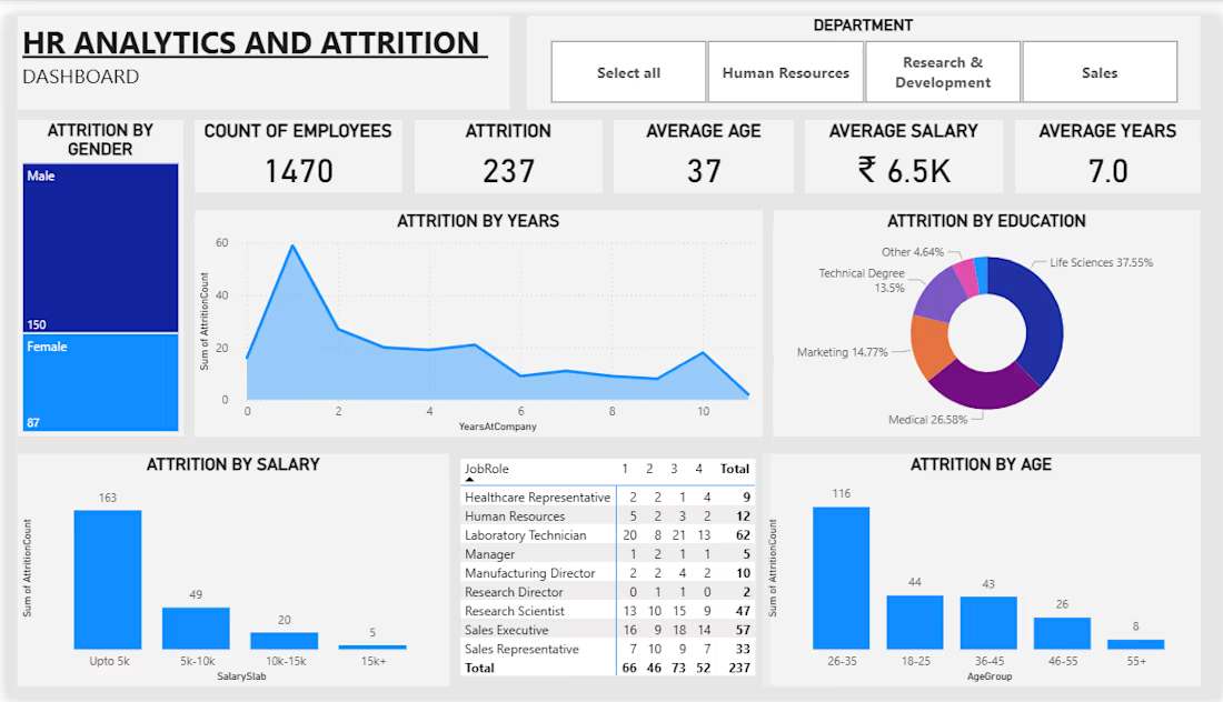
An interactive Power BI HR Analytics Dashboard designed to analyze employee attrition and workforce trends. The dashboard provides insights into employee count, attrition rate, average age, salary, years at the company, education, job roles, salary ranges, and gender-based attrition.
I used data cleaning, Power Query, DAX, KPI cards, charts, tables, and interactive filters to identify employee attrition patterns and understand which departments, job roles, salary ranges, and age groups have higher attrition.
Tools: Power BI, Power Query, DAX, Data Visualization


The network for creativity
Join 1.25M professional creatives like you
Connect with clients, get discovered, and run your business 100% commission-free
Creatives on Contra have earned over $150M and we are just getting started





Related posts

Developed an interactive HR Analytics & Attrition Dashboard in Power BI to analyze employee attrition and workforce trends. Analyzed 1,470 employee records across age groups, salary levels, and departments, using KPI cards, charts, filters, and DAX to deliver actionable workforce insights.

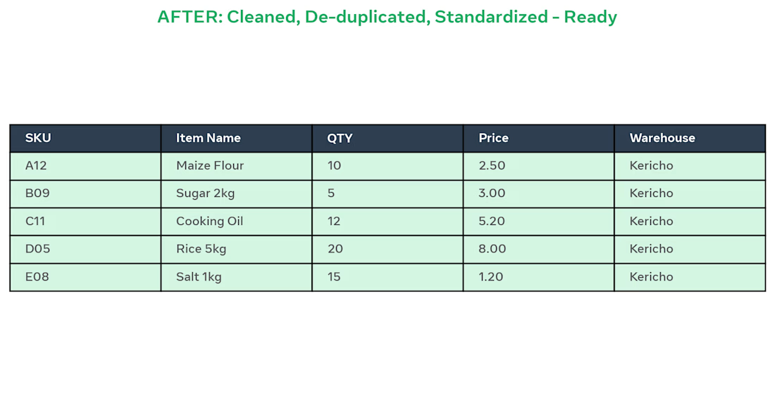
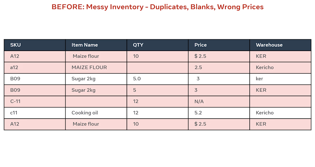
BEFORE: Client had messy Excel inventory with 500 rows, duplicates (A12 / a12), blanks, wrong prices like "$ 2.5" and "N/A", and different warehouse names (KER / ker / Kericho).
AFTER: I did:
Removed 12 duplicate SKUs
Standardized item names to Title Case
Fixed QTY and Prices to 2 decimals
Unified Warehouse to Kericho
Made sheet ready for pivot dashboard
Result: Clean, ready-to-use inventory in 2 days using Excel.
Tools: Excel, Remove Duplicates, Text to Columns, TRIM, PROPER

I designed and developed a Spotify-inspired Music Analytics Dashboard in Microsoft Power BI, combining data modelling, DAX, interactive navigation, and custom dashboard design into a single analytical experience.
The dashboard allows users to explore music data from different perspectives — from overall performance and popularity to individual artists, songs, albums, and trends over time.
What I built
- Overview Dashboard — high-level KPIs and music performance trends
- Artist Analytics — artist rankings, song counts, popularity and catalogue analysis
- Song Analytics — song popularity, duration, year-wise analysis and album insights
- Interactive Navigation — seamless movement between dashboard sections
- Dynamic Visual Analysis — monthly trends, popularity patterns and category comparisons
- Detailed Data Tables — deeper exploration beyond summary-level KPIs
- Spotify-inspired UI — dark, modern interface designed around the visual identity of a music streaming platform
Key metrics explored
- 342 Artists
- 789 Distinct Songs
- 562 Albums
- Average Song Duration: 3.28 minutes
- Average Popularity: 90
Tools & Skills
Power BI · DAX · Data Modeling · Data Visualization · Interactive Dashboard Design · KPI Development · Business Intelligence
The goal wasn't simply to create another Power BI report — it was to make the data explorable, intuitive and visually engaging.
Interested in turning your own data into an interactive Power BI dashboard? Let's connect.