The network for creativity
Join 1.25M professional creatives like you
Connect with clients, get discovered, and run your business 100% commission-free
Creatives on Contra have earned over $150M and we are just getting started
Back to feedPost
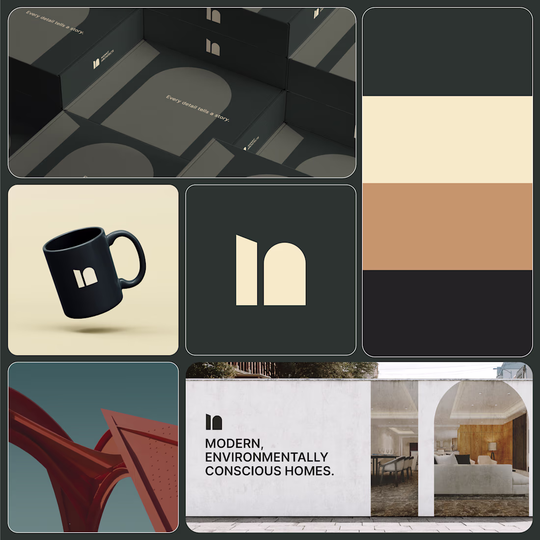
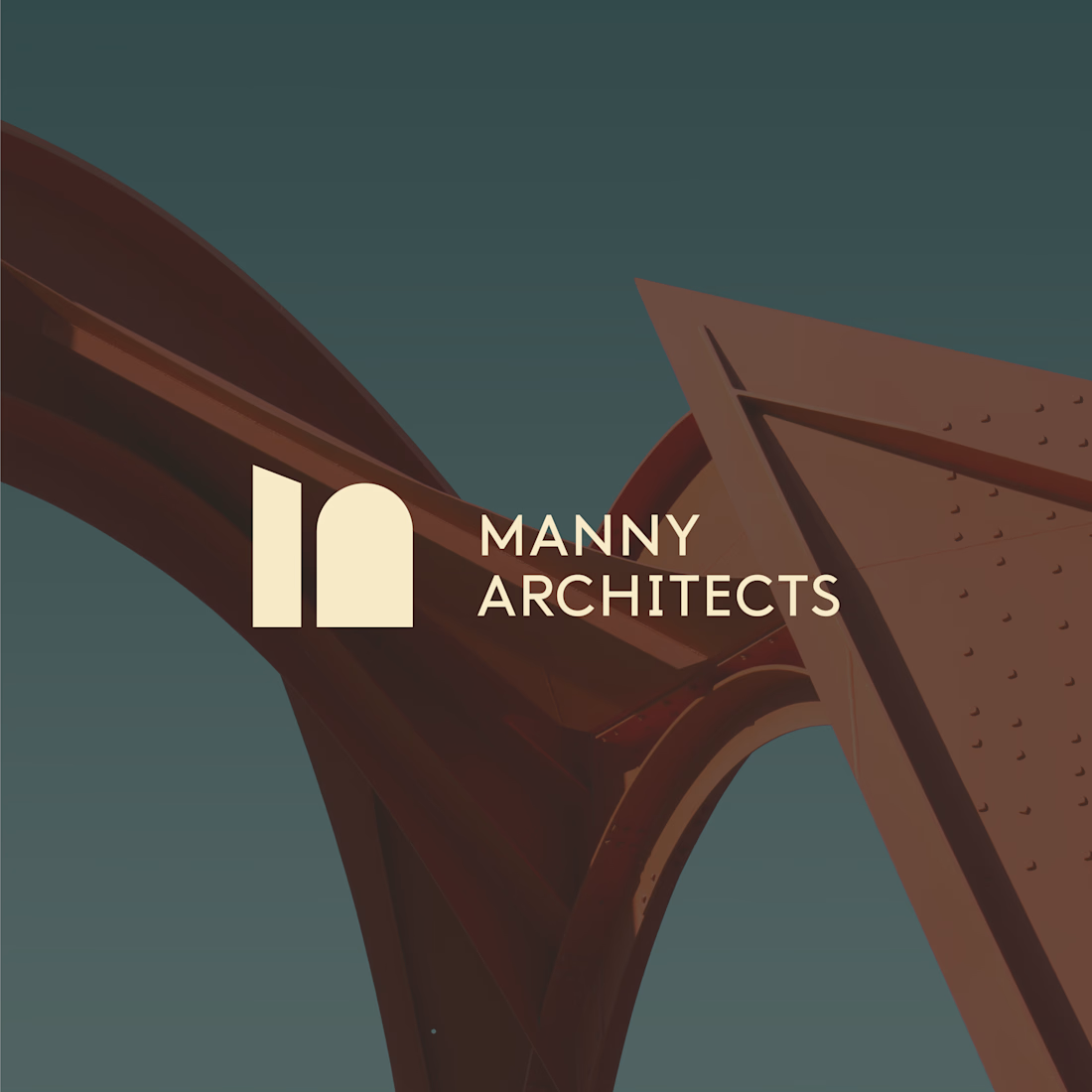
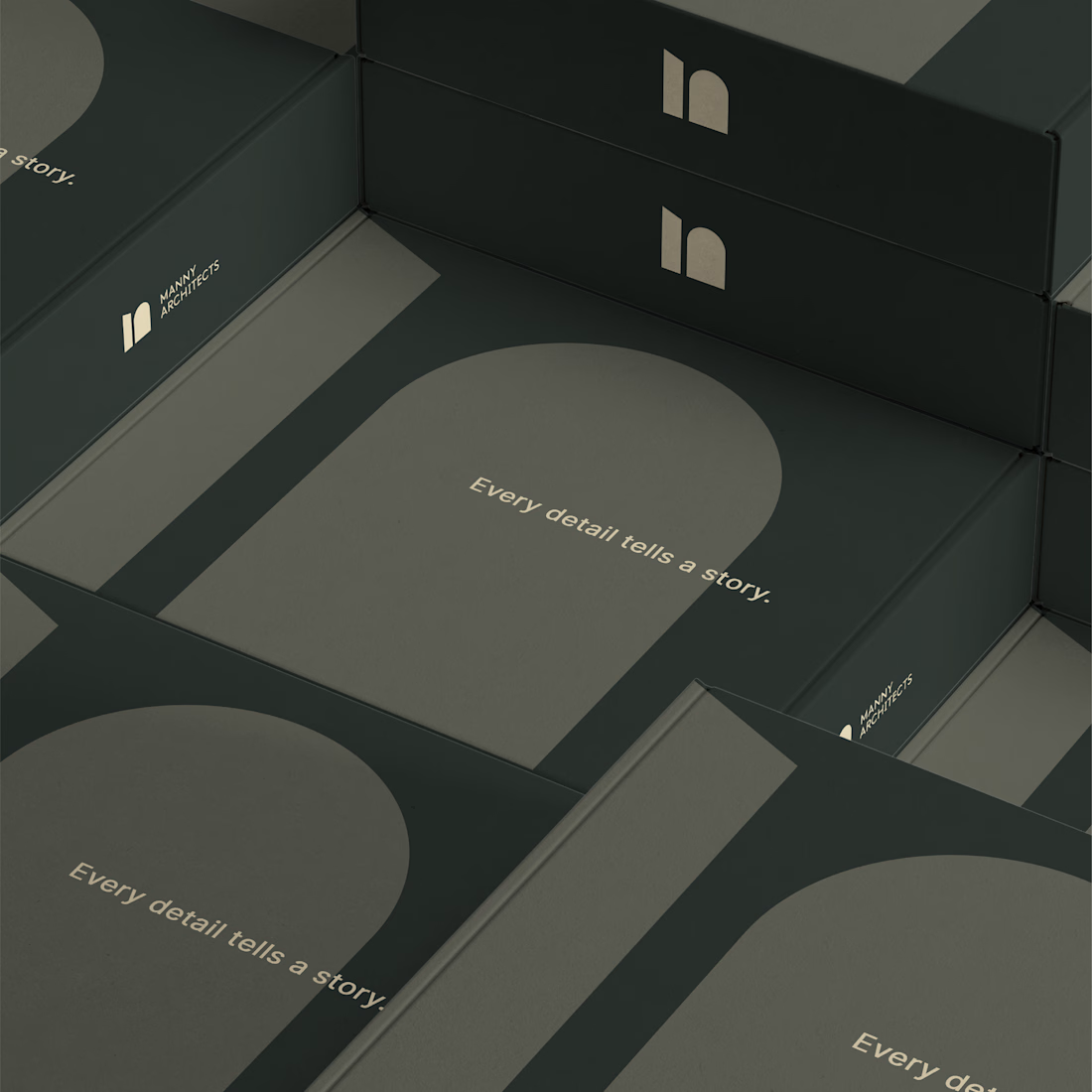
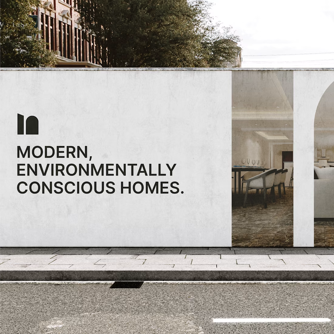
Worked on this logo for an architectural design firm last year— a project that taught me how simple forms can carry deep meaning.
The logo combines both modern and historical forms, creating a symbol that’s not only balanced but also carries a deeper meaning. On closer look, the logomark subtly represents the Tamil letter “ம” (M), adding a beautiful layer of cultural connection to the design.
@Dhananjayan V Beautiful balance of form and meaning
@Jonathan Bensimon Yes, it really is. Thanks
@Dhananjayan V Looking Nice
@Prakash Sannasetti Thank you!
The network for creativity
Join 1.25M professional creatives like you
Connect with clients, get discovered, and run your business 100% commission-free
Creatives on Contra have earned over $150M and we are just getting started
Trending
Claude
Claude has entered the design space. How are you using Claude Design?
Contra University
Learn from expert creatives how to earn more using next-gen AI tools.
creativeaiflow
Creative AI workflows are evolving. What tools do you use, and what are their strengths and weaknesses?
freelancerlife
Freelancer life is wins, pivots, and everything in between. What’s yours right now?