The network for creativity
Join 1.25M professional creatives like you
Connect with clients, get discovered, and run your business 100% commission-free
Creatives on Contra have earned over $150M and we are just getting started
Back to feedPost
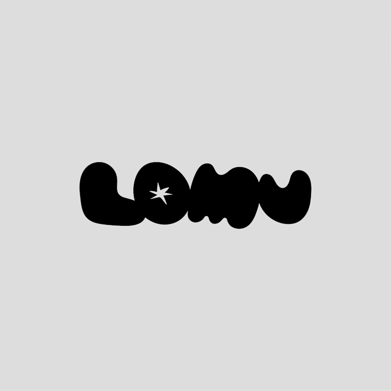
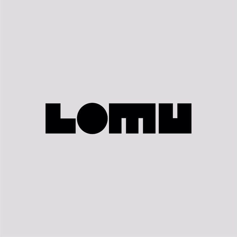
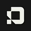
Taste Test
Two concepts for LOMU, a modern, minimal photobooth brand. Each one delivers a different feel and attitude.
Which one do you prefer, and why? Your choice helps me lock the right direction fast.
85 voted
55%
69 voted
45%
154 votes
Closed
Thanks in advance for your contribution :)


Hey Pawel, both look cool. Organic seems more unique/memorable.
Personally, I like the geometric one more. Maybe consider who the target audience is and what would stick in their mind better?
Yes, that’s a fair point. Each direction speaks to a different audience, so this needs some thought.
I appreciate your input, Aleksandrs.
Great work nevertheless! Good luck 🙌

The organic one! love the spark or "flash" on the O!
Glad you noticed it :) Thank you for the input Anita!
Hi Pawel. Both logos look great.
I went with the Geometric one because photobooths are technical bits of kit and felt the geo version seems like a better fit. I just didn't get that feeling from the organic version.
However, having said that, if the photobooth was used for...
Hi, love this feedback, super clear and spot on :)
You’re right. The geometric mark fits the technical side of photobooths better. It feels precise, reliable, and built like the product itself. The organic version leans more emotional and works best when the focus shifts to parties and social moments.
Glad you like both!

I think the correct choice is written by you in the first line of this post "Modern, Minimal"..
The geometric one turns out to be much more in line with the keywords you wrote.
Valid point, you’re totally right. The geometric one feels more modern and fits the technical nature of the photobooth :)
Thanks for the input.

Thank you, Milena. :)
Your feedback makes a lot of sense when I look at it.

As a brand designer for over four years, I suggest going with the geometric option as it better supports the brand's vibe. simple.
Thank you for your input!

Both are good.
I like the organic one.
Depends on the brand persona
The votes are nearly split 50/50, so it really comes down to which audience the brand wants to appeal to.

Visually I prefer the right hand one (Organic) but totally depends on core of the brand.
Makes perfect sense, thanks James!

Love the Geometric one mate
clean, sharp, proper timeless. Gets my vote! 👍
Thank you for your input!
Organic looks more fun and memorable like a photobooth should feel
It is 50/50, which is surprising, the organic one is more approachable for sure.
Thank you Valerie for your vote :)

I mean, it’s almost a 50/50 split vote-wise. Thank you!

The geometric is dope man!
Thank you! really appreciate your input.

If it's modern and minimal then "Organic" doesn't even make it here
Well, the organic one is also minimal flat design, but definitely may appear less modern.
Thank you for contributing. :)

Hello Luis, thanks for the input.
Fun fact, when I was unifying the wordmark I was actually playing around with a few options already.
It might be a clever idea to turn the letters into a visual system, using them as modular blocks that can be moved around.

The organic one looks more professional, great work by the way
Thank You Muhamad for your opinion, glad you like the work! :)

both of them can make peoples attracted each has it own sense and feel
100%! Thank you for your contribution.
“Thank you for the feedback, happy to contribute.”
The network for creativity
Join 1.25M professional creatives like you
Connect with clients, get discovered, and run your business 100% commission-free
Creatives on Contra have earned over $150M and we are just getting started


Trending
maxearnings
The next frontier of payments is live on Contra. How are you maximizing revenue?
micrographics
Micrographics started as utility - barcodes, packaging, instruction labels. How would you use them?
aidesignflow
AI tools are redefining how designer work. What does your workflow look like?
aivideo
AI video tools are moving at warp speed. What tools are you using?
whennotai
As AI accelerates, creative judgment matters more. What part of your work stays human?