The network for creativity
Join 1.25M professional creatives like you
Connect with clients, get discovered, and run your business 100% commission-free
Creatives on Contra have earned over $150M and we are just getting started
Back to feedPost

Sales Performance Dashboard | Excel & Power BI
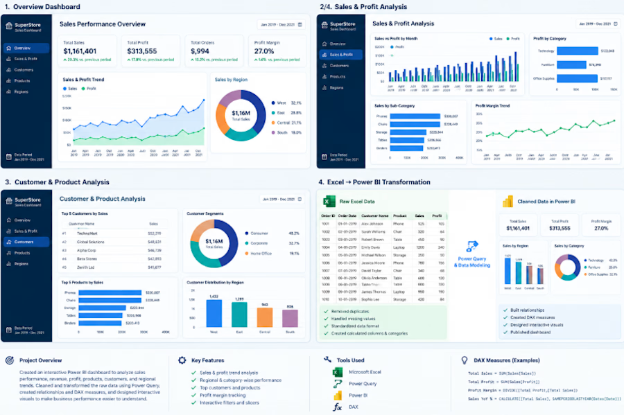
Created an interactive business intelligence dashboard to analyze sales, profit, customers, products, and regional performance.
The project involved cleaning and transforming raw Excel data using Power Query, creating data relationships and DAX measures, and designing interactive Power BI dashboards with KPIs, trends, charts, and filters.
Key features:
Sales and profit KPI tracking
Monthly sales and profit trends
Regional performance analysis
Category and sub-category analysis
Customer and product performance
Interactive filters and slicers
Data cleaning and transformation
Power BI data modeling and DAX calculations
Tools: Microsoft Excel, Power Query, Power BI, DAX


The network for creativity
Join 1.25M professional creatives like you
Connect with clients, get discovered, and run your business 100% commission-free
Creatives on Contra have earned over $150M and we are just getting started







Related posts

Manufacturing ERP & Production Intelligence Dashboard


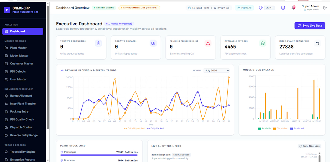

The dark plant nav next to the light data canvas keeps the menus from fighting the charts. Putting the packing trend beside stock balance makes the floor numbers readable at a glance.

📊 Superstore Sales Analysis — Complete Business Analytics Project
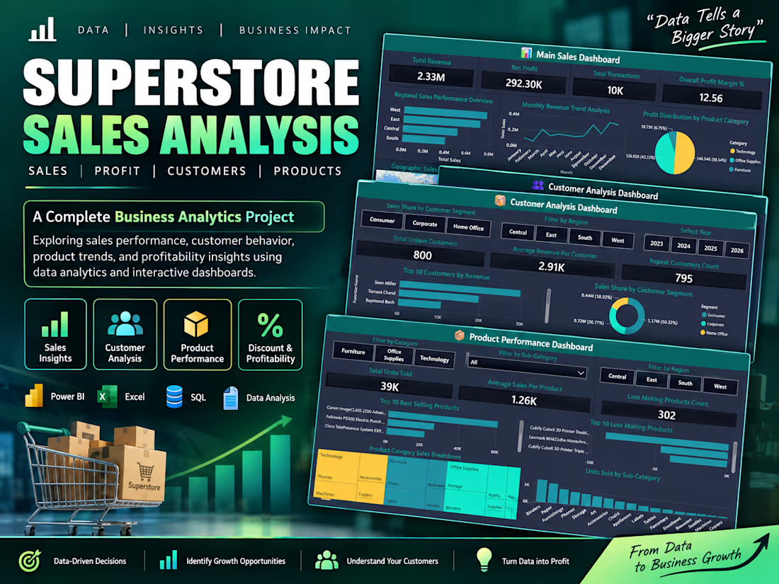
Turned 10,194 rows of raw retail data into a 3-dashboard Power BI system covering Sales, Customers, and Product Performance.
🔹 Main Sales Dashboard — ₹2.33M revenue tracked, 12.56% profit margin, regional & monthly trend breakdowns
🔹 Customer Analysis Dashboard — 800 unique customers segmented, top revenue drivers, repeat customer tracking
🔹 Product Performance Dashboard — 39K units sold, best-sellers vs. loss-making products flagged by category
Built end-to-end with Excel → MySQL → Power BI, this project turns raw transactional data into decisions: what's selling, who's buying, and where the money's leaking.
Tools: Power BI | Excel | SQL | Data Analysis
51 interactive visuals | 4 dashboards | Real business KPIs
📁 Full project + dataset on GitHub — link in profile
From data to business growth. 🚀
#DataAnalytics #PowerBI #SQL #BusinessIntelligence #DataDrivenDecisions

Personal Finance Dashboard UI/UX Design
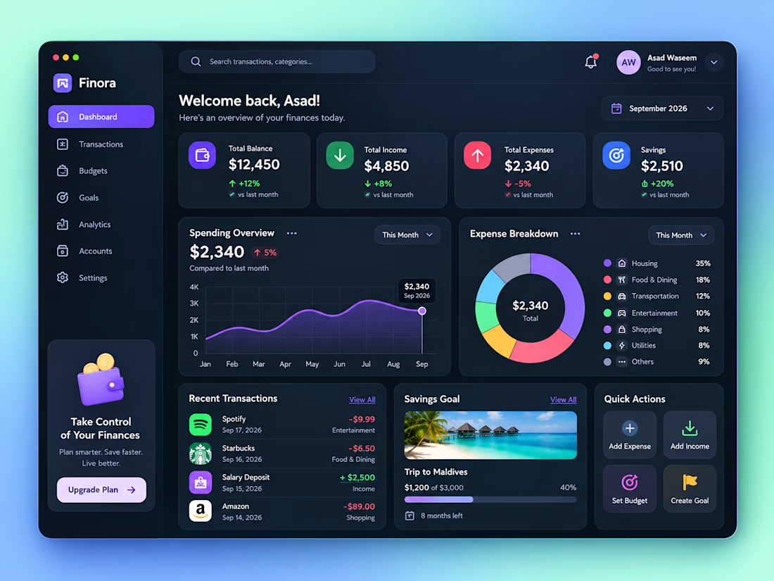
Designed a modern Personal Finance Dashboard UI/UX, focused on making financial management simple, clear, and visually engaging.
The dashboard includes financial overview cards, income and expense tracking, spending analytics, expense breakdown, recent transactions, savings goals, budgets, accounts, and quick actions.
The dark-mode interface combines a clean layout, modern typography, subtle shadows, gradient background, rounded cards, and vibrant accent colors to create a premium SaaS dashboard experience.


How did you prioritize the financial overview over the deeper analytics?