The network for creativity
Join 1.25M professional creatives like you
Connect with clients, get discovered, and run your business 100% commission-free
Creatives on Contra have earned over $150M and we are just getting started
Back to feedPost
Taste Test

Design a Finech App. Which Ui direction is better.
I'll reveal the client's choice at 50 likes.
0 voted
1%

0 voted
1%

0 votes
Closed
The network for creativity
Join 1.25M professional creatives like you
Connect with clients, get discovered, and run your business 100% commission-free
Creatives on Contra have earned over $150M and we are just getting started





Related posts


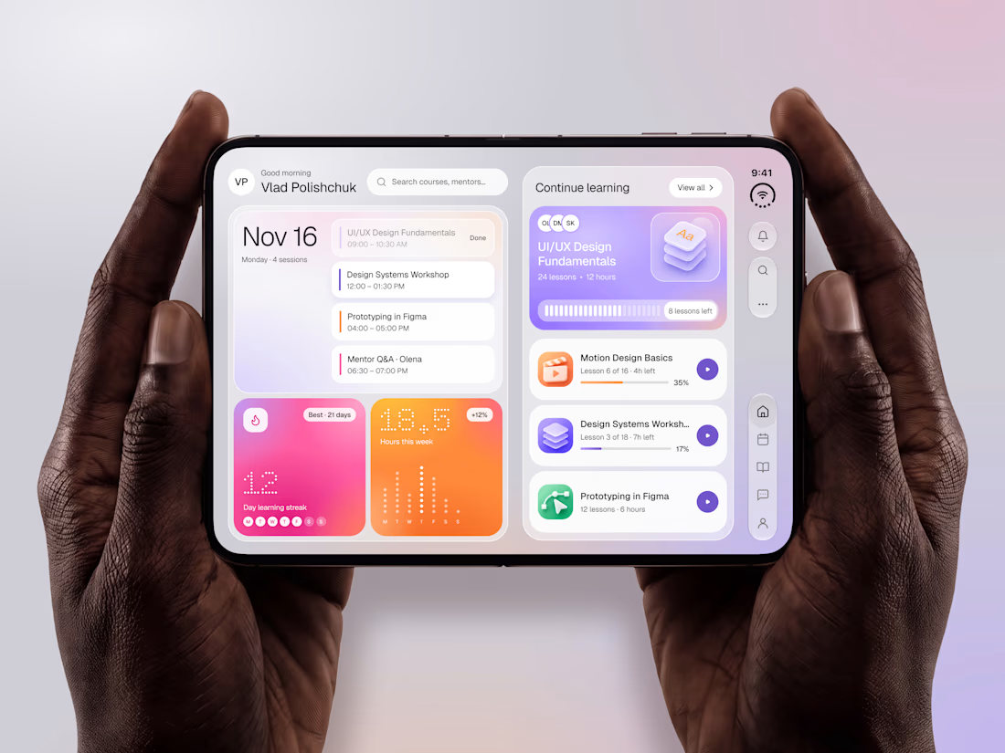

The purple gradients keep learning lively and fun.


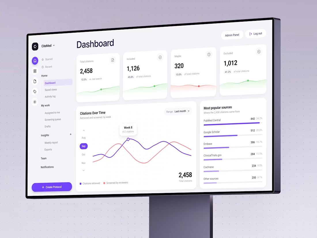
Trust me, nobody has ever said: “I can’t wait to screen 2,458 citations today.”
We designed CiteMed so the immense data to scan doesn't feel like a punishment. Clinical evidence, minus the headache.
Check the case
What’s the most boring task a good interface ever made you enjoy?

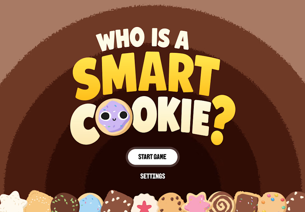

The cookie row at the bottom does a lot of work. Looks fun to play.