The network for creativity
Join 1.25M professional creatives like you
Connect with clients, get discovered, and run your business 100% commission-free
Creatives on Contra have earned over $150M and we are just getting started
Back to feedPost

𝗖𝗿𝗲𝗮𝘁ed 𝗮 𝗧𝗵𝗿𝗲𝗲-𝗦𝘁𝗲𝗽 𝗙𝘂𝗻𝗻𝗲𝗹 𝗳𝗼𝗿 𝗘𝗳𝗳𝗲𝗰𝘁𝗶𝘃𝗲 𝗘𝗻𝗴𝗮𝗴𝗲𝗺𝗲𝗻𝘁 📈 (𝗪𝗶𝘁𝗵 𝗧𝗲𝘀𝘁𝗶𝗻𝗴)
In this video, I walk through how I built a simple and effective three-step funnel designed to improve user engagement and streamline the customer journey.
𝗧𝗵𝗲 𝗳𝘂𝗻𝗻𝗲𝗹 𝗶𝗻𝗰𝗹𝘂𝗱𝗲𝘀:
Step 1: A Form Page to capture user details
Step 2: A Calendar Widget Page to make booking the next step easy and seamless
Step 3: A Thank You Page with an improved message for better visibility and user experience
I also showed how each page was edited to include the right elements and flow properly from one step to the next. To make sure everything worked as expected, I tested the full funnel setup as well.
𝗡𝗲𝗲𝗱 𝗮 𝗳𝘂𝗻𝗻𝗲𝗹 𝗹𝗶𝗸𝗲 𝘁𝗵𝗶𝘀 𝗳𝗼𝗿 𝘆𝗼𝘂𝗿 𝗯𝘂𝘀𝗶𝗻𝗲𝘀𝘀? 𝗟𝗲𝘁’𝘀 𝗰𝗼𝗻𝗻𝗲𝗰𝘁.

The network for creativity
Join 1.25M professional creatives like you
Connect with clients, get discovered, and run your business 100% commission-free
Creatives on Contra have earned over $150M and we are just getting started



Related posts


Which homepage would make you more likely to explore the platform?
HackStack features bold typography, teal gradients, and a centered layout focused on AI tools and automation. DataVistaHQ uses purple accents, a split layout, and a prominent dashboard preview to introduce its business intelligence platform.
I would like your perspective on the visual design, clarity, and first impression. Which approach communicates its value more effectively and makes you want to take the next step?
Vote for your preferred design and share what influenced your choice: the colors, headline, layout, dashboard preview, or overall presentation.
#WebDesign #AIWebsites #UIUXDesign #SaaSDesign #TransformedDesign

2 voted
17%

10 voted
83%

12 votes
Closed

Visually, I lean toward DataVistaHQ, but the cognitive load is really high. The value proposition and the stats feel like they're competing for attention.
On the other hand, HackStack has a much better visual hierarchy. The value proposition and CTA group immediately give me a...


A simple Kajabi funnel that works
You don't need a complicated funnel in Kajabi. Start with four pieces:
Opt-in page: one promise, one form, nothing else
Thank-you page: deliver the freebie and point to the next step
Email sequence: 3–5 emails that teach first, then invite
Sales page: the offer, proof, FAQ, and one button repeated
Build it with a Kajabi Pipeline, then style each page to match your brand, so it doesn't look like every other Kajabi site.
Building in Kajabi right now? Tell me which step you're stuck on.
#Kajabi #SalesFunnel #OnlineCourse #KajabiWebsite #CourseCreator


I’d add one test before sending traffic: submit the opt-in with a fresh email, check the freebie delivery, then follow the sales-page CTA through checkout. The pages can look finished while a tag, email or access rule still breaks the journey.
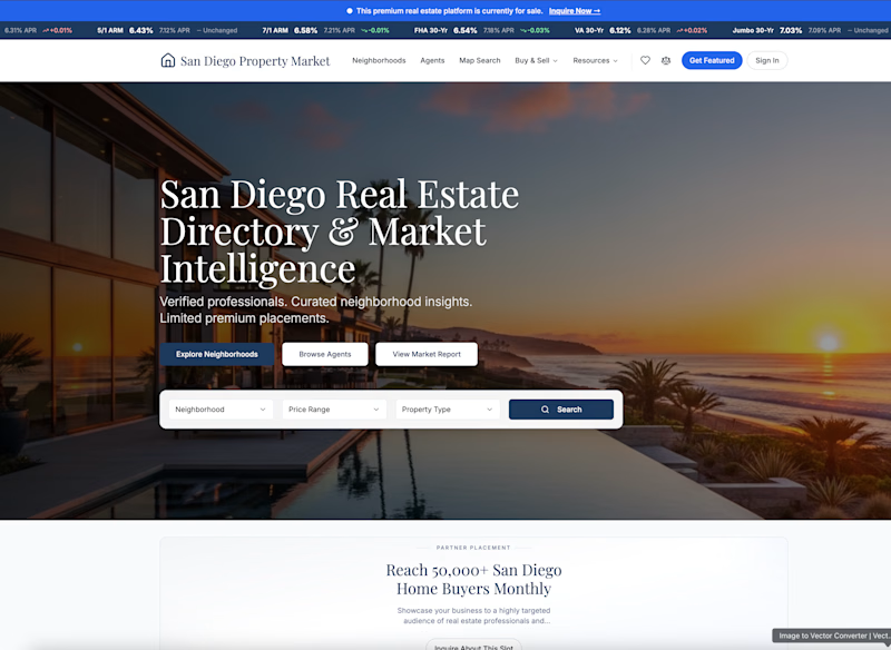
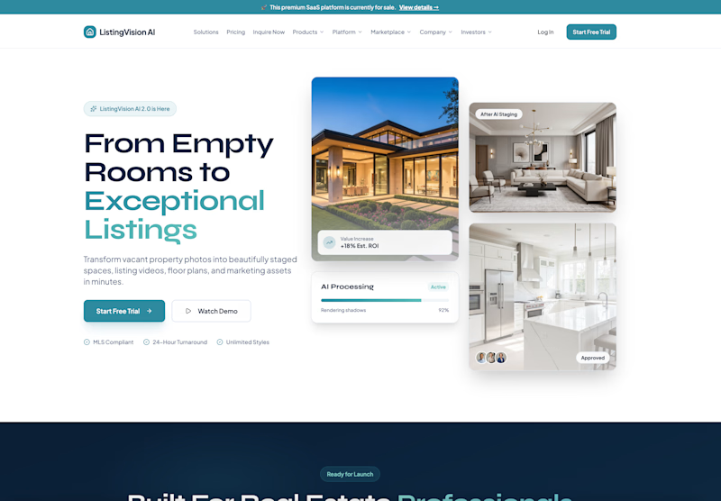
Which real estate homepage makes the stronger first impression?
ListingVision AI features a bright layout, teal accents, and property imagery to introduce its AI staging and listing tools.
San Diego Property Market pairs coastal photography with classic typography, neighborhood search, and market resources.
Which design feels more inviting and makes you want to explore further? Does the clean presentation of ListingVision AI catch your attention, or do you prefer the location-focused experience of San Diego Property Market?
Vote for your favorite and share what influenced your choice: imagery, colors, typography, layout, or calls to action.
#WebDesign #RealEstateMarketing #AIWebsites #UIUXDesign #TransformedDesign
3 voted
43%
4 voted
57%
7 votes
Closed

ListingVision AI. One clear primary button and the staged before/after right in the hero, while San Diego asks you to choose between three equal buttons and a search bar before you know why.