The network for creativity
Join 1.25M professional creatives like you
Connect with clients, get discovered, and run your business 100% commission-free
Creatives on Contra have earned over $150M and we are just getting started
Back to feedPost


Your skincare page has 17 "READ MORE" buttons – but zero reasons to buy. That's not a product page. That's a library catalog.
Just redesigned the product page for Even Glow – a skincare brand.
The old page was a conversion disaster:
· 17 "READ MORE" buttons – scattered everywhere. Buyers don't want to read more. They want to buy.
· No product focus – what am I buying? A cream? A serum? A supplement? No clarity.
· No price – $0 listed. Buyers can't buy what they can't see.
· No Add to Cart button – the most important element on any product page. Missing.
· No social proof – "Real stories from real women" mentioned but no reviews, no ratings, no customer count.
· No trust badges – 30-Day Guarantee mentioned once at the very bottom. Buried.
· Scattered content – "Improve dark spots," "Needle-Free Skin Renewal," "Move Forward With US" – all disconnected. No flow.
· Repetitive sections – "Inside Your Even Glow" and "Improve dark spots" copied multiple times.
The new product page I built:
· Single product focus: One clear product – Even Glow Skincare. No confusion.
· Price anchoring: Show original price crossed out → [Price] (Save X%). Instant "deal" perception above the fold.
· Benefit hierarchy: 21% fewer wrinkles in 12 weeks → Improves dark spots → Effortless balanced glow. Benefits > Features.
· Social proof stacked: ★★★★★ (X reviews) + "Real stories from real women" – credibility before they scroll.
· Trust stacked: 30-Day Risk-Free Guarantee + Free Shipping + Secure Checkout – every objection killed before the CTA.
· Clear CTA: "ADD TO CART" – not "READ MORE." Buyers want to buy.
· Clean visual structure: Product name → Ratings → Price → Benefits → Ingredients → Add to Cart. No hunting, no confusion.
Result? A page that stopped being a library catalog and started selling confidence, clarity, and glowing skin.
If your product page has more "READ MORE" buttons than reasons to buy, DM me "PDP" – I'll audit your page and show you exactly where you're losing buyers. No fluff. Just honest feedback.


The network for creativity
Join 1.25M professional creatives like you
Connect with clients, get discovered, and run your business 100% commission-free
Creatives on Contra have earned over $150M and we are just getting started











Related posts


Hourfield is a 16-second 16:9 launch film for products that organise people's time: calendars, schedulers, booking and reservation apps, planners. Retype a few short lines, drop in your logo and rename the calendar's days and tiles (meetings, table bookings, classes, shifts): the week re-plans itself on screen and the film lands on your logo lockup. Our second version, Maréva, a fictional table-booking app, turns the working week into an evening of reservations on the same animation and timing.
Built end-to-end through the SVGator MCP server. The calendar that re-plans its own week, the orbit that swirls into a single dot and the lines centred by their real letter shapes (fonts measured, not eyeballed) were computed in Python and written straight into a live SVGator project as 780 editable keyframes; I directed every note and finished it in the canvas. Maréva was made the same way, on the same timeline. Everything stays a real layer: 50 live text layers, named elements (headline, logo, product-name, tagline) and one logo image animated in two moments.
Yes, there is a lot to edit: every line of the story, a whole week of calendar tiles, a palette in nine roles. A full rebrand takes longer than five minutes, and that is the honest trade: it shows how much a single SVGator file can carry, and how MCP makes a detailed, story-driven film practical to re-make, not just to watch.
Links:
▶ Template (SVGator)
▶ Demo video, A → B


Love the smooth flow and the text animation! Good luck!

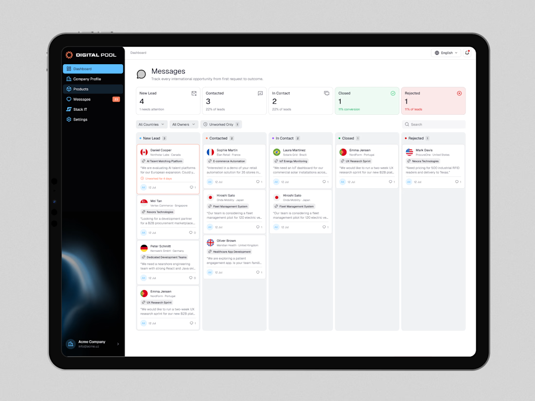
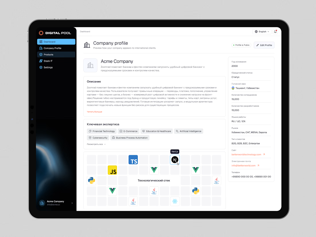
Digital Pool — Website Redesign & Product Dashboard Design
Digital Pool is a digital marketplace connecting businesses with verified software vendors, IT companies, and technology solutions.
The goal was to create a modern, intuitive experience for both businesses looking for technology partners and companies showcasing their products and services.
My work covered the public-facing website and a dedicated company dashboard, including company profiles, product management, application workflows, lead tracking, and account settings.
I focused on simplifying complex workflows, improving information hierarchy, and building a consistent design system across the entire platform.
The result is a cohesive digital ecosystem that makes discovering solutions, managing products, and connecting with potential clients easier.
Live website: https://digitalpool.gov.uz/en

That's really great digitalmarket place dashboard 🎉🎉🎉
Great job 🎉

Traditional corporate training often feels disconnected from everyday work. Skillio helps bridge that gap with personalized five-minute sessions, job-specific AI simulations, and instant feedback.
The mobile experience supports role-based learning across professions, with interactive chat and voice exercises that recreate realistic workplace situations. A lime-green, lavender, and deep-green palette, bold typography, and a flower-shaped performance chart make progress easy to understand and engaging to explore.
Explore the project on Dribbble:
https://dribbble.com/shots/27808131-Mobile-App-Powered-Employee-Training

Sweeet