The network for creativity
Join 1.25M professional creatives like you
Connect with clients, get discovered, and run your business 100% commission-free
Creatives on Contra have earned over $150M and we are just getting started
Back to feedPost

Why lists with dense information items can't have some fun. How about we squeeze in more items in a single fold where all the primary information is visible at a glance, and the secondary info reveals itself as you scroll up. I am calling this "Spatial Compression Progressive disclosure thing." There is some complicated maths going behind which Claude Opus 4.6 took care gracefully.
Instagram post: https://www.instagram.com/p/DVVAM1OAsI6/
Try out yourself: https://sharp-aid-69571830.figma.site/
Feel free to remix: https://www.figma.com/community/file/1609795163968903922
Beware, the scroll ticking sound which Figma Make generated in a single prompt is highly addicting.


This is seriously amazing.
The network for creativity
Join 1.25M professional creatives like you
Connect with clients, get discovered, and run your business 100% commission-free
Creatives on Contra have earned over $150M and we are just getting started
Challenges
View all


Related posts


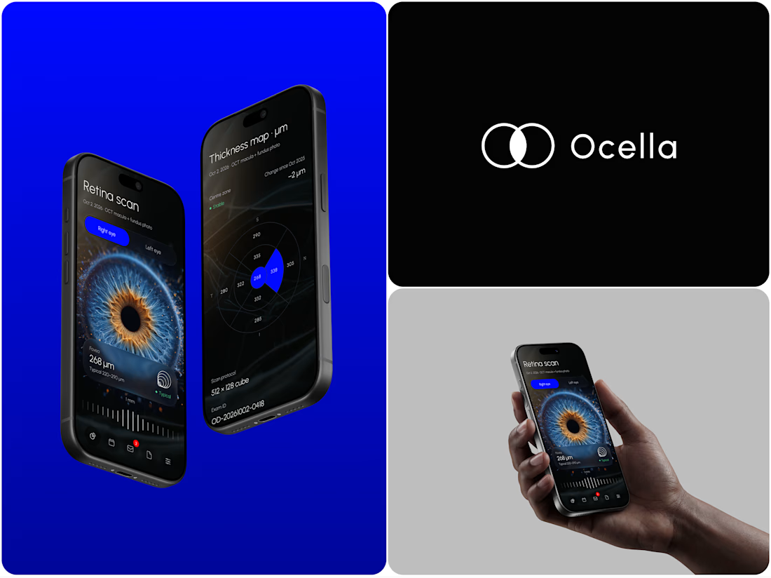
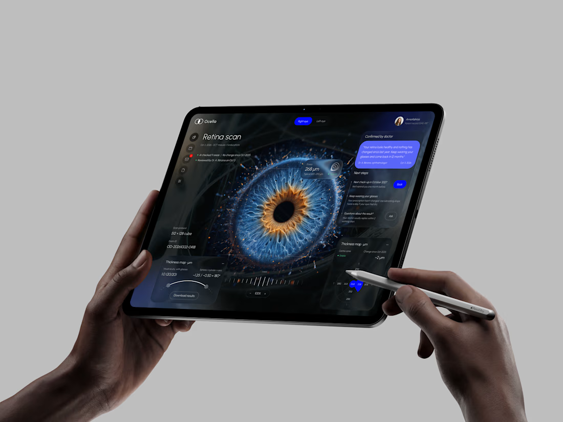
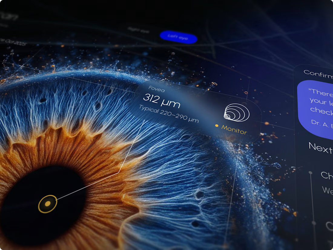
Ocella Eye Exam Results Portal
Clear results build trust. Patients know what their exam means and what to do next, and doctors spend less time explaining the same numbers.


I never see design like this before thats unique 🎉🎉🔥🔥


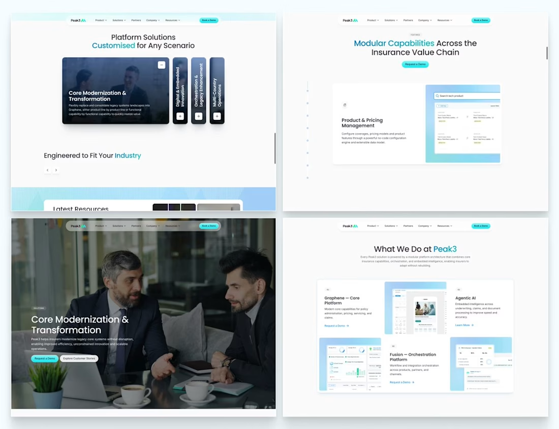
Our Peak3 website build covered 17 page templates and six CMS collections. At that scale, the questions about publishing deserve as much attention as the finished pages.
A blog post, a whitepaper and a careers entry need different information. Making them editable is only part of the design problem. The person adding the next entry also needs to understand what is missing and what happens when they publish it.
Here’s a hypothetical review I’d run before a CMS handoff: create a whitepaper entry, add the title and cover, then leave out the download file.
Does the editor flag the missing file? Can someone preview what the visitor will see? If the entry can still be published, does it create a download button that leads nowhere?
I’d use that test to decide which fields must be required and which incomplete states need an explanation.

Beautifully executed work


So excited to see Creative Intelligence 2026 by @Contra Labs out in the world!
At @Heed Collective , we had the pleasure of designing both the website and the report. We’re incredibly grateful for this collaboration!
Our creative exploration started with a question:
What does Creative Intelligence mean today?
We believe it lives at the intersection of creativity and analysis, imagination and insight.
We translated this into a visual story that begins in space — vast, dreamy, full of possibility — and gradually moves closer to Earth, grounding imagination in something tangible and human.
Huge congrats to the whole team, @Erin Horner, @Ben Huffman, @Mark Vassilevskiy, @Alex Karpodinis, @Stacy · Heed Collective, @Heed Collective , and the entire @Contra Labs team 👏


Incredible work, congrats!


