The network for creativity
Join 1.25M professional creatives like you
Connect with clients, get discovered, and run your business 100% commission-free
Creatives on Contra have earned over $150M and we are just getting started


The network for creativity
Join 1.25M professional creatives like you
Connect with clients, get discovered, and run your business 100% commission-free
Creatives on Contra have earned over $150M and we are just getting started





Related posts

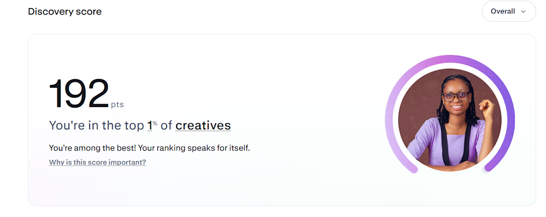
Top 1% on Contra. 🎉
A small milestone that means a lot.
Every project, client, lesson, and late night has contributed to this journey. Grateful for everyone who has trusted my work and supported my growth.
Still building. Still learning. Still going.

Congrats

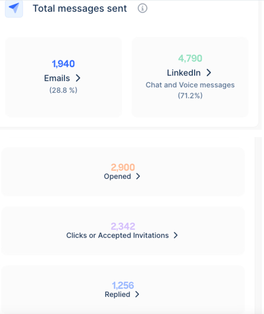
25% reply rate - 51 C-Level Meetings in 60 days
Set up the full outbound system in Lemlist from scratch, from reply playbook to Claude cowork skill that can handle replies. ICP targeting, sequence logic, copy, follow-up cadences. Sitting at a 1.5% meeting rate across three markets (Albania, Croatia, Slovenia) with no sales headcount (51 meetings
booked with biggest companies creating a 600K+ pipeline in 60 days)



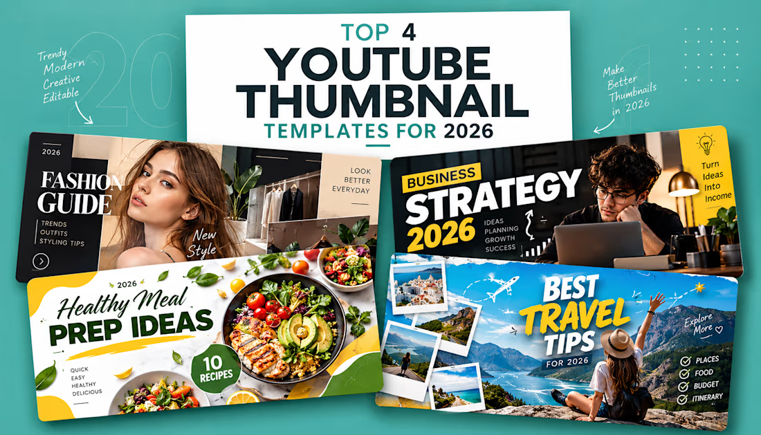
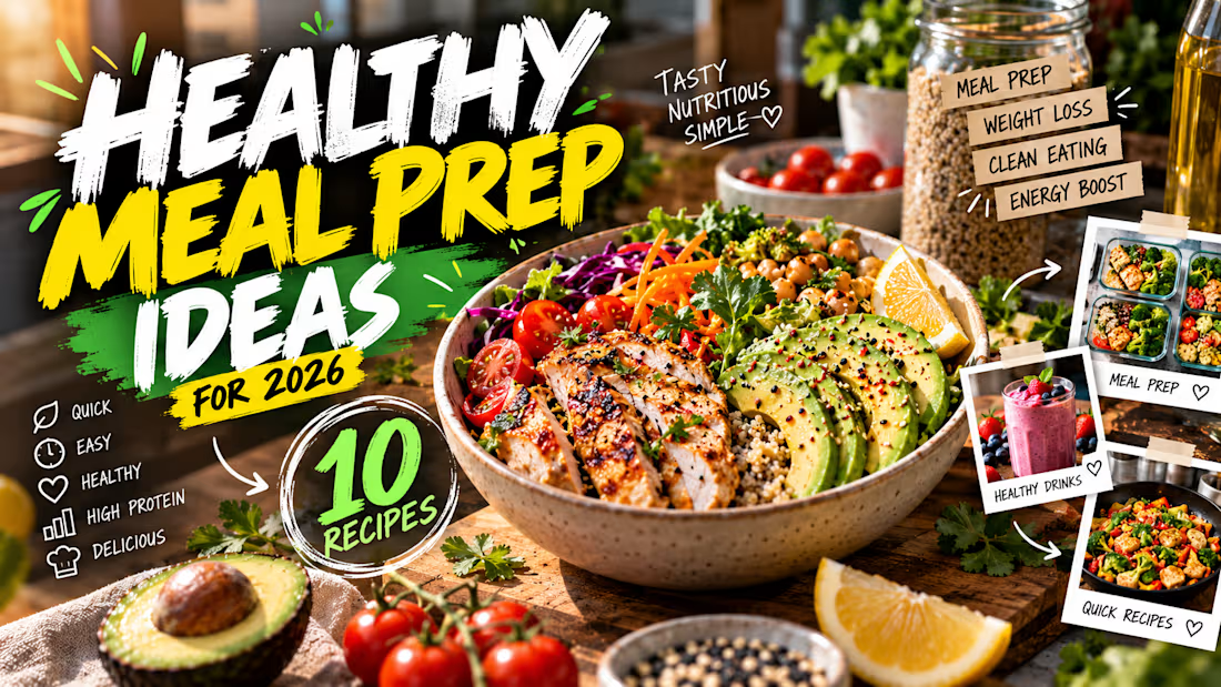
Thumbnail Design — High-Impact Visuals
A curated set of four thumbnail concepts designed to make content instantly recognizable and visually compelling.
Each thumbnail uses a different creative direction, with careful attention to composition, subject focus, typography, contrast, color balance, image treatment, and visual hierarchy. The goal is to communicate the core idea within seconds while creating a strong reason to click.
Focus
High-impact visual composition
Clear subject and message hierarchy
Professional photo manipulation & retouching
Strong typography and readability
Attention-grabbing color and contrast
Platform-ready visual presentation
Every design is built around the specific content rather than following one repeated template—giving each thumbnail its own visual identity while maintaining a polished, professional finish.