The network for creativity
Join 1.25M professional creatives like you
Connect with clients, get discovered, and run your business 100% commission-free
Creatives on Contra have earned over $150M and we are just getting started
Back to feedPost
Been a bit busy, but this is what I have been working on recently
Don't forget to refer me to your fashion design friends


oh, this is very cool.

Thank you so much Erika🥰
The network for creativity
Join 1.25M professional creatives like you
Connect with clients, get discovered, and run your business 100% commission-free
Creatives on Contra have earned over $150M and we are just getting started





Related posts

Light or dark, which one wins? ☀️🌙
Same site, two moods. Warm stone and lacquer red, or the same build after dark.
Both are hand-built with a 3D paper crumple, real physics, a stick-figure film drawn in code, and a receipt that gets a bicycle kick. 🔊 Sound on.
Tell me which you'd ship: light or dark? 👇
26 voted
59%
18 voted
41%
44 votes
Closed

I really like how the light version looks, but it has some legibility issues. Since readability is more important for users than visual appeal, I think the dark version is the better option.
BTW, I initially voted for the light version, but after analyzing both options more closely, I changed my mind 😄

✨ Modern Fashion Poster Design - STYLE ✨
Designed a clean, high-fashion poster concept focusing on bold typography and minimalist aesthetics.
Concept: Modern Fashion | Define Your Style
Tool: Canva / Photoshop
Style: Luxury, Minimal, Editorial
Open to feedback and freelance work!
#GraphicDesign #PosterDesign #FashionDesign #Canva #ContraCommunity


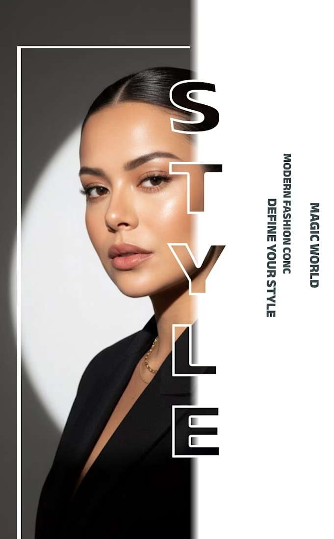
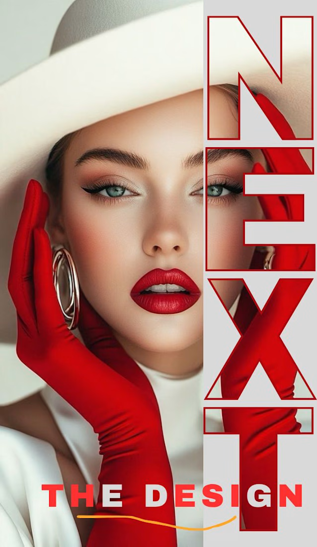
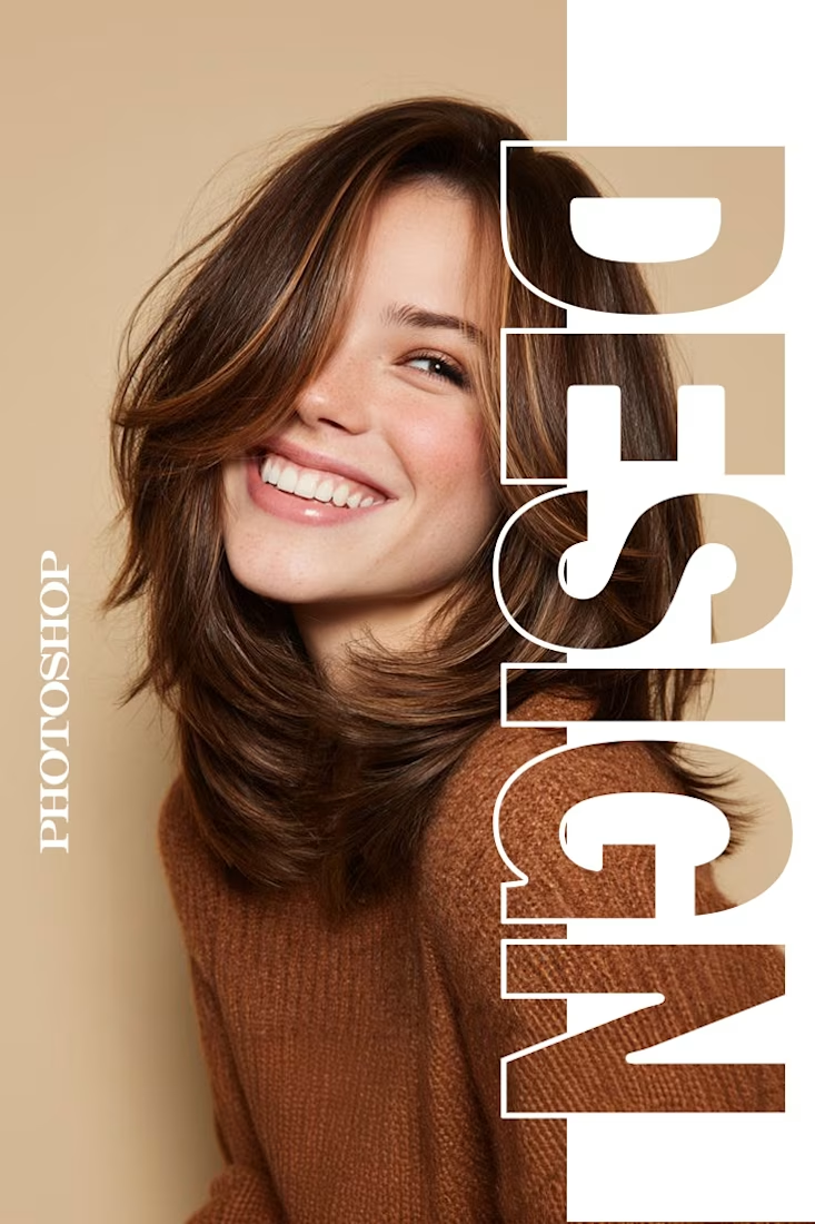
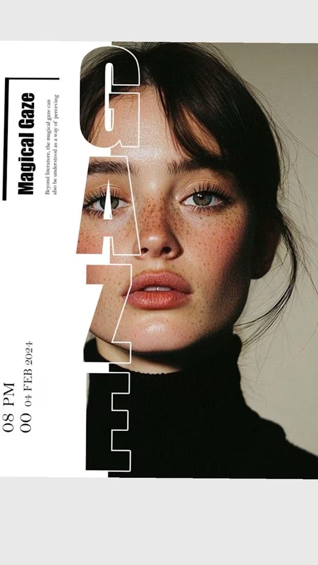

The way you let the bold type dominate the empty space really drives the luxury feel.

Still waiting to hear back from @Contra HQ
So I did what any designer would do: I made the card myself 😂
Brushed metal. Laser-engraved logo. Holographic Mastercard rings. Full 360° spin. I'm going to keep polishing this until the real one shows up in my mailbox. Your move, Contra 👀
(Concept / fan design, not an official Contra product..Yet 🙌 )


“Okay, this looks WAY too good 🔥 Contra needs to make this real 👀”