The network for creativity
Join 1.25M professional creatives like you
Connect with clients, get discovered, and run your business 100% commission-free
Creatives on Contra have earned over $150M and we are just getting started
Back to feedPost


The network for creativity
Join 1.25M professional creatives like you
Connect with clients, get discovered, and run your business 100% commission-free
Creatives on Contra have earned over $150M and we are just getting started



Related posts

What if sending money felt a little more like giving a gift?
For Nova, I explored a banking app that brings payments, cards, and a bit of personality together. You can check your balance, browse recent transactions, send or request money, top up, and pay bills.
My favorite part is the digital postcard feature. Before sending a transfer, you can add a little illustrated card—a heart, a birthday greeting, or a playful character. A simple way to make birthday money or a thank-you feel more personal.
I carried that same 3D character into onboarding, pairing it with bold red gradients and large, clear payment details. There’s room for play, while the recipient and amount stay easy to check.
Would you add a postcard to a transfer? I’d love to know what occasion you’d use it for.






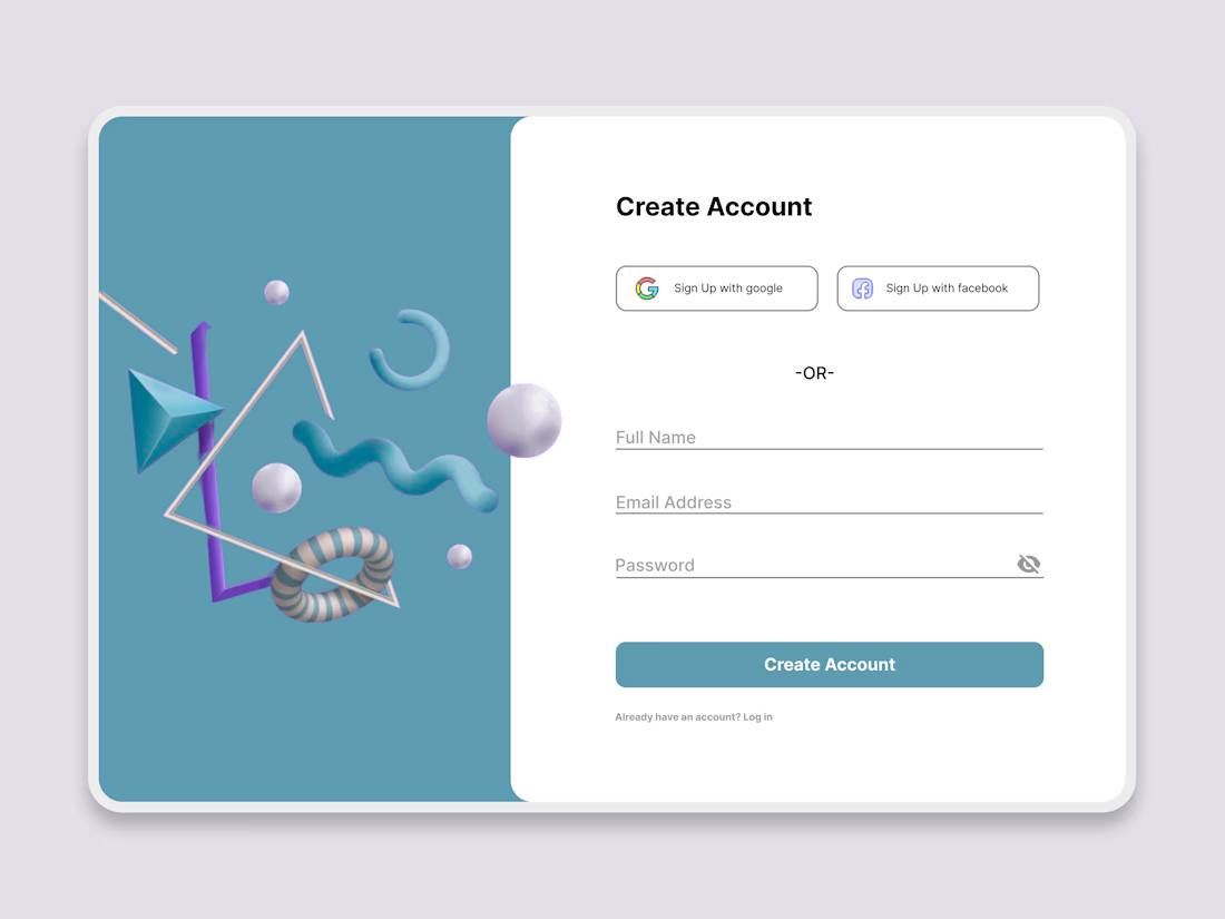
Just finished working on a Modern Sign Up Page UI Design!
Focused on creating a clean and user-friendly account creation experience with a minimal split-screen layout, soft 3D elements, and a fresh blue color palette.
Designed in Figma with a focus on visual hierarchy, simplicity, and usability.
#UIDesign #UXDesign #Figma #WebDesign #ProductDesign

Love the split layout.

A great online store should make discovering products feel simple and enjoyable.
With this e-commerce website concept, I wanted to create a modern digital marketplace where product presentation and user experience work together.
From the clean product layouts and featured collections to the soft colour palette and organised categories, every part of the design helps make browsing easier while keeping the products at the centre of attention.
I like how the design brings together visual appeal and functionality, creating a shopping experience that feels both modern and easy to navigate.
I'm available for new website design projects and collaborations.
If you were shopping online, what would make you stay longer on a website like this?
#WebDesign #UIDesign #EcommerceDesign #Figma

Good filters and clear product photos keep me browsing longer. The overlapping art cards in the hero are a nice touch.