The network for creativity
Join 1.25M professional creatives like you
Connect with clients, get discovered, and run your business 100% commission-free
Creatives on Contra have earned over $150M and we are just getting started
Back to feedPost

Designed a modern crypto wallet dashboard focused on clarity, usability, and speed.
The interface gives users an instant overview of their portfolio, asset allocation, recent activity, and performance, while keeping core actions like Send, Receive, Swap, and Buy just one click away.
The goal was to make complex financial data feel simple through clean hierarchy, thoughtful spacing, and a polished dark UI.


One click away from Send, Receive, Swap, and Buy is a bold promise for a wallet, that's usually where these apps get cluttered. What ended up getting cut or tucked into a secondary screen so the main dashboard could stay this uncluttered?
The network for creativity
Join 1.25M professional creatives like you
Connect with clients, get discovered, and run your business 100% commission-free
Creatives on Contra have earned over $150M and we are just getting started





Related posts

Continuing my series of short motion videos for a crypto project.
Which coin looks better? (Rendered on a transparent background, by the way.)
If your product needs something similar, feel free to reach out :)
67 voted
74%
24 voted
26%
91 votes
Closed

B took the lead for me

The real cost of bad UX:
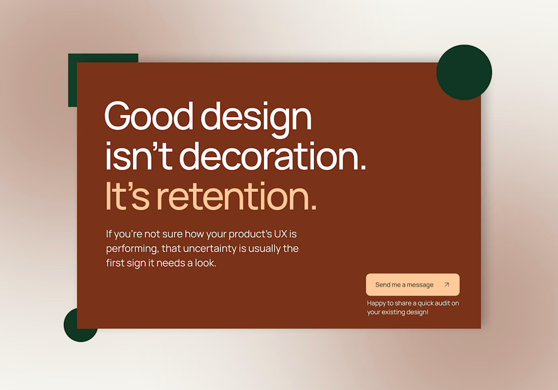
Cluttered layouts, and slow load times quietly push people toward competitors before they even read your value prop. Good design isn't decoration. It's retention.
If you're not sure how your product's UX is performing, that uncertainty is usually the first sign it needs a look.
Send me a message - happy to share quick audit on your existing design!
#UXDesign #UIUX #WebDesign #UserExperience #WebsiteDesign #ConversionFocusedDesign

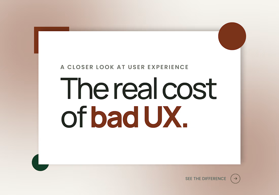
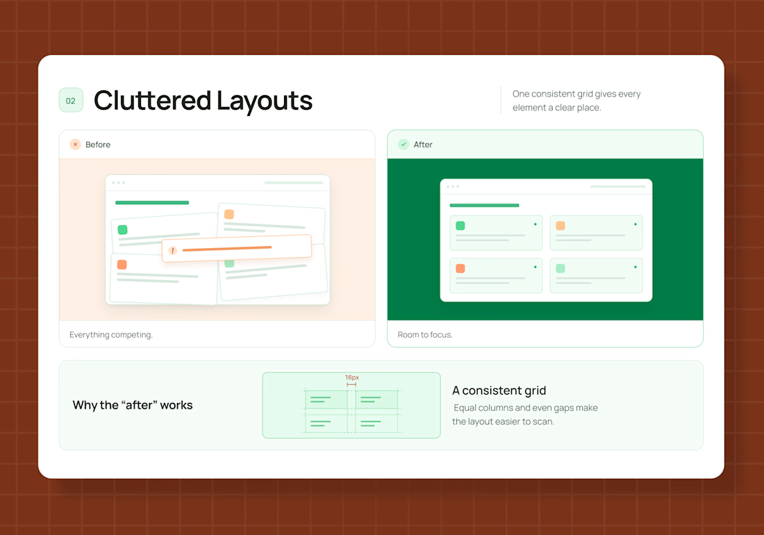
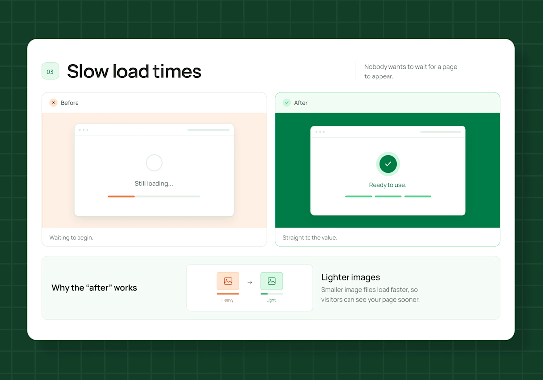

Good design isn't decoration, it's retention is a line every founder should tape to their monitor. People bounce over clutter and slow loads before they ever reach the value prop, and that lost revenue is invisible so it never gets fixed. Framing UX as retention is exactly right.

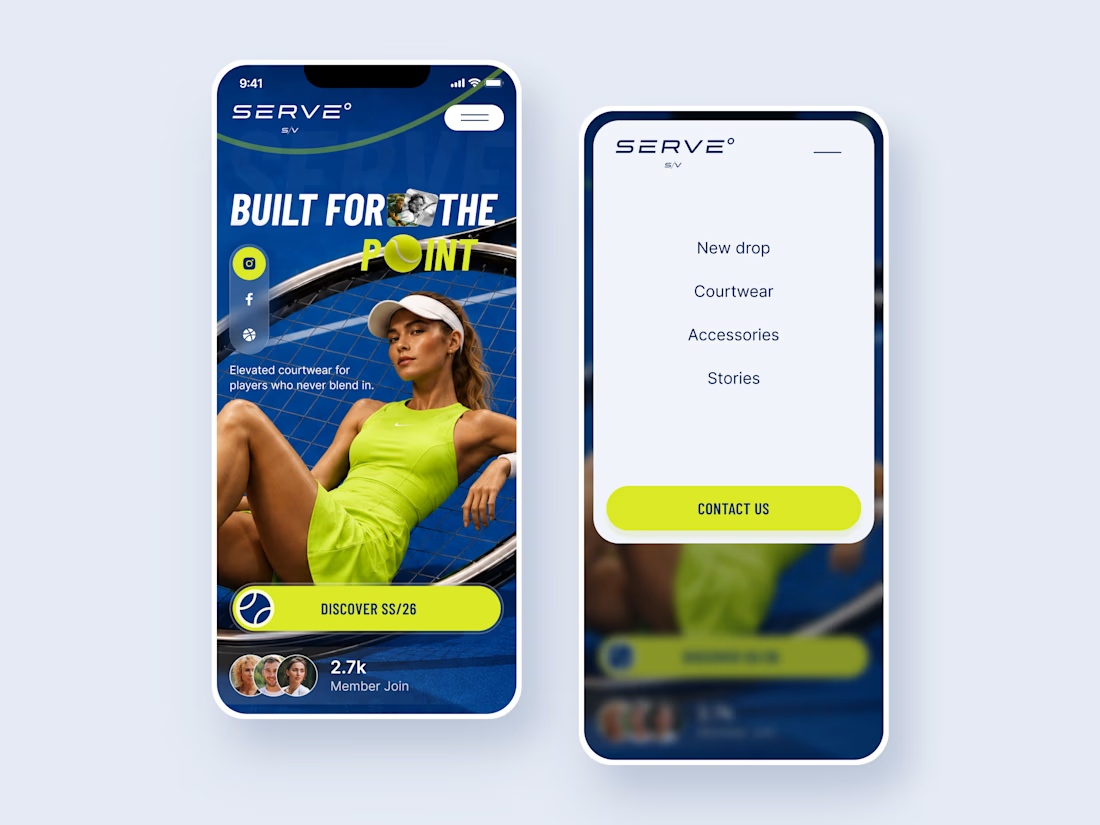
SERVE — Tennis Courtwear Landing Page 🎾
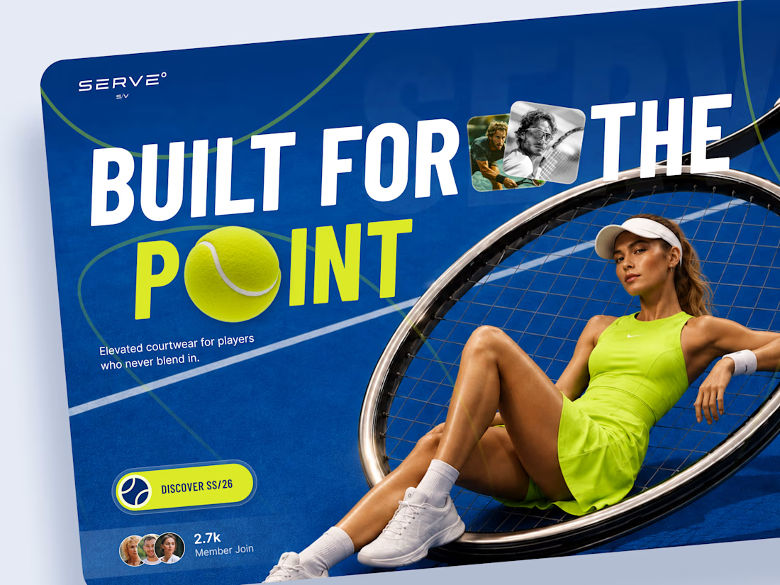
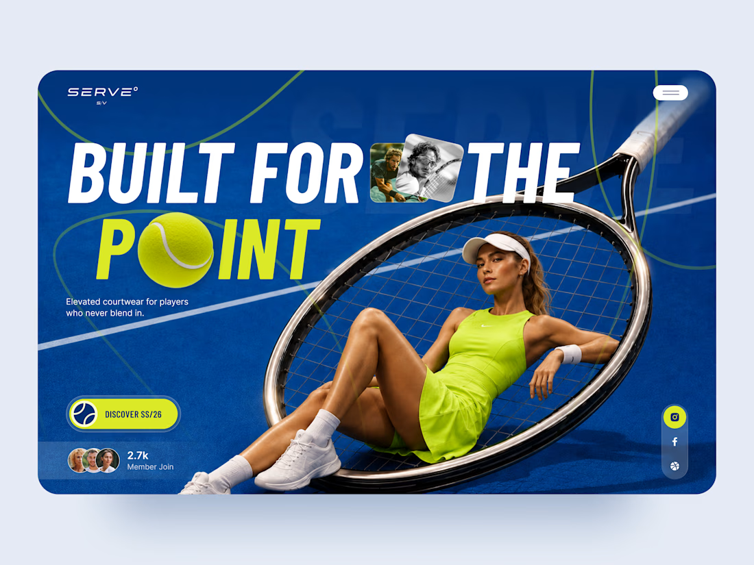
SERVE is a bold landing page concept for a contemporary tennis and courtwear brand built around performance, style, and attitude.
The goal was to move away from the traditional clean, minimal sportswear aesthetic and create something with more energy and personality. Deep court blue, electric tennis yellow, oversized typography, and layered photography give the experience a strong editorial feel.
Special attention was given to:
• a hero composition built around the tennis racket and athlete
• oversized typography that feels energetic and campaign-driven
• electric yellow accents inspired by the tennis ball 🎾
• layered photography and graphic elements that create depth
• a strong CTA for the SS/26 collection
• social and community elements that make the brand feel active
• a simplified mobile composition that keeps the same visual impact
• a clean mobile menu that contrasts with the expressive hero
The result is a high-energy digital experience that blends sports performance with fashion-forward art direction.
Looking to create a bold website for your sports, fashion, or lifestyle brand? Let’s build something people remember ⚡