The network for creativity
Join 1.25M professional creatives like you
Connect with clients, get discovered, and run your business 100% commission-free
Creatives on Contra have earned over $150M and we are just getting started
Back to feedPost

Fitting products where they really deserve
A concept product experimenting "if land rover made water bottle how will they advertise it"
The work was simple -
Study the Brand DNA, how they showcase their product, what material language do they use, in which environments do they place thier products and then the work was just to reimagine a product completly different from SUV's.
A bottle... yes.
The project focuses more on the brand positioning than the product itself.
For example if it was made by some other lifestyle brand they would have shown the product in clean, minimal aesthetic environment with smooth cut animations and soft lightings.
But...
beacuse this concept totally focuses on the brand "Land Rover" the visuals must justify thier Brand motto 'Above&Beyond' with terrain visuals, harsh environment, rugged surfaces etc.
This little deconstruction is enough to explain my vision & intention to work on this project.
Open for Projects work.vanshul@gmail.com

A great product visual doesn't just show the product.
It shows the lifestyle around it.
That's the difference between a render and a story.

The network for creativity
Join 1.25M professional creatives like you
Connect with clients, get discovered, and run your business 100% commission-free
Creatives on Contra have earned over $150M and we are just getting started







Related posts

An existing brand identity showcased across a new campaign. This was one of my favourite projects ever!

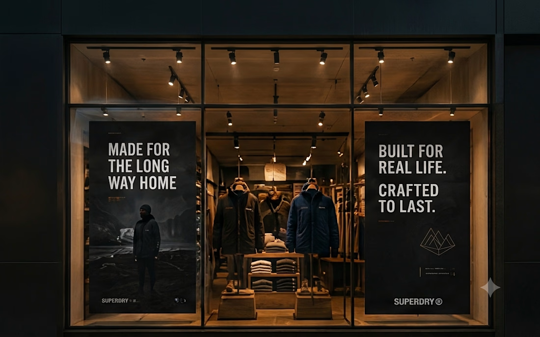
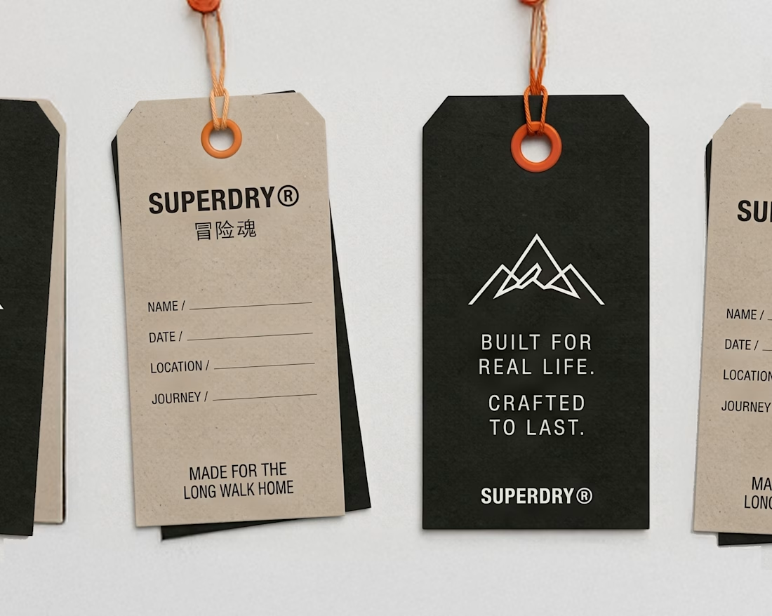
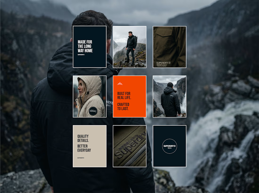
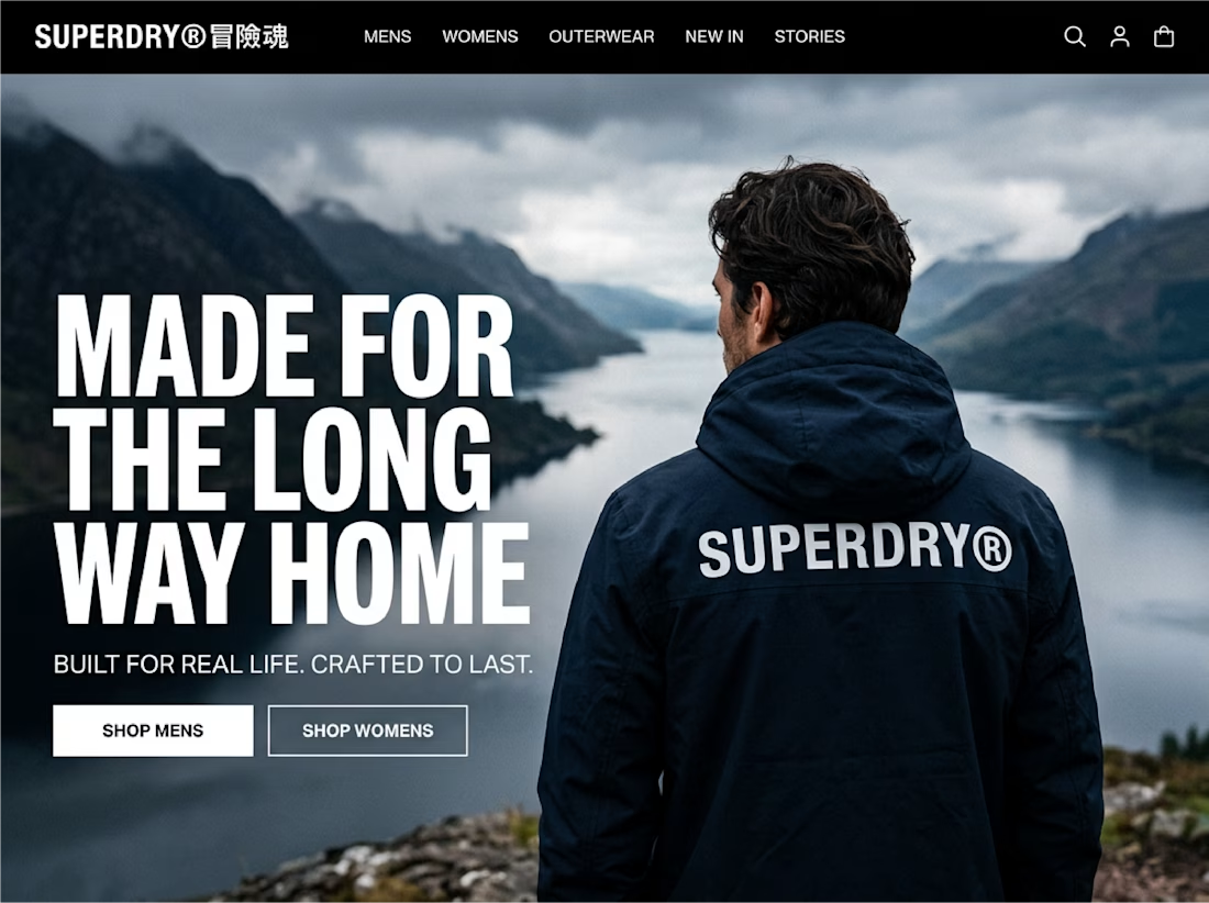


made for the long way home across the back of that jacket is so good


Torque, a robotics AI - brand identity, in motion.
What do you think?


A little excerpt from the brand guidelines for a recent project

The APS mark built from the four small symbols reads like a map legend, which suits a psychology service. Nice that the guidelines page shows it on the dark teal, most would have played it safe on white.