The network for creativity
Join 1.25M professional creatives like you
Connect with clients, get discovered, and run your business 100% commission-free
Creatives on Contra have earned over $150M and we are just getting started
Back to feedPost

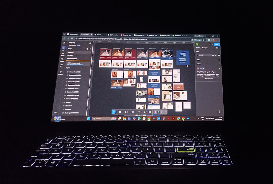
what the process actually looks like before everything gets cleaned up :(
references everywhere, multiple directions, and slowly figuring out what belongs.
building my first Framer template 👀
The network for creativity
Join 1.25M professional creatives like you
Connect with clients, get discovered, and run your business 100% commission-free
Creatives on Contra have earned over $150M and we are just getting started







Related posts

My portfolio, reimagined in Framer
The goal was simple: bring everything together in one place, from client projects and case studies to Framer templates and project videos, while keeping the experience clean and easy to navigate.
The entire portfolio fits within a strict 100vh viewport, so you can explore everything without scrolling.
Would love to hear your thoughts and feedback!
Portfolio link in the comments.


A few years ago I had the chance to take a course where one of the modules was taught by a designer I really admire, Joseph Berry.
The goal was to create a website for a product, in this case, a speaker. We went through the entire process, from receiving the brief to the very last detail, even modeling the product ourselves in 3D using Spline.
I learned so much, and also got to meet great designers. It’s amazing to see how each one has a different process, and having the chance to observe that and take a bit from each way of doing things to make it your own and develop a unique result really helps you grow a lot as a professional.
I’m sharing some frames from the project, hope you like them!


Great website design visuals I like the color palette ❤️❤️
Great job Ivan🎉🎉

Datum, a personal portfolio website for builders and makers.
HTML, React and @Framer versions.
Go and check out the cool "inspect" feature at https://no-code.supply/templates/datum


Amaizing